install.packages("palmerpenguins")Demo 03: Simple visuals for high-dimensional data
More fun with penguins
The graphs below don’t have proper titles, axis labels, legends, etc. Please take care to do this on your own graphs. Throughout this demo we will use the palmerpenguins dataset. To access the data, you will need to install the palmerpenguins package:
We load the penguins data in the same way as the previous demos:
library(tidyverse)
library(palmerpenguins)
data(penguins)
head(penguins)
# A tibble: 6 × 8
species island bill_length_mm bill_depth_mm flipper_length_mm body_mass_g
<fct> <fct> <dbl> <dbl> <int> <int>
1 Adelie Torgersen 39.1 18.7 181 3750
2 Adelie Torgersen 39.5 17.4 186 3800
3 Adelie Torgersen 40.3 18 195 3250
4 Adelie Torgersen NA NA NA NA
5 Adelie Torgersen 36.7 19.3 193 3450
6 Adelie Torgersen 39.3 20.6 190 3650
# ℹ 2 more variables: sex <fct>, year <int>Pairs plot with GGally
We will use the GGally package to make pairs plots in R with ggplot figures. You need to install the package:
install.packages("GGally")Next, we’ll load the package and create a pairs plot of just the continuous variables using ggpairs. The main arguments you have to worry about for ggpairs are data, columns, and mapping:
data: specifies the datasetcolumns: Columns of data you want in the plot (can specify with vector of column names or numbers referring to the column indices)mapping: aesthetics usingaes(). Most important one isaes(color = <variable name>)
First, let’s create a pairs plot by specifying columns as the four columns of continuous variables (columns 3 through 6):
library(GGally)
penguins |> ggpairs(columns = 3:6)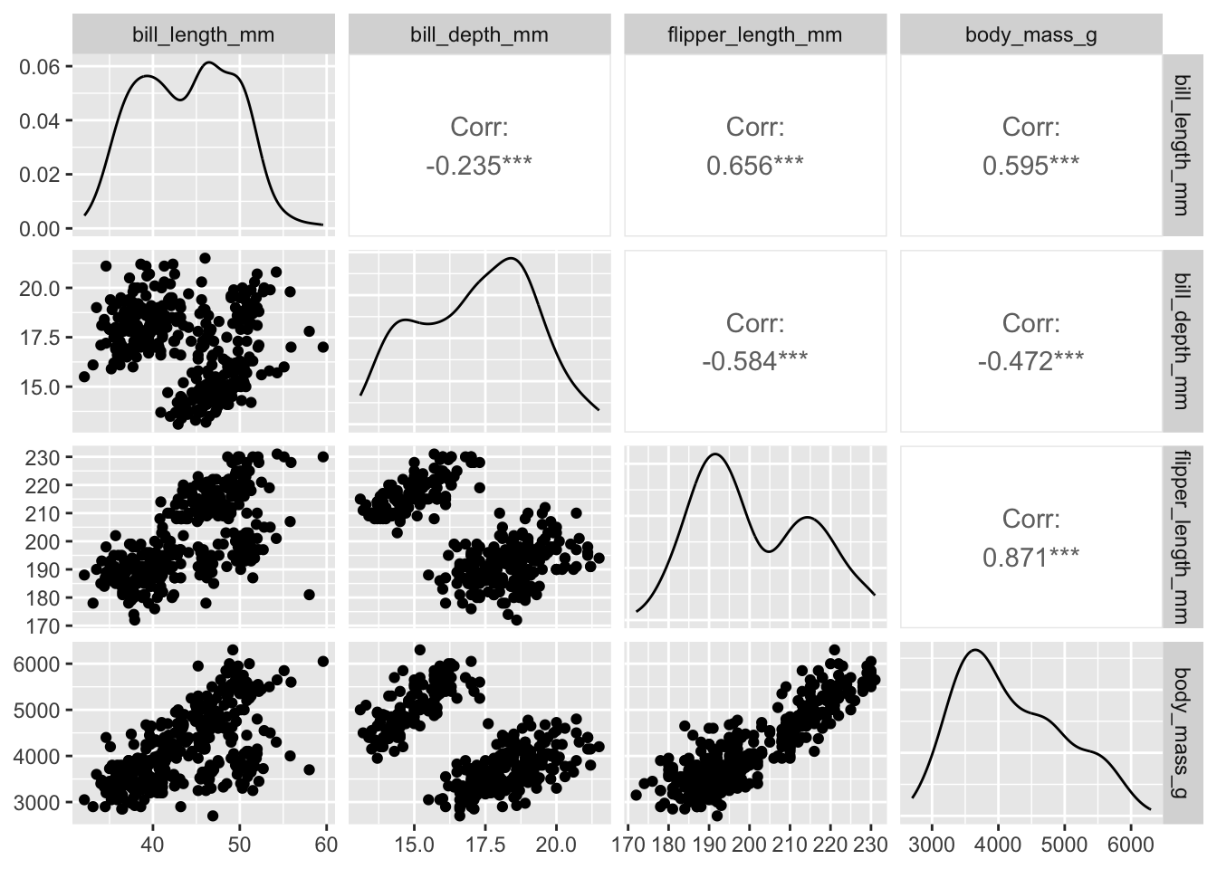
Obviously this suffers from over-plotting so we’ll want to adjust the alpha. An annoying thing is that we specify the alpha directionly with aes when using ggpairs:
penguins |> ggpairs(columns = 3:6, mapping = aes(alpha = 0.5))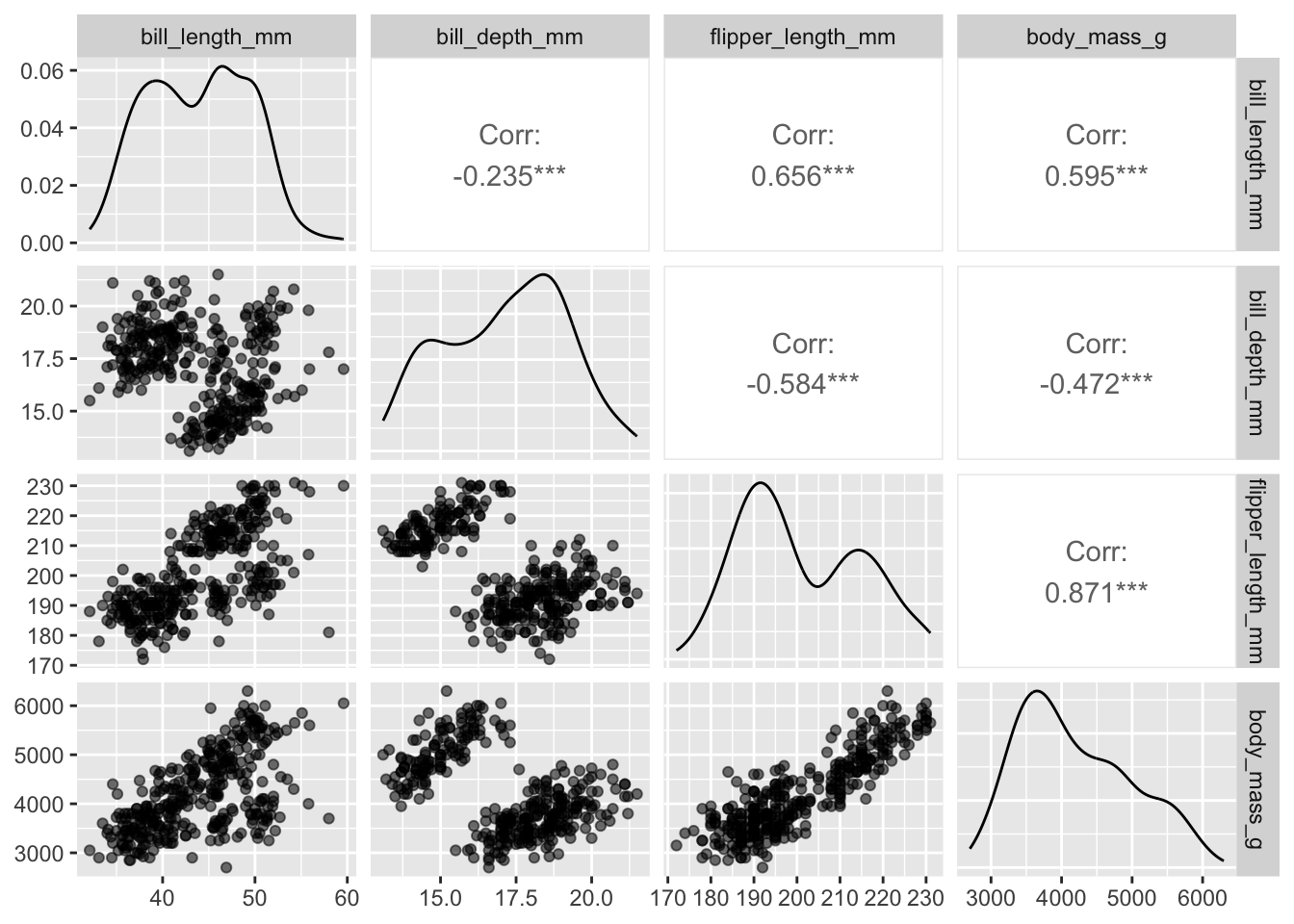
Plots along the diagonal show marginal distributions. Plots along the off-diagonal show joint (pairwise) distributions or statistical summaries (e.g., correlation) to avoid redundancy. The matrix of plots is symmetric; e.g., entry (1,2) shows the same distribution as entry (2,1). However, entry (1,2) and entry (2,1) display different bits of information (or alternative plots) about the same distribution.
We could also specify categorical variables in the plot. We also don’t need to specify column indices if we just select which columns to use beforehand:
penguins |>
  dplyr::select(bill_length_mm, body_mass_g, species, island) |>
  ggpairs(mapping = aes(alpha = 0.5))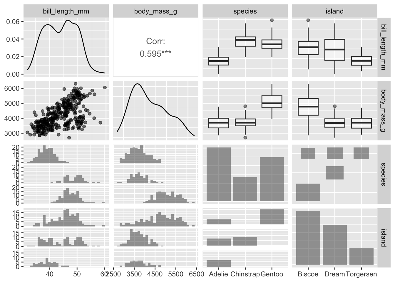
Alternatively, we can use the mapping argument to display these categorical variables in a different manner - and arguably more efficiently:
penguins |>
  ggpairs(columns = c("bill_length_mm", "body_mass_g", "island"),
          mapping = aes(alpha = 0.5, color = species))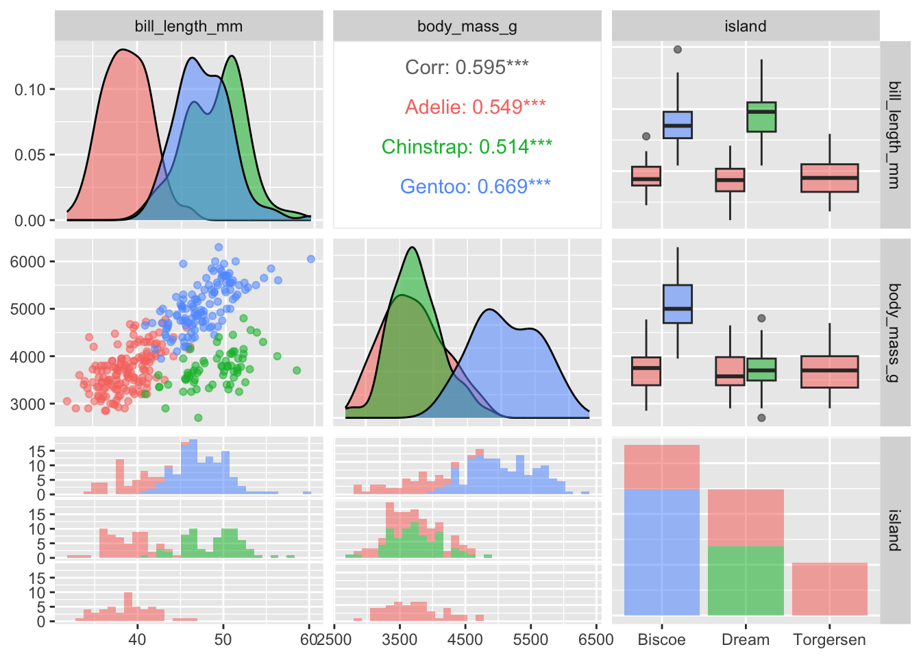
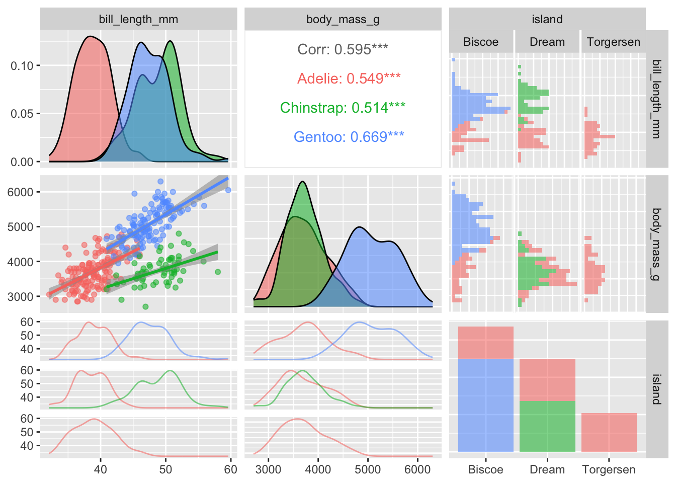
The ggpairs function in GGally is very flexible and customizable with regards to which figures are displayed in the various panels. I encourage you to check out the vignettes and demos on the package website for more examples. For instance, in the pairs plot below I decide to display the regression lines and make other adjustments to the off-diagonal figures:
penguins |>
  ggpairs(columns = c("bill_length_mm", "body_mass_g", "island"),
          mapping = aes(alpha = 0.5, color = species),
          lower = list(
            continuous = "smooth_lm",
            combo = "facetdensitystrip"
          ),
          upper = list(
            continuous = "cor",
            combo = "facethist"
          )
  )
You can also proceed to customize the pairs plot in the same manner as ggplot figures:
penguins |>
  dplyr::select(species, body_mass_g, ends_with("_mm")) |>
  ggpairs(mapping = aes(color = species, alpha = 0.5),
          columns = c("flipper_length_mm", "body_mass_g",
                      "bill_length_mm", "bill_depth_mm")) +
  scale_colour_manual(values = c("darkorange","purple","cyan4")) +
  scale_fill_manual(values = c("darkorange","purple","cyan4")) +
  theme_bw() +
  theme(strip.text = element_text(size = 7))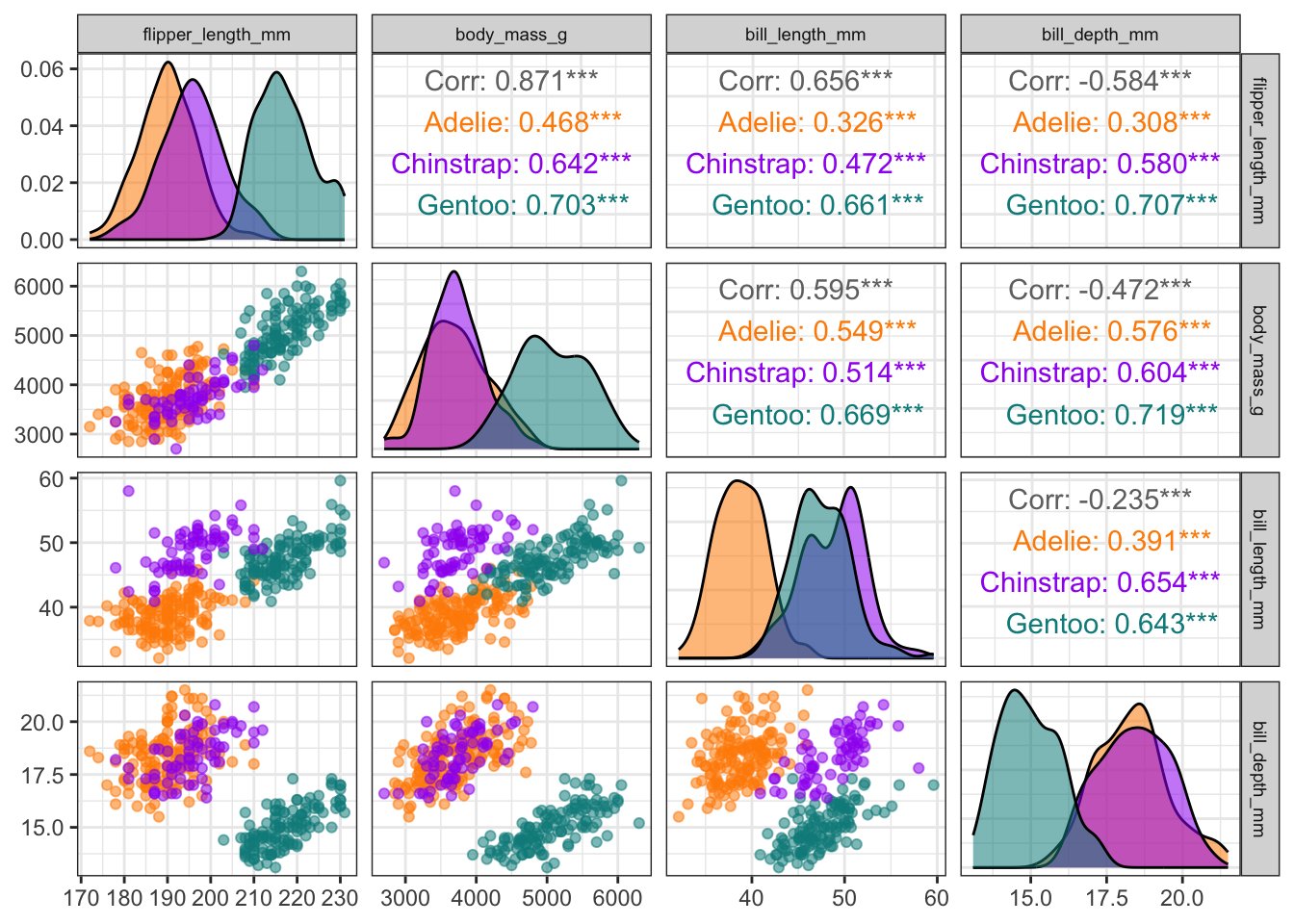
Correlograms with ggcorrplot
We can visualize the correlation matrix for the variables in a dataset using the ggcorrplot package. You need to install the package:
install.packages("ggcorrplot")Next, we’ll load the package and create a correlogram using only the continuous variables. To do this, we first need to compute the correlation matrix for these variables:
penguins_cor_matrix <- penguins |>
  dplyr::select(bill_length_mm, bill_depth_mm, flipper_length_mm, body_mass_g) |>
  cor(use = "complete.obs")
penguins_cor_matrix
bill_length_mm bill_depth_mm flipper_length_mm body_mass_g
bill_length_mm 1.0000000 -0.2350529 0.6561813 0.5951098
bill_depth_mm -0.2350529 1.0000000 -0.5838512 -0.4719156
flipper_length_mm 0.6561813 -0.5838512 1.0000000 0.8712018
body_mass_g 0.5951098 -0.4719156 0.8712018 1.0000000NOTE: Since there are missing values in the penguins data we need to indicate in the cor() function how to handle missing values using the use argument. By default, the correlations are returned as NA, which is not what we want. Instead, we can change this to only use observations without NA values for the considered columns (see help(cor) for more options).
Now, we can create the correlogram using ggcorrplot() using this correlation matrix:
library(ggcorrplot)
ggcorrplot(penguins_cor_matrix)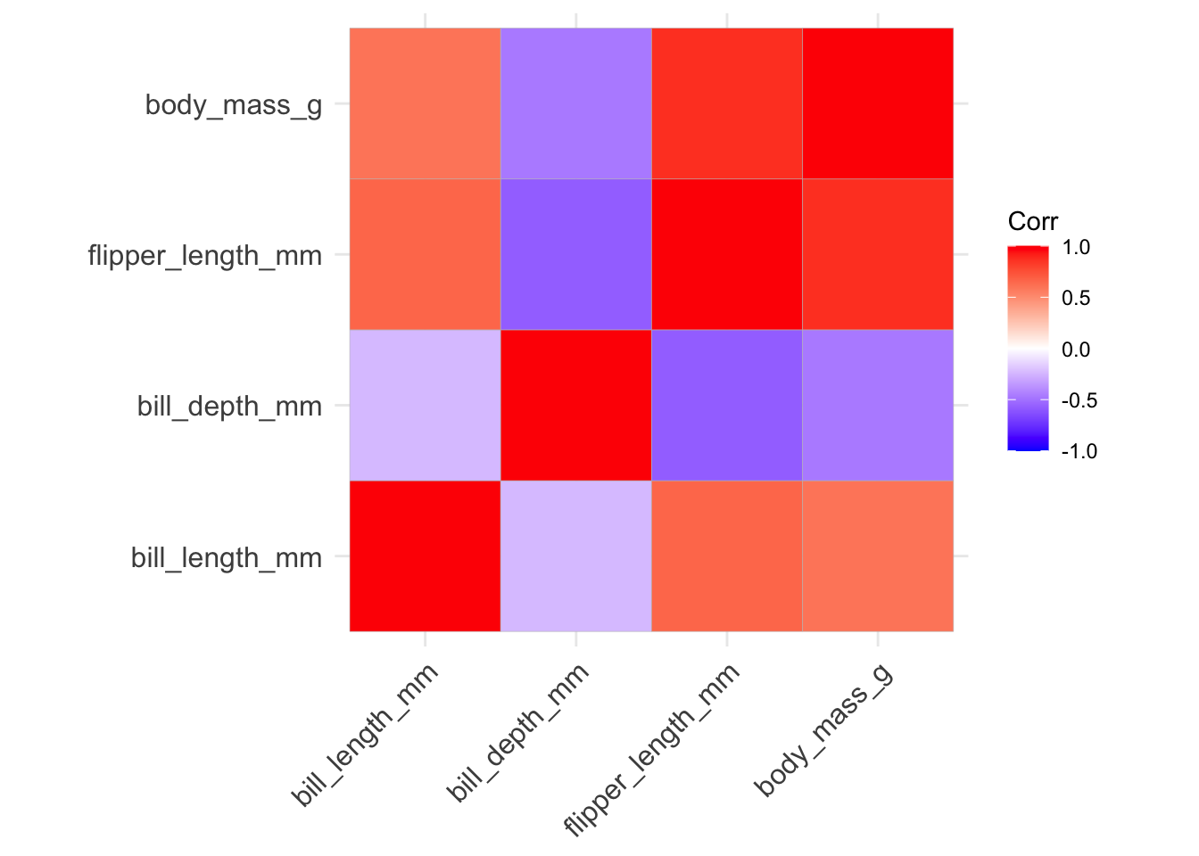
There are several ways we can improve this correlogram:
- we can avoid redundancy by only using one half of matrix by changing the
typeinput: the default isfull, we can make itlowerorupperinstead:
ggcorrplot(penguins_cor_matrix, type = "lower")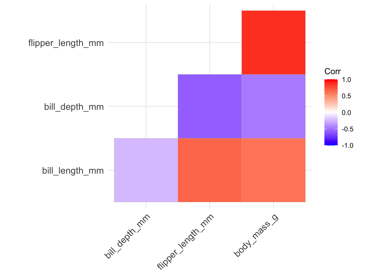
- we can rearrange the variables using hierarchical clustering so that variables displaying stronger levels of correlation are closer together along the diagonal by setting
hc.order = TRUE:
ggcorrplot(penguins_cor_matrix, type = "lower", hc.order = TRUE)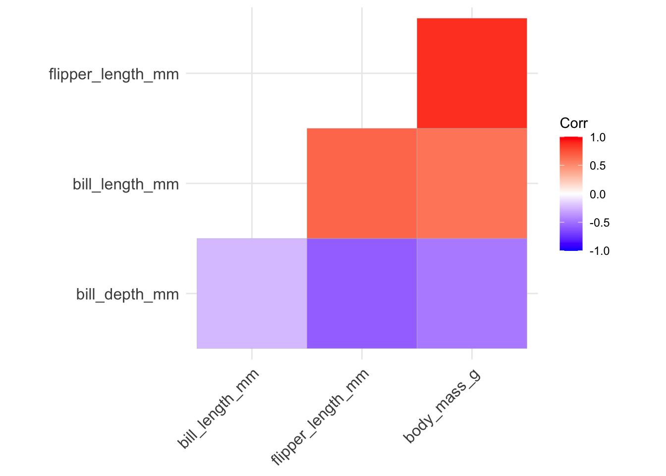
- if we want to add the correlation values directly to the plot, we can include those labels setting
lab = TRUE- but we should round the correlation values first using theround()function:
ggcorrplot(round(penguins_cor_matrix, digits = 4),
           type = "lower", hc.order = TRUE, lab = TRUE)
- if we want to place more stress on the correlation magnitude, we can change the
methodinput tocircleso that the size of the displayed circles is mapped to the absolute value of the correlation value:
ggcorrplot(penguins_cor_matrix, type = "lower", hc.order = TRUE,
           method = "circle")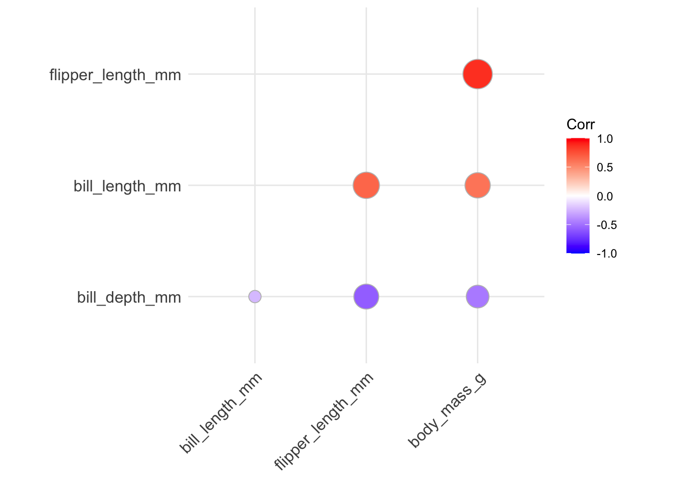
You can ignore the Warning message that is displayed - just from the differences in ggplot implementation.
Heatmaps to display dataset structure with color
Heatmaps provide a way to display structure of the dataset using the fill of tiles in a matrix. The fill of the tiles is mapped to a variable’s standardized value (i.e., (x - mean(x)) / sd(x)). There is a convenient function in R called heatmap to create this type of figure:
heatmap(as.matrix(dplyr::select(penguins,
                                bill_length_mm, bill_depth_mm,
                                flipper_length_mm, body_mass_g)),
        scale = "column",
        Rowv = NA, Colv = NA)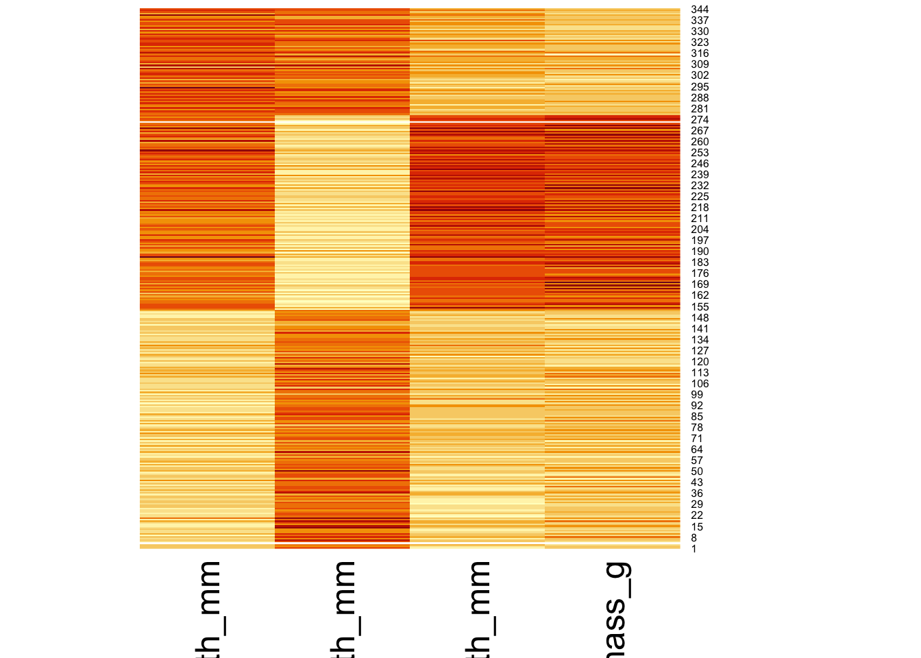
In order to manually create this figure, we’ll need to pivot our dataset from wide to long using the pivot_longer() function. This results in a dataset with one row per observation and variable combination. Then we use geom_tile as the geometric object with the standardized value mapped to the fill:
penguins |>
  mutate(penguin_index = as.factor(paste0("Penguin-", 1:n()))) |>
  dplyr::select(penguin_index, bill_length_mm, bill_depth_mm,
                flipper_length_mm, body_mass_g) |>
  pivot_longer(bill_length_mm:body_mass_g,
               names_to = "variable",
               values_to = "raw_value") |>
  group_by(variable) |>
  mutate(std_value = (raw_value - mean(raw_value, na.rm = TRUE)) /
           sd(raw_value, na.rm = TRUE)) |>
  ungroup() |>
  ggplot(aes(x = variable, y = penguin_index, fill = std_value)) +
  geom_tile() +
  theme_light() +
  theme(legend.position = "bottom",
axis.text.y = element_text(size = 2)) 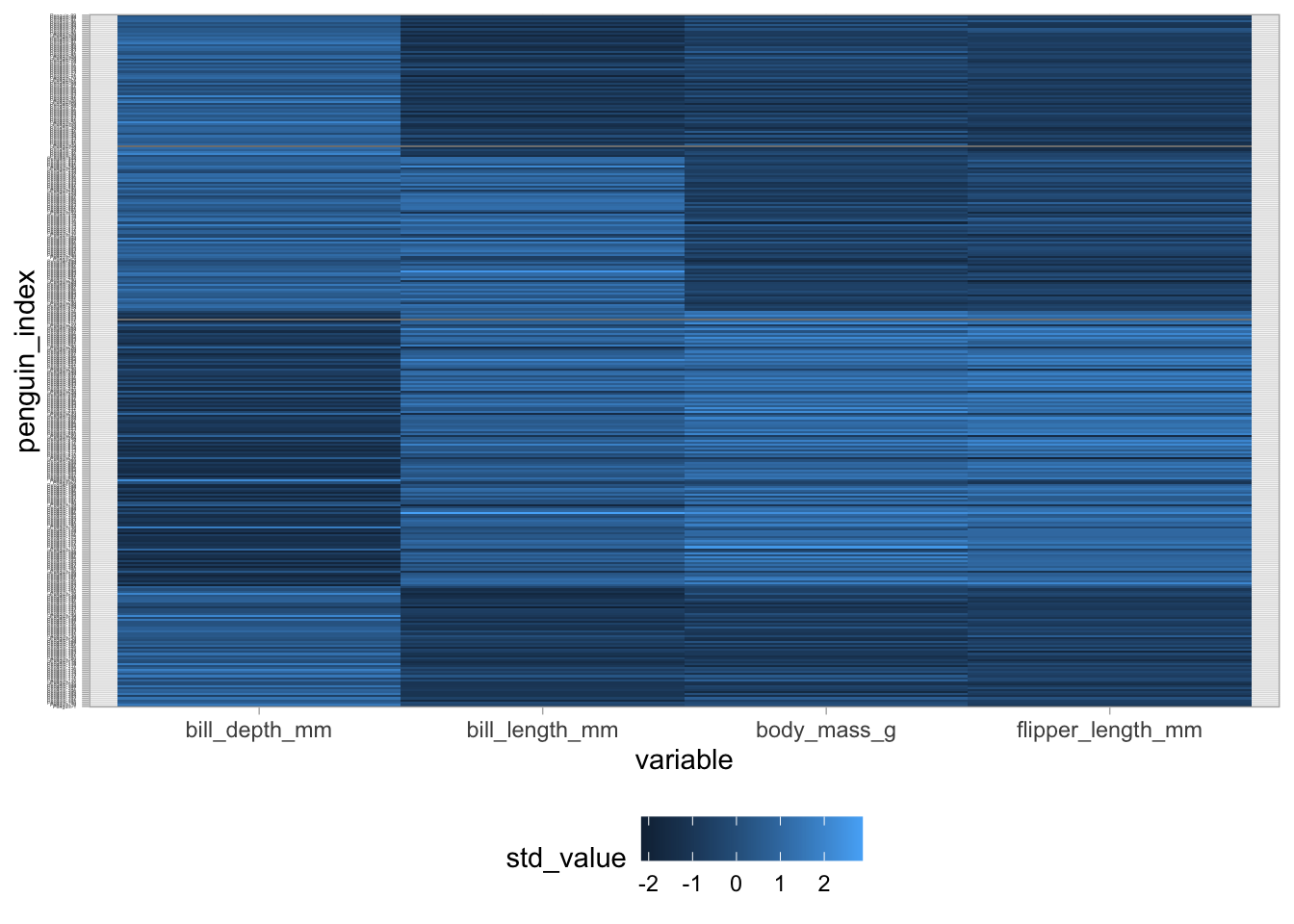
In order to provide some notion of the correlation structure between variables, it’s useful to reorder the observations in the heatmap display by some variable:
penguins |>
  mutate(penguin_index = as.factor(paste0("Penguin-", 1:n())),
         penguin_index = fct_reorder(penguin_index, body_mass_g,
                                     # Ignore the missings when reordering
                                     .na_rm = TRUE)) |>
  dplyr::select(penguin_index, bill_length_mm, bill_depth_mm,
                flipper_length_mm, body_mass_g) |>
  pivot_longer(bill_length_mm:body_mass_g,
               names_to = "variable",
               values_to = "raw_value") |>
  group_by(variable) |>
  mutate(std_value = (raw_value - mean(raw_value, na.rm = TRUE)) /
           sd(raw_value, na.rm = TRUE)) |>
  ungroup() |>
  ggplot(aes(x = variable, y = penguin_index, fill = std_value)) +
  geom_tile() +
  scale_fill_gradient(low = "darkblue", high = "darkorange") +
  theme_light() +
  theme(legend.position = "bottom",
axis.text.y = element_text(size = 2)) 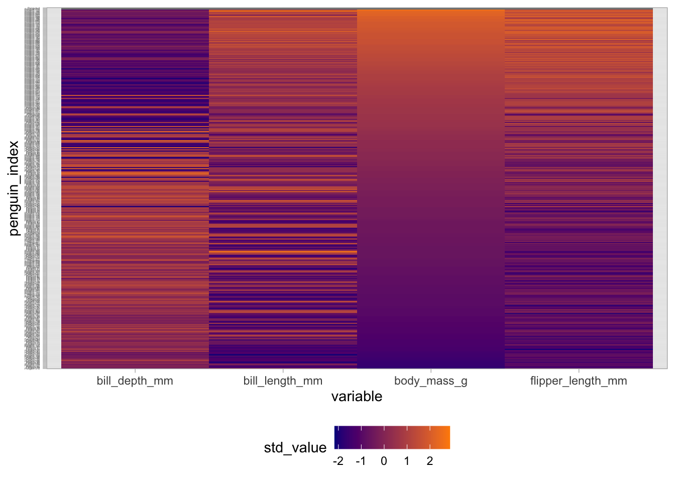
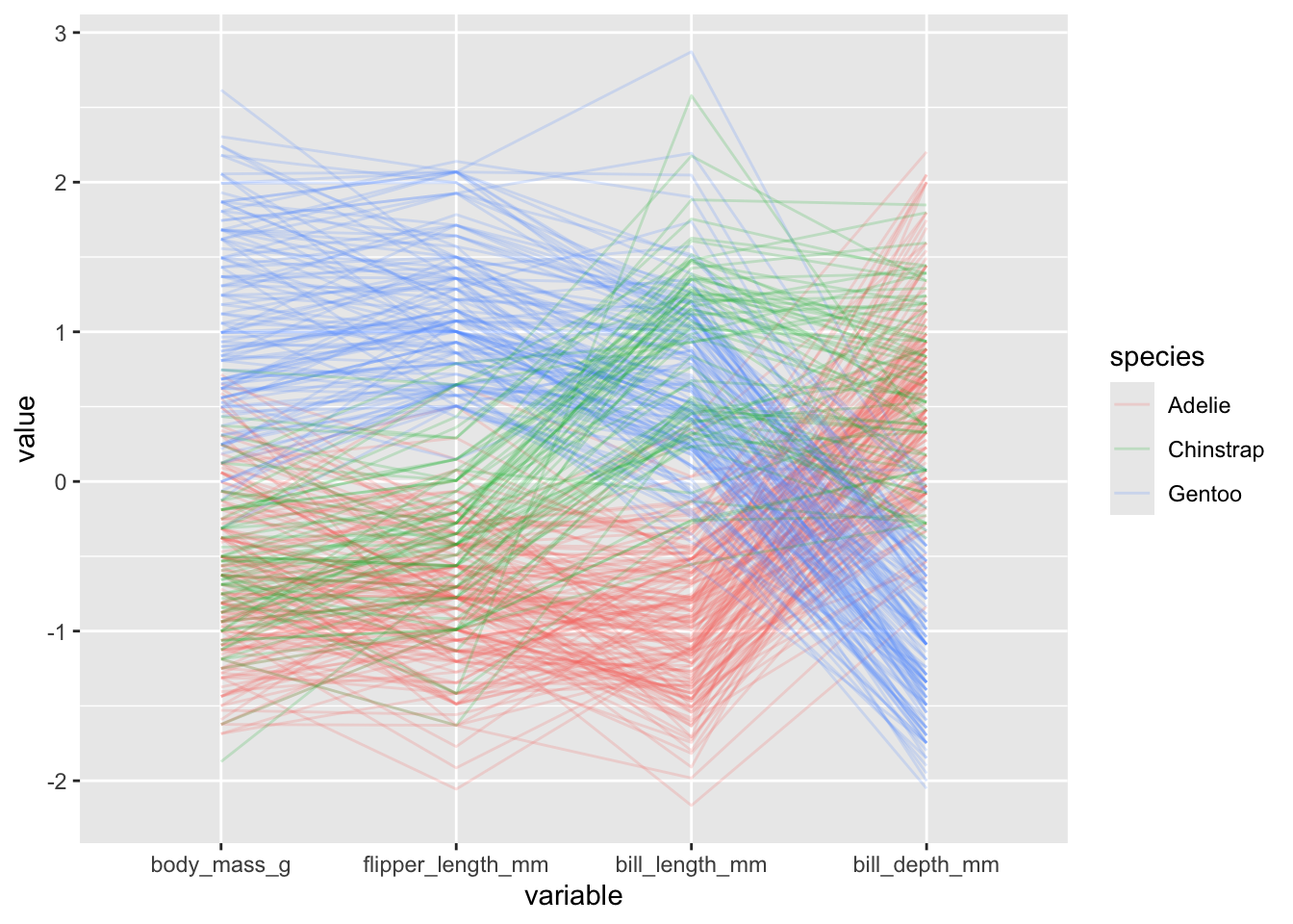
Parallel coordinates plot with GGally
In a parallel coordinates plot, we create an axis for each varaible and align these axes side-by-side, drawing lines between observations from one axis to the next. This can be useful for visualizing structure among both the variables and observations in our dataset. These are useful when working with a moderate number of observations and variables - but can be overwhelming with too many.
We use the ggparcoord() function from the GGally package to make parallel coordinates plots:
penguins |>
  ggparcoord(columns = 3:6)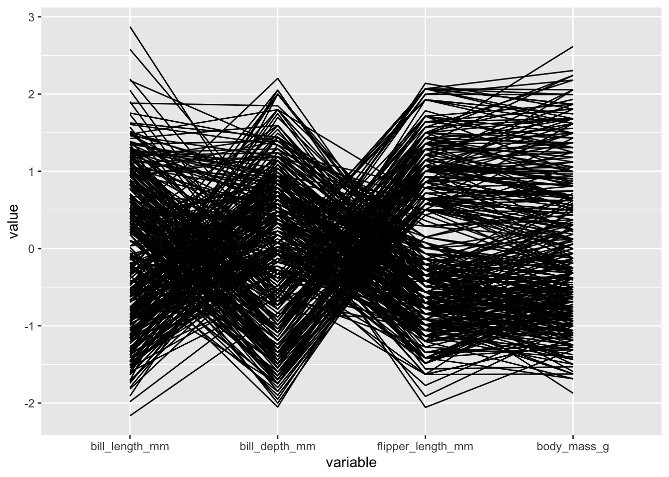
There are several ways we can modify this parallel coordinates plot:
- we should always adjust the transparency of the lines using the
alphaLinesinput to help handle overlap:
penguins |>
  ggparcoord(columns = 3:6, alphaLines = .2)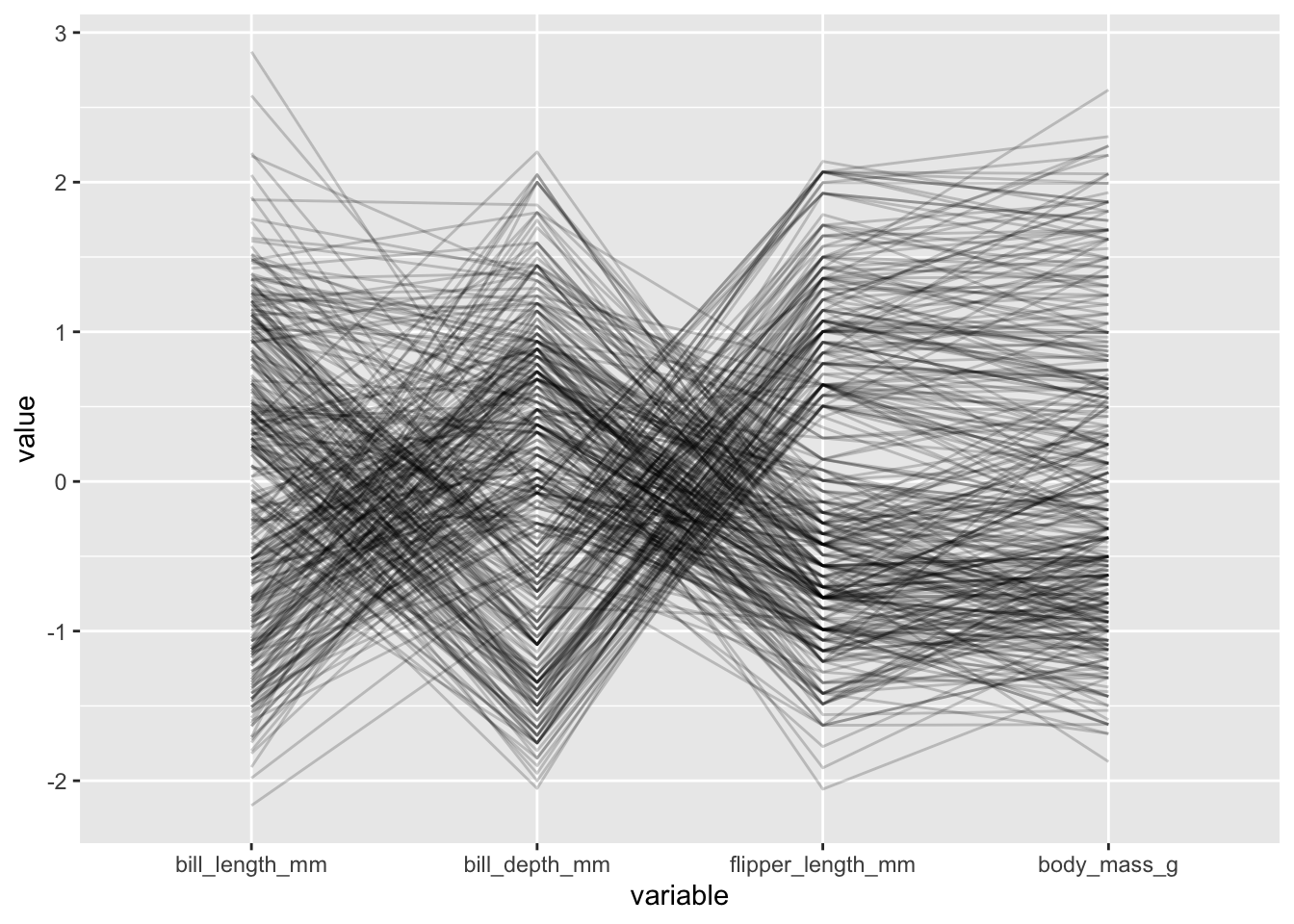
- we can color each observation’s lines by a categorical variable, which can be useful for revealing group structure:
penguins |>
  ggparcoord(columns = 3:6, alphaLines = .2, groupColumn = "species")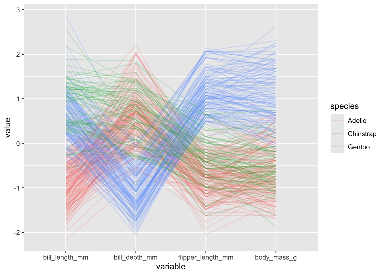
- we can change how the y-axis is constructed by modifying the
scaleinput, which by default isstdthat is simply subtracting the mean and dividing by the standard deviation. We could instead useuniminmaxso that minimum of the variable is zero and the maximum is one:
penguins |>
  ggparcoord(columns = 3:6, alphaLines = .2, groupColumn = "species",
             scale = "uniminmax")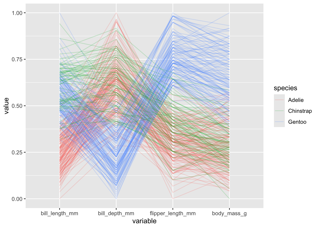
- we can also reorder the variables a number of different ways with the
orderinput (seehelp(ggparcoord)for details). There appears to be some weird errors however with the different options, but you can still manually provide the order of indices as follows:
penguins |>
  ggparcoord(columns = 3:6, alphaLines = .2, groupColumn = "species",
             order = c(6, 5, 3, 4))