install.packages("palmerpenguins")Demo 10: Modifying colors and themes
Throughout this demo we will once again use the palmerpenguins dataset. To access the data, you will need to install the palmerpenguins package:
library(tidyverse)
library(palmerpenguins)
data(penguins)
Notes on colors in plots
Three types of color scales to work with:
- Qualitative: distinguishing discrete items that don’t have an order (nominal categorical). Colors should be distinct and equal with none standing out unless otherwise desired for emphasis.
- Do NOT use a discrete scale on a continuous variable
- Sequential: when data values are mapped to one shade, e.g., in a choropleth, for an ordered categorical variable or low to high continuous variable
- Do NOT use a sequential scale on an unordered variable
- Divergent: think of it as two sequential scales with a natural midpoint midpoint could represent 0 (assuming +/- values) or 50% if your data spans the full scale
- Do NOT use a divergent scale on data without natural midpoint
Options for ggplot2 colors
The default color scheme is pretty bad to put it bluntly, but ggplot2 has ColorBrewer built in which makes it easy to customize your color scales. For instance, we change the palette for the species plot from before.
penguins |>
  ggplot(aes(x = body_mass_g, y = bill_length_mm, color = species)) +
  geom_point(alpha = 0.5, size = 2) +
  scale_color_brewer(palette = "Set2") +
  labs(x = "Body Mass (g)", y = "Bill Length (mm)") +
  theme_bw()
Warning: Removed 2 rows containing missing values or values outside the scale range
(`geom_point()`).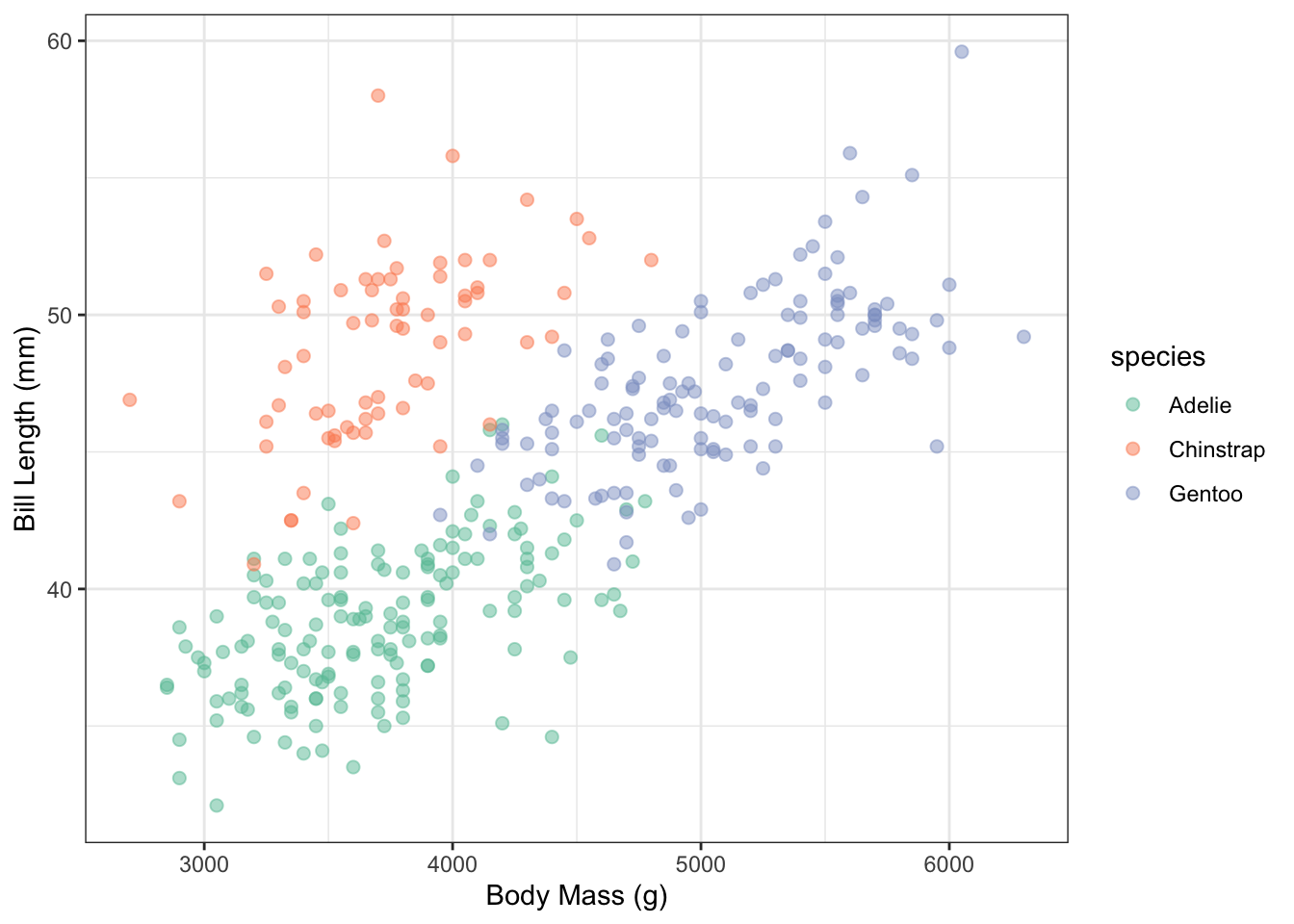
Something you should keep in mind is to pick a color-blind friendly palette. One simple way to do this is by using the ggthemes package which has color-blind friendly palettes included:
penguins |>
  ggplot(aes(x = body_mass_g, y = bill_length_mm, color = species)) +
  geom_point(alpha = 0.5, size = 2) +
  ggthemes::scale_color_colorblind() +
  labs(x = "Body Mass (g)", y = "Bill Length (mm)") +
  theme_bw()
Warning: Removed 2 rows containing missing values or values outside the scale range
(`geom_point()`).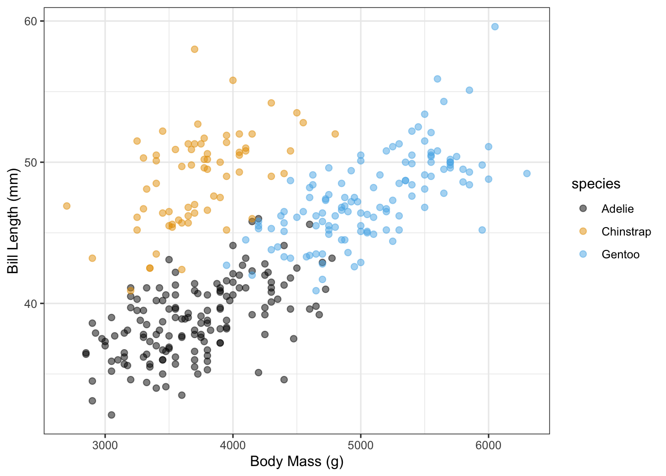
In terms of displaying color from low to high, the viridis scales are excellent choices (and are also color-blind friendly!).
penguins |>
  ggplot(aes(x = body_mass_g, y = bill_length_mm,
             color = flipper_length_mm)) +
  geom_point(alpha = 0.5, size = 2) +
  scale_color_viridis_c() +
  labs(x = "Body Mass (g)", y = "Bill Length (mm)",
       color = "Flipper Length (mm)") +
  theme_bw()
Warning: Removed 2 rows containing missing values or values outside the scale range
(`geom_point()`).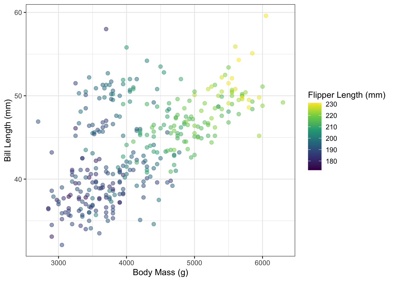
Notes on themes
Throughout the semester, you have seen various changes to the theme of plots for customization in lectures and assignments. You will constantly be changing the theme of your plots to optimize the display. Fortunately, there are a number of built-in themes you can use to start with rather than the default theme_gray():
penguins |>
  ggplot(aes(x = body_mass_g, y = bill_length_mm, color = species)) +
  geom_point(alpha = 0.5, size = 2) +
  ggthemes::scale_color_colorblind() +
  labs(x = "Body Mass (g)", y = "Bill Length (mm)") +
  theme_gray()
Warning: Removed 2 rows containing missing values or values outside the scale range
(`geom_point()`).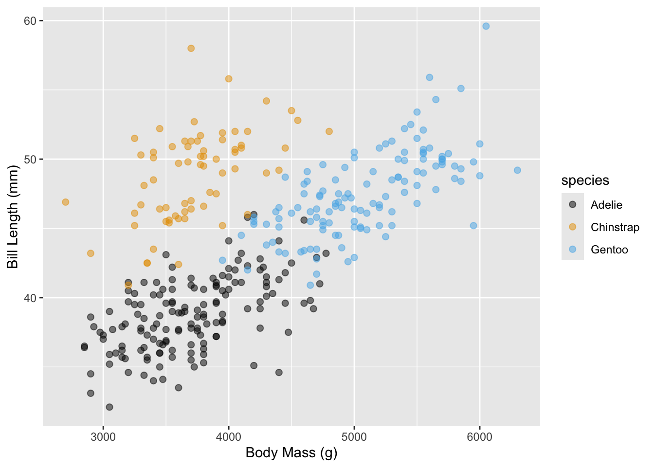
For instance, you have seen me use theme_bw() many times throughout the semester:
penguins |>
  ggplot(aes(x = body_mass_g, y = bill_length_mm, color = species)) +
  geom_point(alpha = 0.5, size = 2) +
  ggthemes::scale_color_colorblind() +
  labs(x = "Body Mass (g)", y = "Bill Length (mm)") +
  theme_bw()
Warning: Removed 2 rows containing missing values or values outside the scale range
(`geom_point()`).
As well as theme_light():
penguins |>
  ggplot(aes(x = body_mass_g, y = bill_length_mm, color = species)) +
  geom_point(alpha = 0.5, size = 2) +
  ggthemes::scale_color_colorblind() +
  labs(x = "Body Mass (g)", y = "Bill Length (mm)") +
  theme_light()
Warning: Removed 2 rows containing missing values or values outside the scale range
(`geom_point()`).
There are options such as theme_minimal():
penguins |>
  ggplot(aes(x = body_mass_g, y = bill_length_mm, color = species)) +
  geom_point(alpha = 0.5, size = 2) +
  ggthemes::scale_color_colorblind() +
  labs(x = "Body Mass (g)", y = "Bill Length (mm)") +
  theme_minimal()
Warning: Removed 2 rows containing missing values or values outside the scale range
(`geom_point()`).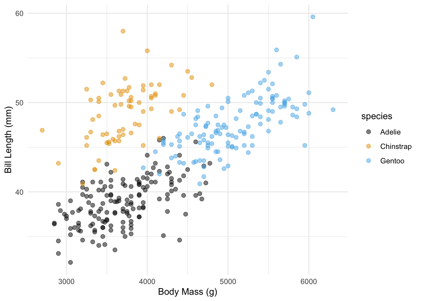
or theme_classic():
penguins |>
  ggplot(aes(x = body_mass_g, y = bill_length_mm, color = species)) +
  geom_point(alpha = 0.5, size = 2) +
  ggthemes::scale_color_colorblind() +
  labs(x = "Body Mass (g)", y = "Bill Length (mm)") +
  theme_classic()
Warning: Removed 2 rows containing missing values or values outside the scale range
(`geom_point()`).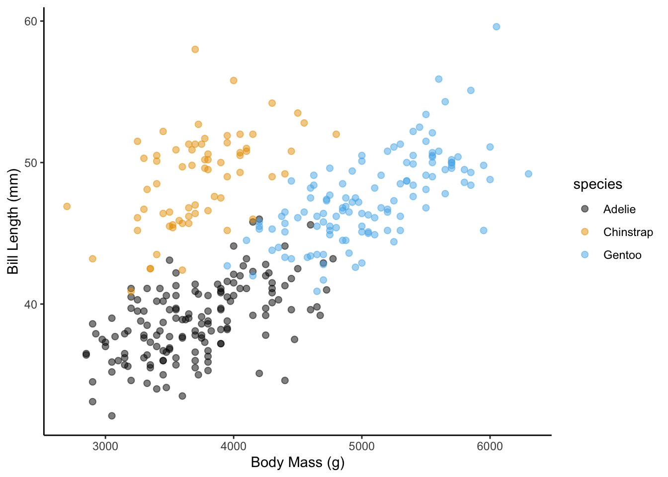
There are also packages with popular, such as the ggthemes package which includes, for example, theme_economist():
library(ggthemes)Warning: package 'ggthemes' was built under R version 4.2.3penguins |>
ggplot(aes(x = body_mass_g, y = bill_length_mm, color = species)) +
geom_point(alpha = 0.5, size = 2) +
ggthemes::scale_color_colorblind() +
labs(x = "Body Mass (g)", y = "Bill Length (mm)") +
theme_economist()Warning: Removed 2 rows containing missing values or values outside the scale range
(`geom_point()`).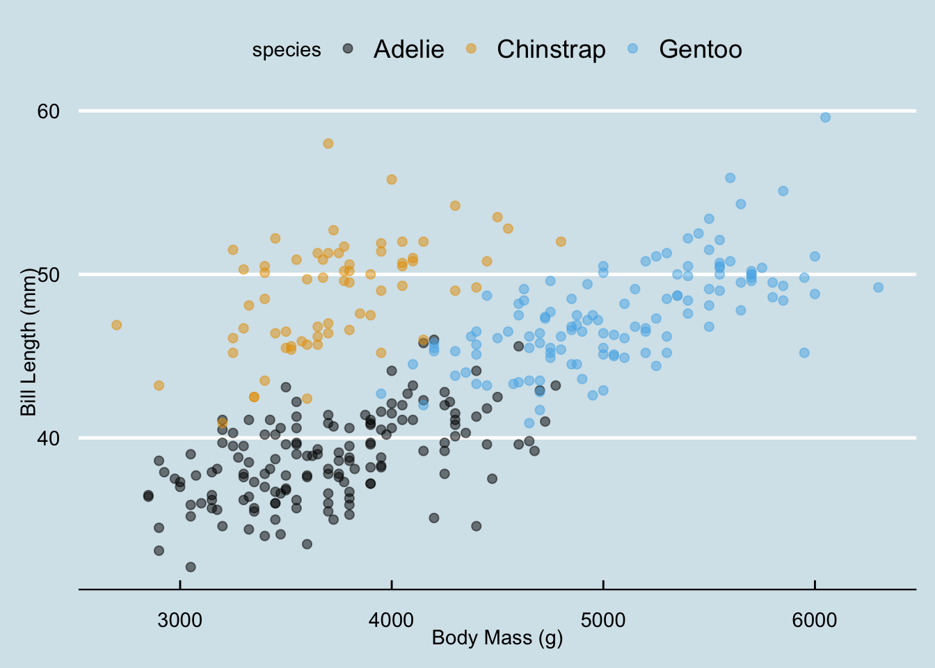
and theme_fivethirtyeight() to name a couple:
penguins |>
  ggplot(aes(x = body_mass_g, y = bill_length_mm, color = species)) +
  geom_point(alpha = 0.5, size = 2) +
  ggthemes::scale_color_colorblind() +
  labs(x = "Body Mass (g)", y = "Bill Length (mm)") +
  theme_fivethirtyeight()
Warning: Removed 2 rows containing missing values or values outside the scale range
(`geom_point()`).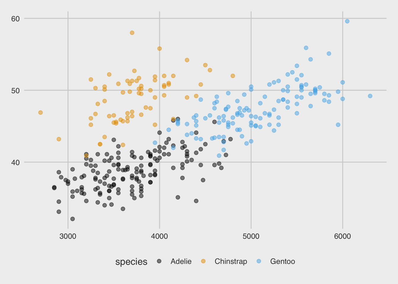
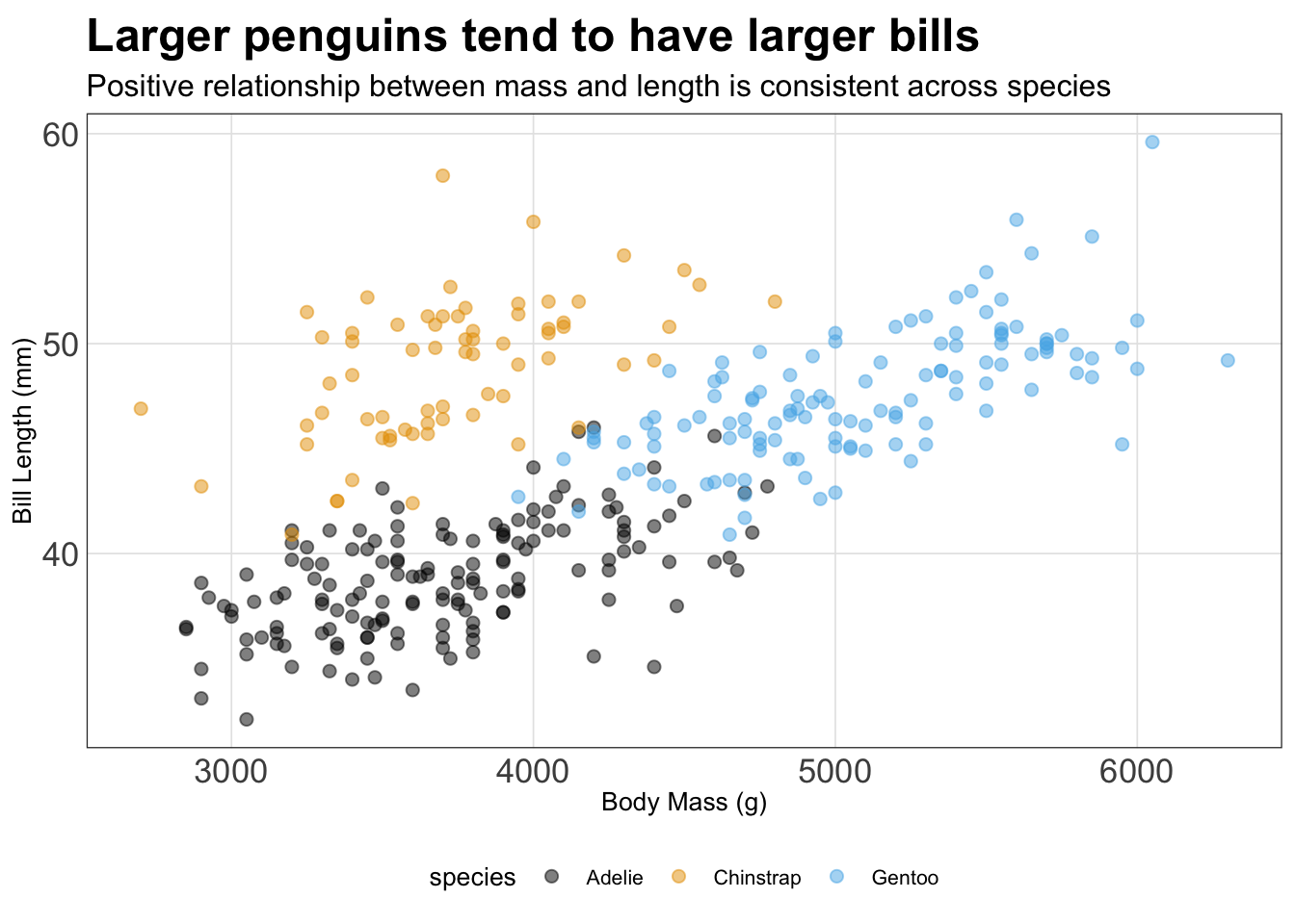
With any theme you have picked, you can then modify specific components directly using the theme() layer. There are many aspects of the plot’s theme to modify, such as my decision to move the legend to the bottom of the figure, drop the legend title, and increase the font size for the y-axis:
penguins |>
  ggplot(aes(x = body_mass_g, y = bill_length_mm, color = species)) +
  geom_point(alpha = 0.5, size = 2) +
  ggthemes::scale_color_colorblind() +
  labs(x = "Body Mass (g)", y = "Bill Length (mm)",
       title = "Larger penguins tend to have larger bills",
       subtitle = "Positive relationship between mass and length is consistent across species") +
  theme_bw() +
  theme(legend.position = "bottom",
        legend.title = element_blank(),
        axis.text.y = element_text(size = 14),
        axis.text.x = element_text(size = 6))
Warning: Removed 2 rows containing missing values or values outside the scale range
(`geom_point()`).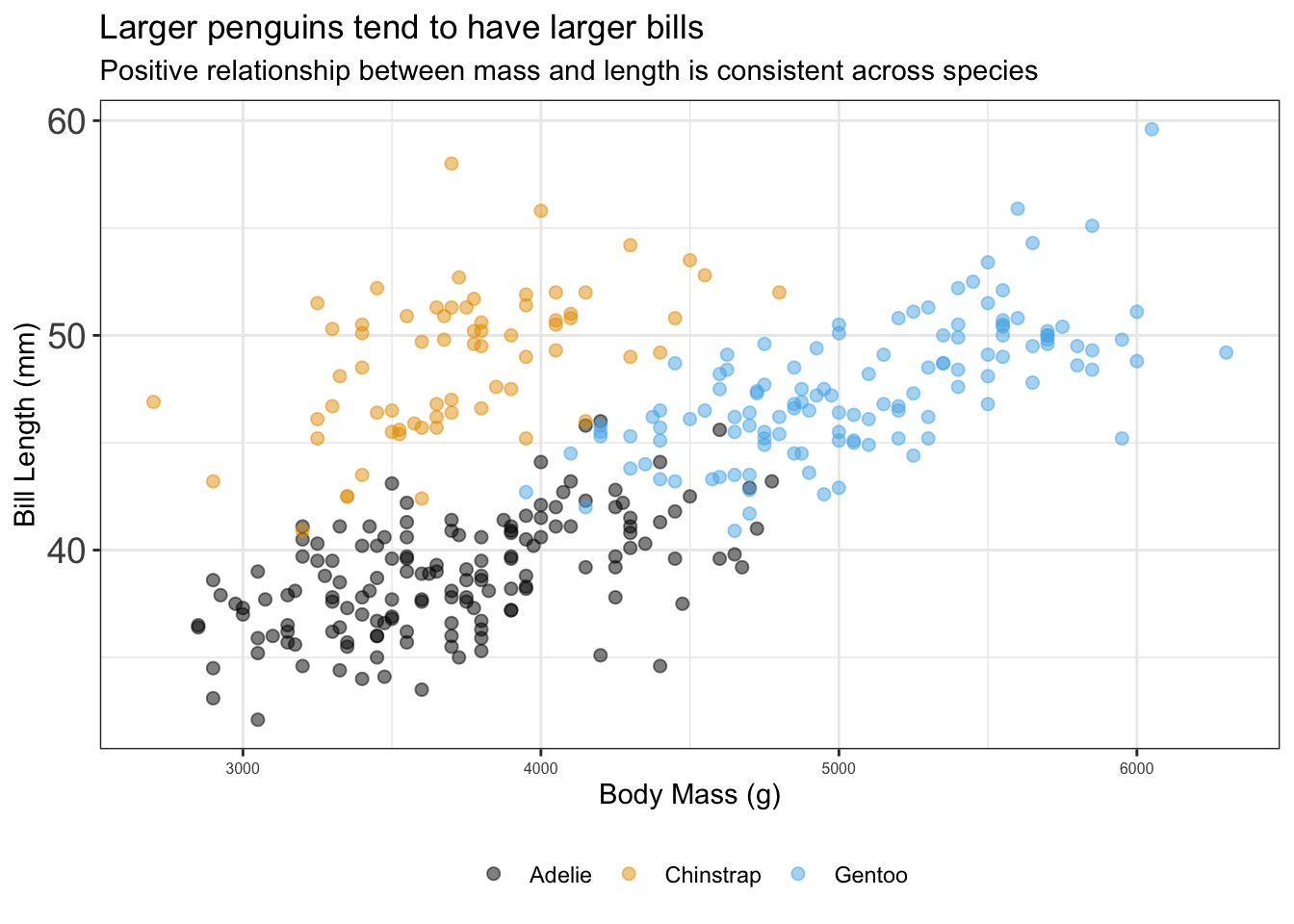
If you’re tired of explicitly customizing every plot in the same way all the time, then you should make a custom theme. It’s quite easy to make a custom theme for ggplot2 and of course there are an incredible number of ways to customize your theme. In the code chunk, I modify the theme_bw() theme using the %+replace% argument to make my new theme named my_theme() - which is stored as a function:
my_theme <- function () {
  # Start with the base font size
  theme_bw(base_size = 10) %+replace%
    theme(
      panel.background  = element_blank(),
      plot.background = element_rect(fill = "transparent", color = NA),
      legend.position = "bottom",
      legend.background = element_rect(fill = "transparent", color = NA),
      legend.key = element_rect(fill = "transparent", color = NA),
      axis.ticks = element_blank(),
      panel.grid.major = element_line(color = "grey90", size = 0.3),
      panel.grid.minor = element_blank(),
      plot.title = element_text(size = 18,
                                hjust = 0, vjust = 0.5,
                                face = "bold",
                                margin = margin(b = 0.2, unit = "cm")),
      plot.subtitle = element_text(size = 12, hjust = 0,
                                   vjust = 0.5,
                                   margin = margin(b = 0.2, unit = "cm")),
      plot.caption = element_text(size = 7, hjust = 1,
                                  face = "italic",
                                  margin = margin(t = 0.1, unit = "cm")),
      axis.text.x = element_text(size = 13),
      axis.text.y = element_text(size = 13)
    )
}
Now I can go ahead and my plot from before with this theme:
penguins |>
  ggplot(aes(x = body_mass_g, y = bill_length_mm, color = species)) +
  geom_point(alpha = 0.5, size = 2) +
  ggthemes::scale_color_colorblind() +
  labs(x = "Body Mass (g)", y = "Bill Length (mm)",
       title = "Larger penguins tend to have larger bills",
       subtitle = "Positive relationship between mass and length is consistent across species") +
  my_theme()
Warning: The `size` argument of `element_line()` is deprecated as of ggplot2 3.4.0.
ℹ Please use the `linewidth` argument instead.Warning: Removed 2 rows containing missing values or values outside the scale range
(`geom_point()`).