By far, the simplest way to create visualizations with animations is to use the gganimate package. This effectively works as an extension to ggplot figures but with the inclusion of various transition_* functions
When should we animate plots?
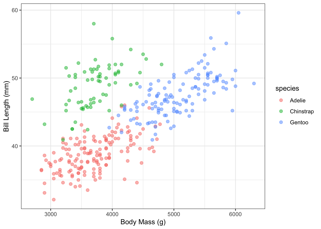
First, let’s think about when you should NOT animate a plot. We first create a visualization of the penguins data from before, of bill length on the y-axis against the body mass on the x-axis colored by species:
library(tidyverse)
Warning: package 'ggplot2' was built under R version 4.2.3
Warning: package 'tidyr' was built under R version 4.2.3
Warning: package 'readr' was built under R version 4.2.3
Warning: package 'dplyr' was built under R version 4.2.3
Warning: package 'stringr' was built under R version 4.2.3
── Attaching core tidyverse packages ──────────────────────── tidyverse 2.0.0 ──
✔ dplyr     1.1.4     ✔ readr     2.1.5
✔ forcats   1.0.0     ✔ stringr   1.5.1
✔ ggplot2   3.5.0     ✔ tibble    3.2.1
✔ lubridate 1.9.3     ✔ tidyr     1.3.1
✔ purrr     1.0.2
── Conflicts ────────────────────────────────────────── tidyverse_conflicts() ──
✖ dplyr::filter() masks stats::filter()
✖ dplyr::lag()    masks stats::lag()
ℹ Use the conflicted package (<http://conflicted.r-lib.org/>) to force all conflicts to become errors
library(palmerpenguins)penguins |>ggplot(aes(x = body_mass_g, y = bill_length_mm, color = species)) +geom_point(alpha =0.5, size =2) +labs(x ="Body Mass (g)", y ="Bill Length (mm)") +theme_bw()
Warning: Removed 2 rows containing missing values or values outside the scale range
(`geom_point()`).
Now, we could do the following: use the gganimate package to only display one species at a time with the transition_states() function:
library(gganimate)penguins |>ggplot(aes(x = body_mass_g, y = bill_length_mm, color = species)) +geom_point(alpha =0.5, size =2) +labs(x ="Body Mass (g)", y ="Bill Length (mm)") +theme_bw() +transition_states(species,transition_length =0.5,state_length =1)
The use of transition_length and state_length indicate how much relative time should take place when transitioning between states and the pause at each state, respectively. But the above use of animation is useless!
So when should you consider using animation?
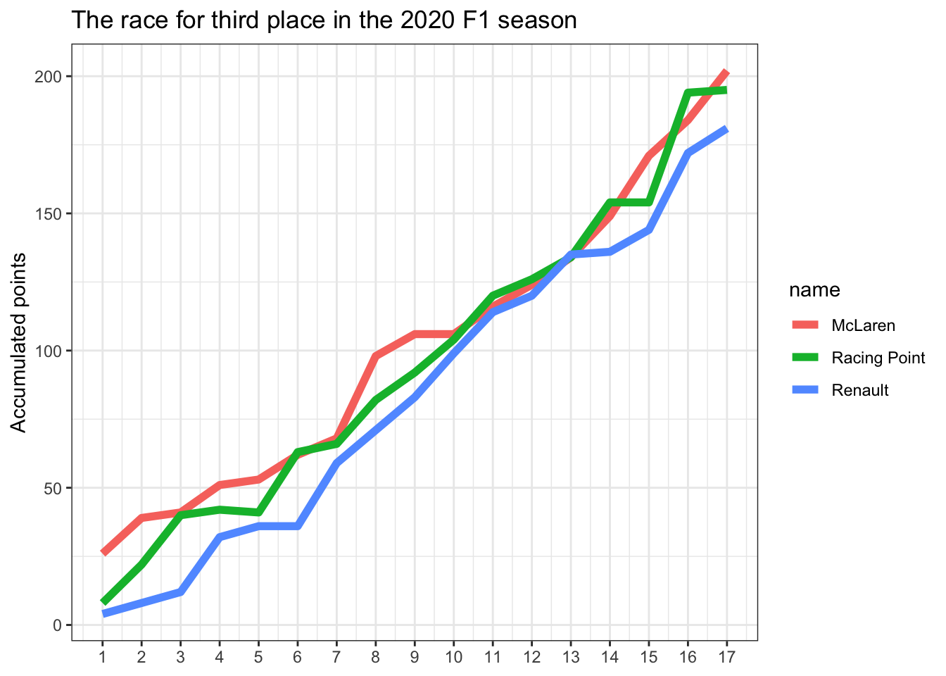
One appropriate usage is in the context of storytelling with data, to emphasize some aspect of your visual display. For instance, we’ll borrow this F1 racing dataset from Meghan Hall’s data viz to compare the performance of three racing teams:
# First load the data from Meghan's githubf1_data_ex <-read_csv('https://raw.githubusercontent.com/meghall06/CMU-36-315-site/main/data/constructor_pts.csv') |>filter(name %in%c("McLaren", "Renault", "Racing Point"), year ==2020)# Now display the results across the rounds:f1_data_ex |>ggplot(aes(x = round, y = points, group = name, color = name)) +geom_line(size =2) +scale_x_continuous(breaks =seq(1, 17, 1)) +labs(title ="The race for third place in the 2020 F1 season",y ="Accumulated points", x =NULL) +theme_bw()
From above we can see the accumulated points increasing over time for each team, with McLaren finishing better than both, Racing Point and Renault, at the end. But we could incrementally reveal the results at each stage emphasize the story of progression. We’re not adding another dimension to the display, but we emphasize the intermediate results through animation with the transition_reveal() function:
f1_data_ex |>ggplot(aes(x = round, y = points, group = name, color = name)) +geom_line(size =2) +scale_x_continuous(breaks =seq(1, 17, 1)) +labs(title ="The race for third place in the 2020 F1 season",y ="Accumulated points", x =NULL) +theme_bw() +# Reveal the results by roundtransition_reveal(round)
The most effective use of animation is when it adds another dimension to your visualization, typically in the form of time. The previous visualization only animated across the x-axis - it did NOT add another variable in our data. However, animation can let us bring in another dimension so that we can see differences between relationships of variables in various ways. You should watch Hans Rosling’s 200 Countries, 200 Years, 4 Minutes to see one example in action. We can make similar visualizations with gganimate.
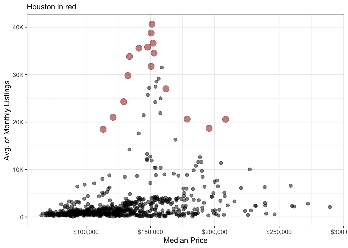
In the code chunk below, we’re going to display yearly summaries about housing sales in TX (dataset comes loaded with ggplot2). We’re going to plot the average number of active listings and average median sale price for each city-year combination in the data. For context, we’re going to highlight the data for Houston in red with a larger point size:
# Load the scales package for better labeling of the axestxhousing |>group_by(city, year) |>summarize(median =mean(median, na.rm =TRUE),listings =mean(listings, na.rm =TRUE)) |>ggplot(aes(x = median, y = listings, color = (city =="Houston"),size = (city =="Houston"))) +# Hide the legend for the point layergeom_point(alpha =0.5, show.legend =FALSE) +# Manual color labelscale_color_manual(values =c("black", "darkred")) +# Manual size adjustmentscale_size_manual(values =c(2, 4)) +scale_x_continuous(labels = scales::dollar, name ="Median Price") +scale_y_continuous(labels = scales::label_number(scale_cut = scales::cut_short_scale())) +theme_bw() +labs(x ="Median Price", y ="Avg. of Monthly Listings",subtitle ="Houston in red")
`summarise()` has grouped output by 'city'. You can override using the
`.groups` argument.
Warning: Removed 68 rows containing missing values or values outside the scale range
(`geom_point()`).
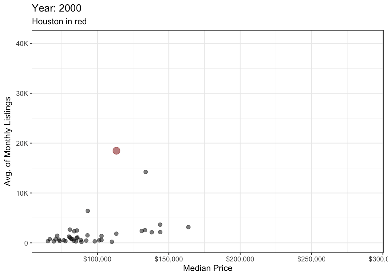
In the figure above we do not have year included in any way. But we can use the transition_time() function to animate the visual over time, while also updating the plot title to include the displayed year:
# Load the scales package for better labeling of the axestxhousing |>group_by(city, year) |>summarize(median =mean(median, na.rm =TRUE),listings =mean(listings, na.rm =TRUE)) |>ggplot(aes(x = median, y = listings, color = (city =="Houston"),size = (city =="Houston"))) +# Hide the legend for the point layergeom_point(alpha =0.5, show.legend =FALSE) +# Manual color labelscale_color_manual(values =c("black", "darkred")) +# Manual size adjustmentscale_size_manual(values =c(2, 4)) +scale_x_continuous(labels = scales::dollar, name ="Median Price") +scale_y_continuous(labels = scales::label_number(scale_cut = scales::cut_short_scale())) +theme_bw() +labs(x ="Median Price", y ="Avg. of Monthly Listings",subtitle ="Houston in red", title ="Year: {frame_time}") +transition_time(year)
From viewing the above visual, you can see how animation makes changes appear more dramatic between years - versus plotting each year separately with facets. We can then save the above animation as a GIF with the anim_save("INSERT/FILEPATH") function, which will save the last animation you made by default.
anim_save("examples/txhousing.gif")
Some key points to think about before adding animation to a visualization:
Always make and describe the original / base graphic first that does NOT include animation.
Before adding animation to the graph, ask yourself: How would animation give you additional insights about the data that you would otherwise not be able to?
Never add animation just because it’s cool!
When presenting, make sure you explain exactly what is being displayed with animation and what within the animation you want to emphasize. This will help you determine if animation is actually worth including.