Introduction and the Grammar of Graphics

Prof Ron Yurko

2024-08-26

Who am I?

  • Assistant Teaching Professor

  • Finished Phd in Statistics @ CMU in May 2022

  • Previously BS in Statistics @ CMU in 2015

  • Research interests: sports analytics, natural language processing, clustering, selective inference

  • Industry experience: finance before returning to grad school and also as data scientist in professional sports

Why do we visualize data?

Always visualize your data before analyzing it!

Course Structure

Lectures on Mondays/Wednesdays

Four homework assignments due Wednesdays by 11:59 PM ET

  • Posted Monday mornings and due Wednesday of the following week

Group EDA Report due Friday October 4th by 5:00 PM ET

  • Each group will write an IMRD report and present their work in 36-611

Individual Infographics due Friday October 11th by 11:59 PM ET

  • You will create a high-quality, single page infographic with dataset of your choice

  • First rough draft for peer feedback due Wednesday Oct 2nd

IMPORTANT! HW0 and GenAI module in HW1

As seen in today’s Canvas announcement - you must submit HW0 by Thursday night!

  • This is just to make sure you have everything installed correctly and can render .qmd files to PDF

HW1 is posted already, since you will complete a Generative AI Learning Module Assignment

All you need to do is follow the steps in the Fostering GenAI Literacy Canvas Module: Student Information by completing the tasks in order before their respective deadlines in order to receive full credit:

  1. Knowledge Check: Opens on Tuesday August 27 at 12:00 AM and is due Wednesday August 28 by 11:59 PM. This must be completed in one sitting (open for 2 hours in total, but should only take 10-20 minutes).

  2. Learning Modules: Opens on Thursday August 29 at 12:00 AM and is due Friday August 30 by 11:59 PM. This can be completed over multiple sessions.

  3. Knowledge Review: Opens on Saturday August 31 at 12:00 AM and is due Sunday September 1 by 11:59 PM. This must be completed in one sitting (open for 2 hours in total, but should only take 10-20 minutes).

Course Objectives

Practice the Fundamentals of Tidy Data Wrangling and Reproducible Workflows.

  • Practice tidy data manipulation in R using the tidyverse with consistent code style

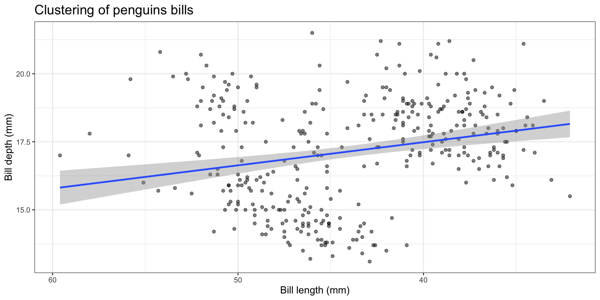
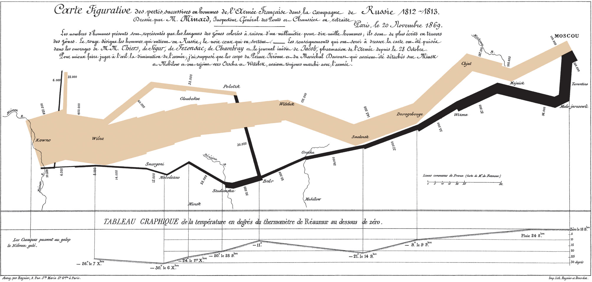
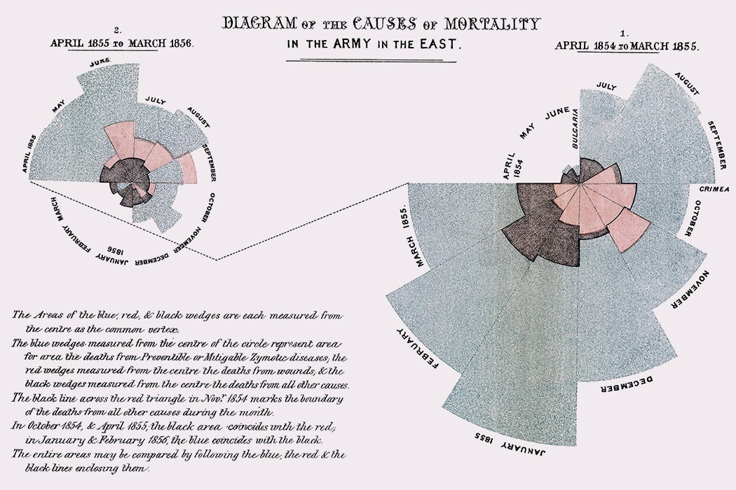
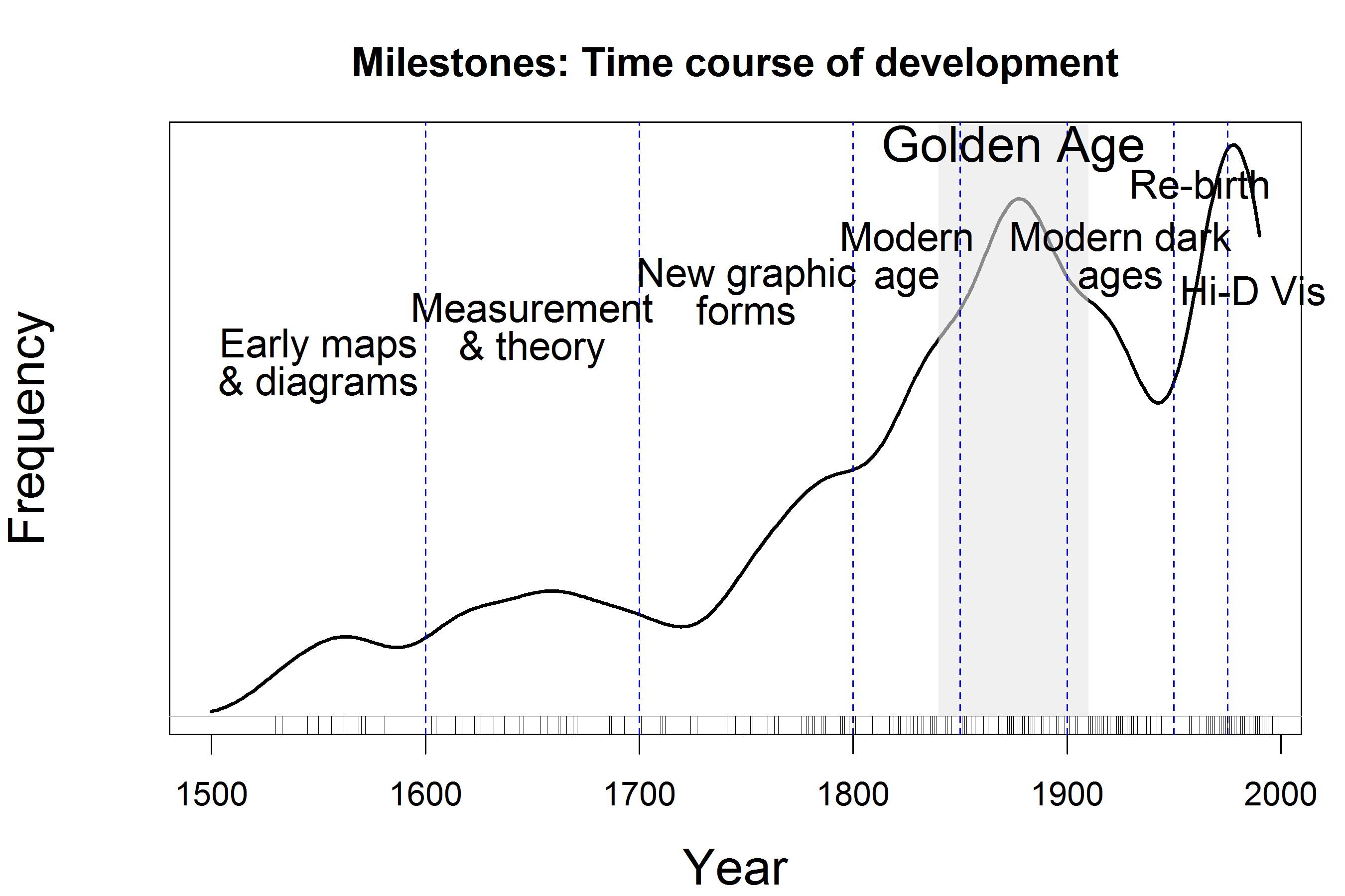
Create High-Quality Data Visualizations and Infographics.

  • Master the use of R and ggplot2 to create data visualizations and infographics that are easily readable and understandable for technical and non-technical audiences

Critique and Write About Data Visualizations and Infographics.

  • Give useful critiques, feedback, and suggestions for improvement on others’ graphics

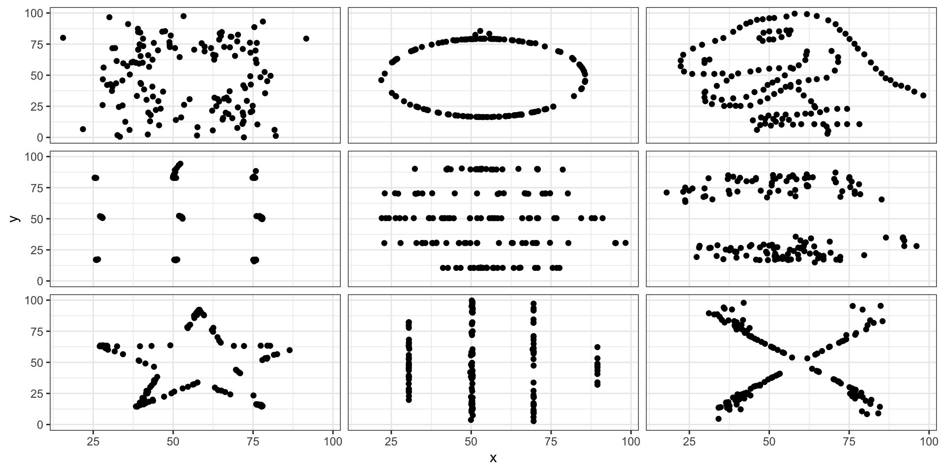
What do I mean by tidy data?

Data are often stored in tabular (or matrix) form:
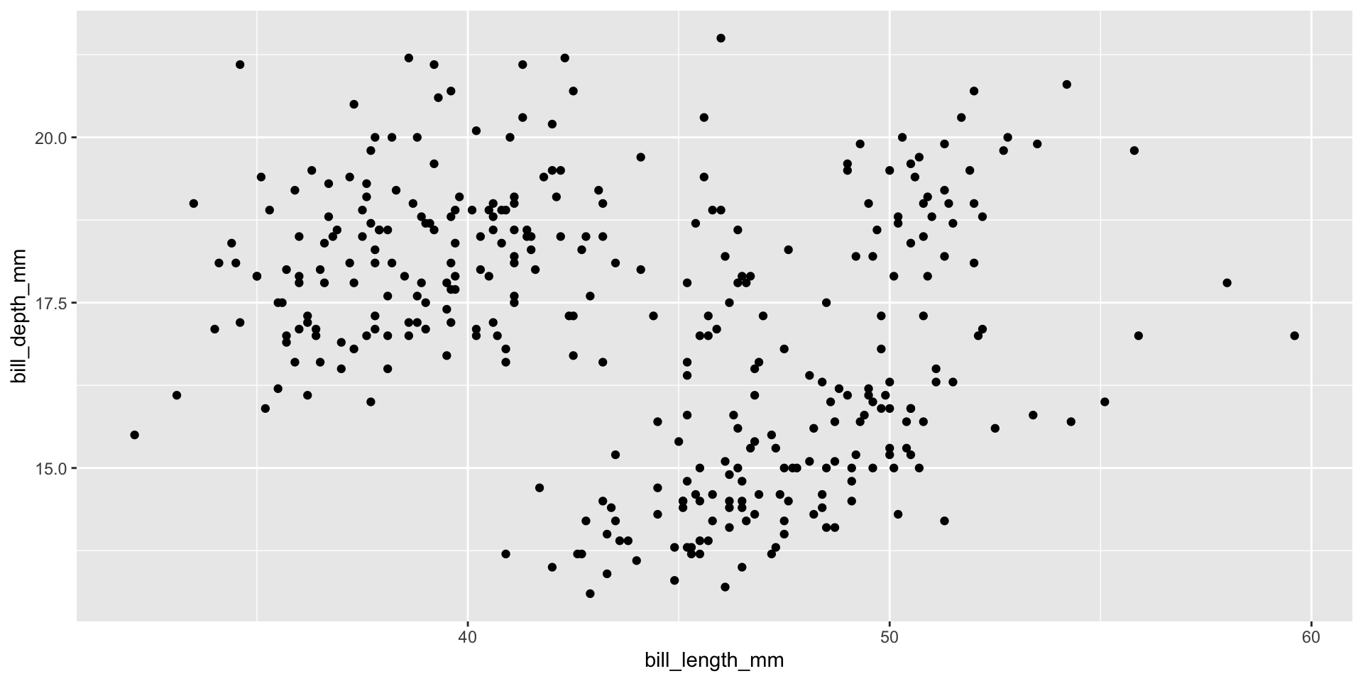
library(palmerpenguins)
penguins |> slice(1:5)
# A tibble: 5 × 8
  species island    bill_length_mm bill_depth_mm flipper_length_mm body_mass_g
  <fct>   <fct>              <dbl>         <dbl>             <int>       <int>
1 Adelie  Torgersen           39.1          18.7               181        3750
2 Adelie  Torgersen           39.5          17.4               186        3800
3 Adelie  Torgersen           40.3          18                 195        3250
4 Adelie  Torgersen           NA            NA                  NA          NA
5 Adelie  Torgersen           36.7          19.3               193        3450
# ℹ 2 more variables: sex <fct>, year <int>

The Grammar of Graphics

Originally defined by Leland Wilkinson

  1. data

  2. geometries: type of geometric objects to represent data, e.g., points, lines

  3. aesthetics: visual characteristics of geometric objects to represent data, e.g., position, size

  4. scales: how each aesthetic is converted into values on the graph, e.g., color scales

  5. stats: statistical transformations to summarize data, e.g., counts, means, regression lines

  6. facets: split data and view as multiple graphs

  7. coordinate system: 2D space the data are projected onto, e.g., Cartesian coordinates

Hadley Wickham created ggplot2

  1. data

  2. geom

  3. aes: mappings of columns to geometric objects

  4. scale: one scale for each aes variable

  5. stat

  6. facet

  7. coord

  8. labs: labels/guides for each variable and other parts of the plot, e.g., title, subtitle, caption

  9. theme: customization of plot layout

Start with the data

Access ggplot2 from the tidyverse:

library(tidyverse)
ggplot(data = penguins)

Or equivalently using |>:

penguins |>
  ggplot()

Need to add geometric objects!

penguins |>
  ggplot(aes(x = bill_length_mm, 
             y = bill_depth_mm)) + 
  geom_point()
penguins %>%
  ggplot(mapping = aes(x = bill_length_mm,
                       y = bill_depth_mm)) + 
  geom_point() 

Modify scale, add statistical summary, and so on…

penguins %>%
  ggplot(aes(x = bill_length_mm,
             y = bill_depth_mm)) + 
  # Adjust alpha of points
  geom_point(alpha = 0.5) +
  # Add smooth regression line
  stat_smooth(method = "lm") + 
  # Flip the x-axis scale
  scale_x_reverse() + 
  # Change title & axes labels 
  labs(x = "Bill length (mm)", 
       y = "Bill depth (mm)", 
       title = "Clustering of penguins bills") + 
  # Change the theme:
  theme_bw() +
  # Update font size of text:
  theme(axis.title = element_text(size = 12),
        plot.title = element_text(size = 16))

Modify scale, add statistical summary, and so on…

In the beginning…

Michael Florent van Langren published the first (known) statistical graphic in 1644

  • Plots different estimates of the longitudinal distance between Toledo, Spain and Rome, Italy

  • i.e., visualization of collected data to aid in estimation of parameter

John Snow Knows Something About Cholera

Charles Minard’s Map of Napoleon’s Russian Disaster

Florence Nightingale’s Rose Diagram

Milestones in Data Visualization History

Edward Tufte’s Principles of Data Visualization

Graphics: visually display measured quantities by combining points, lines, coordinate systems, numbers, symbols, words, shading, color

Often our goal is to show data and/or communicate a story

  • Induce viewer to think about substance, not graphical methodology

  • Make large, complex datasets more coherent

  • Encourage comparison of different pieces of data

  • Describe, explore, and identify relationships

  • Avoid data distortion and data decoration

  • Use consistent graph design

Avoid graphs that lead to misleading conclusions!

How to Fail this Class:

What about this spiral?

Infographics to communicate a story (check out FlowingData for more examples)

Alberto Cairo and the art of insight

Recap and next steps

  • Walked through course logistics (READ THE SYLLABUS)

  • Introduced the Grammar of Graphics and ggplot2 basics

  • Discussed data visualization principles and the role of infographics