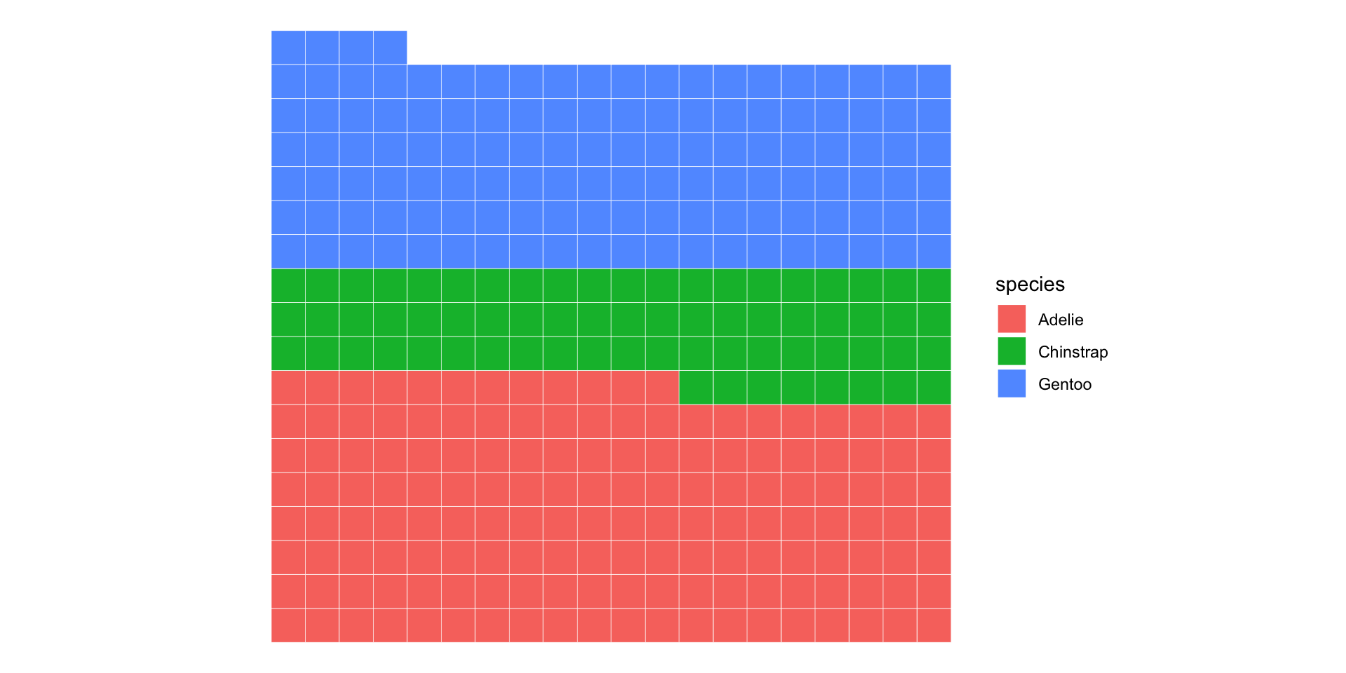
[1] Adelie Adelie Adelie Adelie Adelie Adelie
Levels: Adelie Chinstrap GentooPrinciples and Visualizations for 1D Categorical Data
2024-08-28
In the beginning…
Michael Florent van Langren published the first (known) statistical graphic in 1644

Plots different estimates of the longitudinal distance between Toledo, Spain and Rome, Italy
i.e., visualization of collected data to aid in estimation of parameter

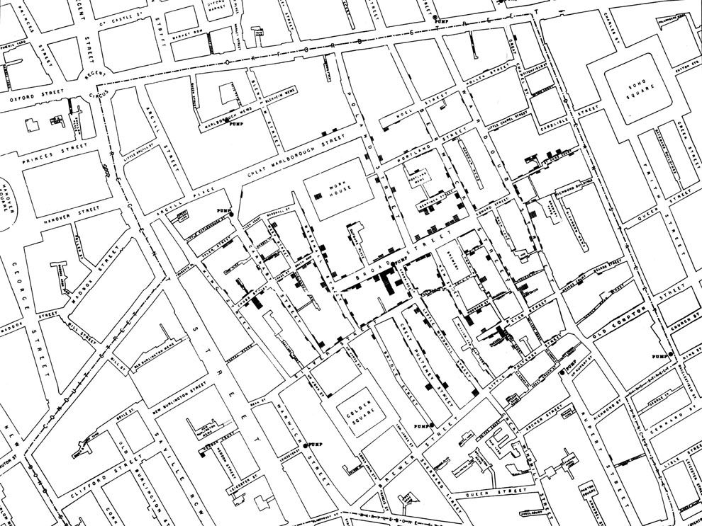
John Snow Knows Something About Cholera
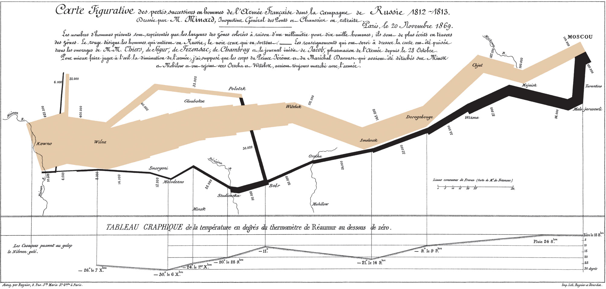
Charles Minard’s Map of Napoleon’s Russian Disaster
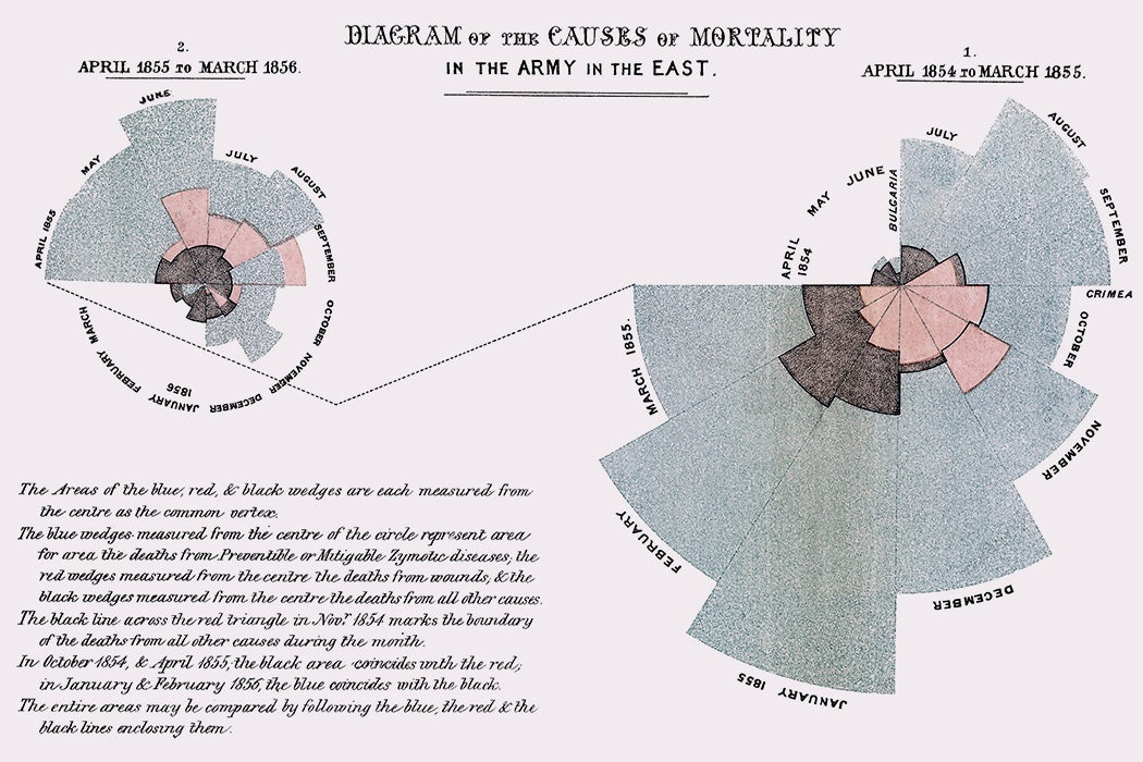
Florence Nightingale’s Rose Diagram
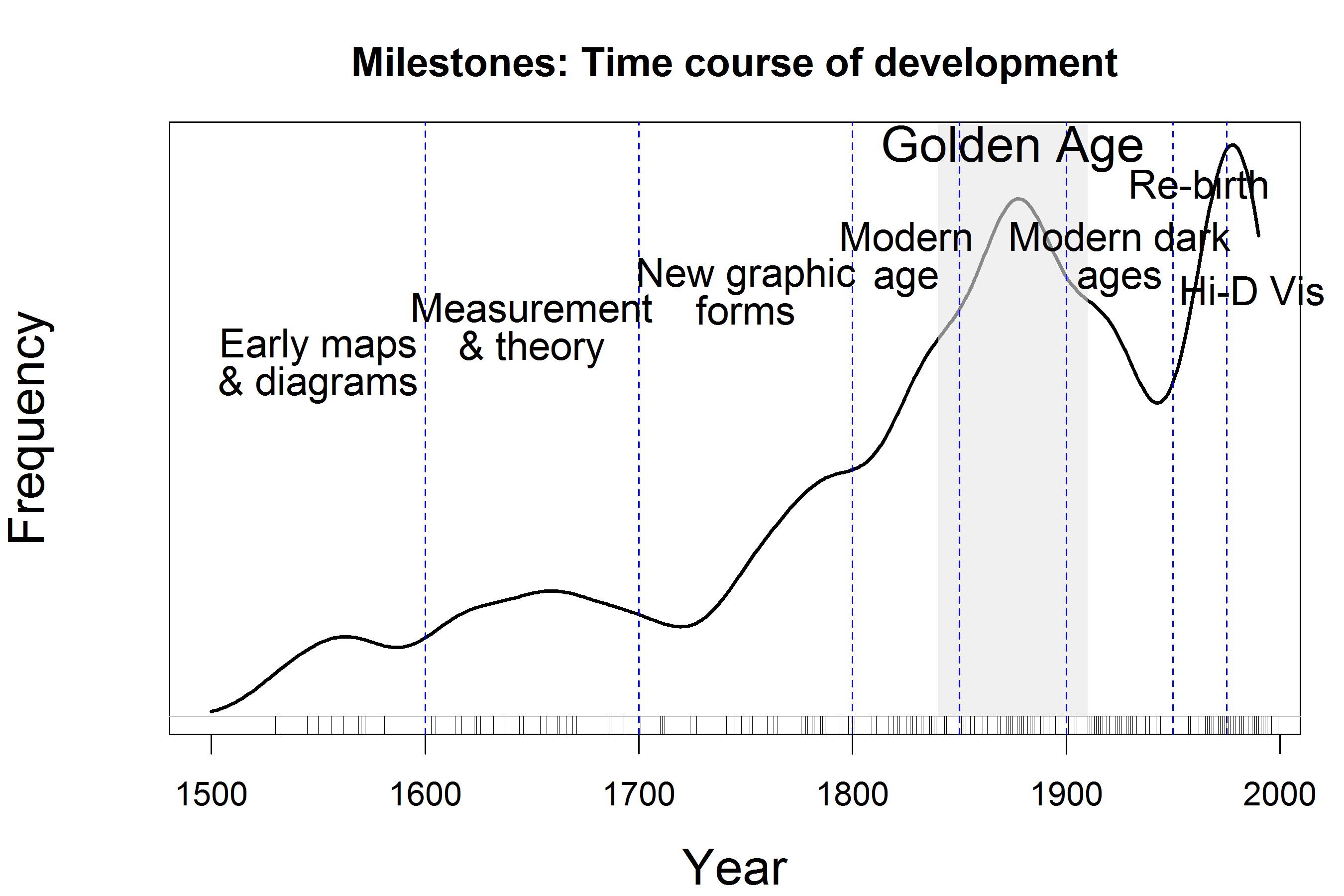
Milestones in Data Visualization History
How to Fail this Class:
What about this spiral?

Infographics to communicate a story (check out FlowingData for more examples)

Alberto Cairo and the art of insight
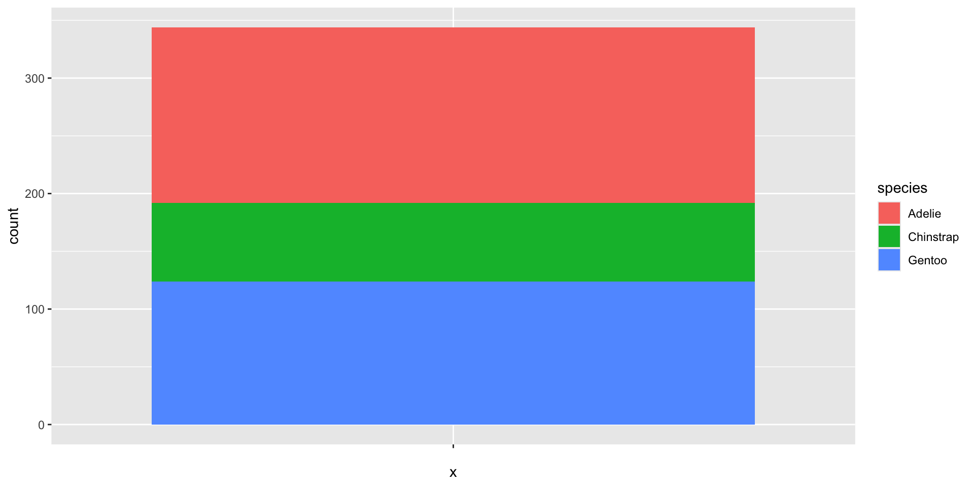
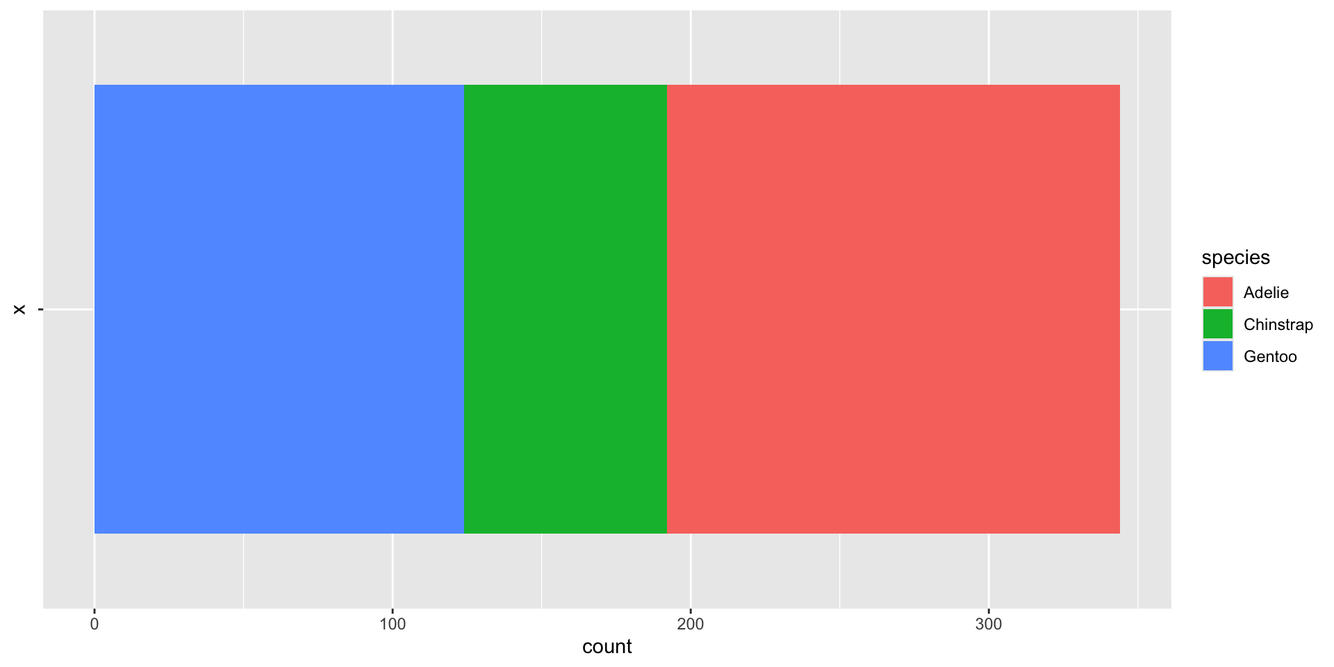
Area plots
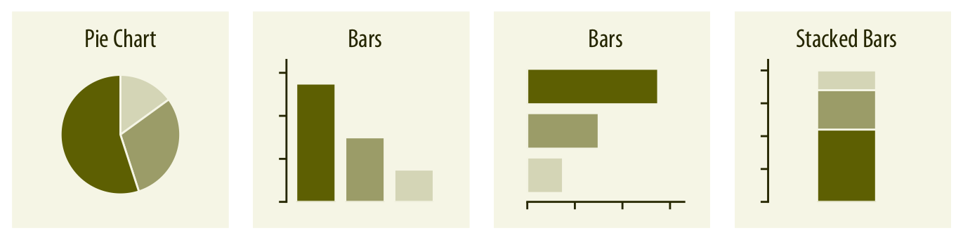
Each area corresponds to one categorical level
Area is proportional to counts/frequencies/percentages
Differences between areas correspond to differences between counts/frequencies/percentages
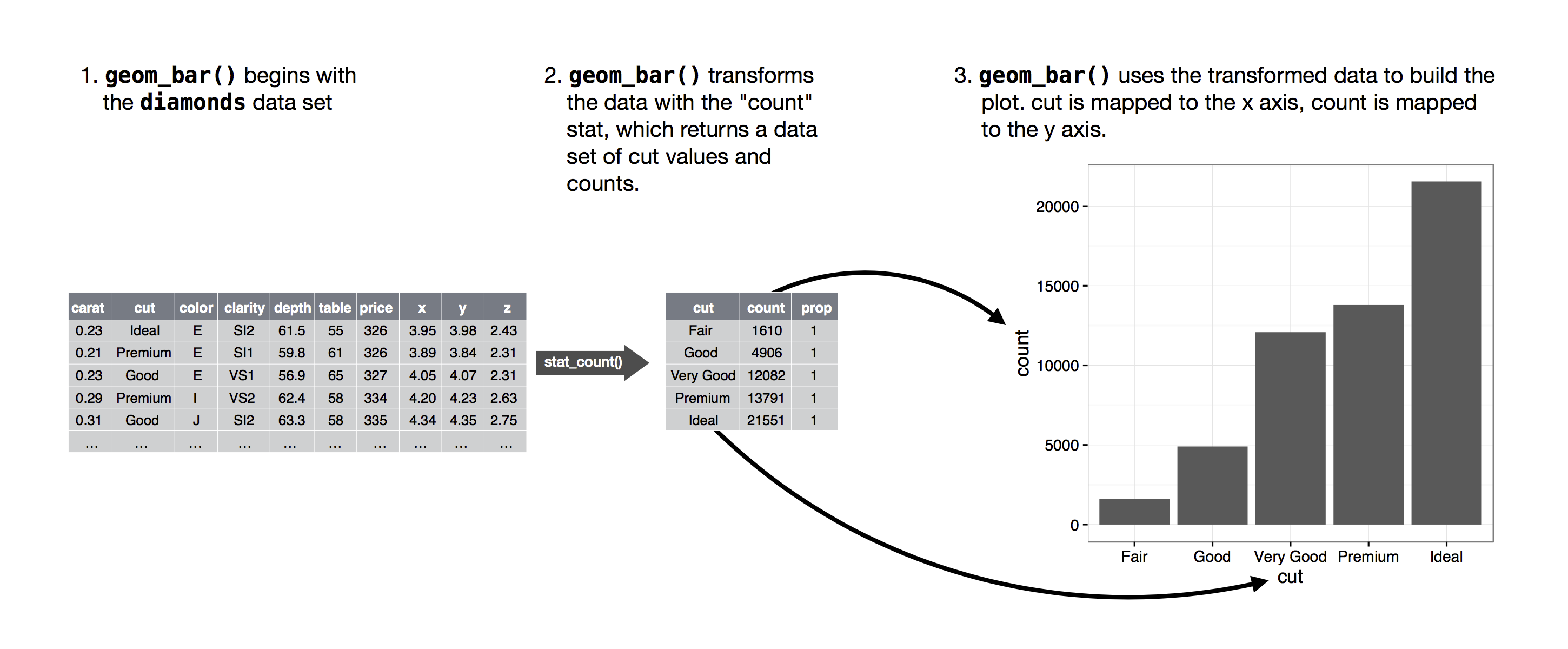
Bar charts

Behind the scenes: statistical summaries
Spine charts - height version
Spine charts - width version
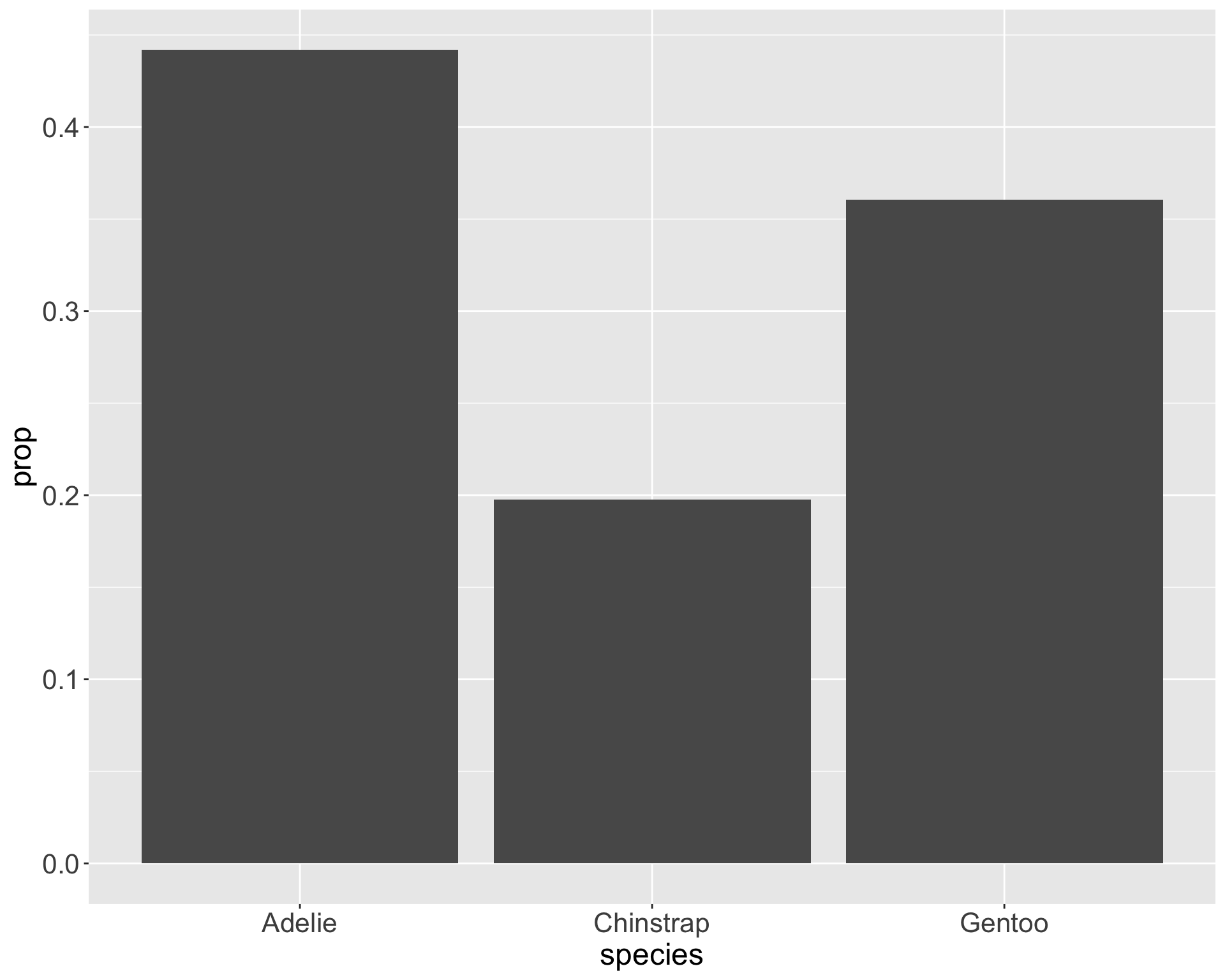
Bar charts with proportions
after_stat()indicates the aesthetic mapping is performed after statistical transformationUse
after_stat(count)to access thestat_count()called bygeom_bar()
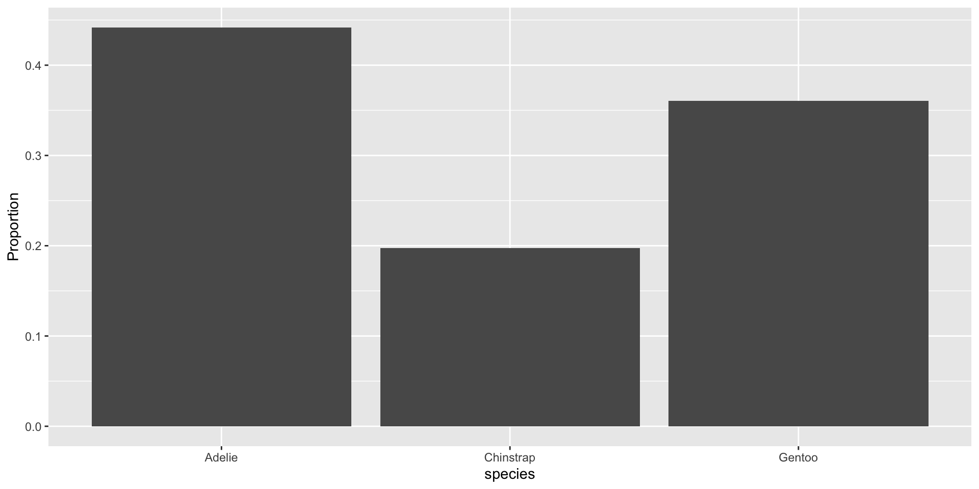
Compute and display the proportions directly

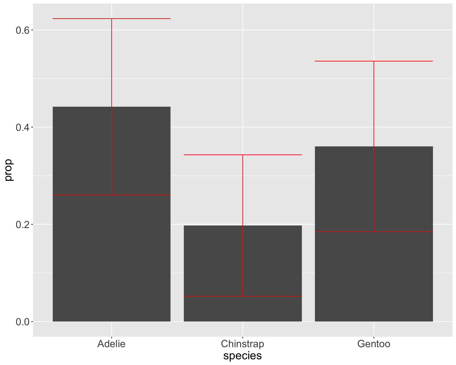
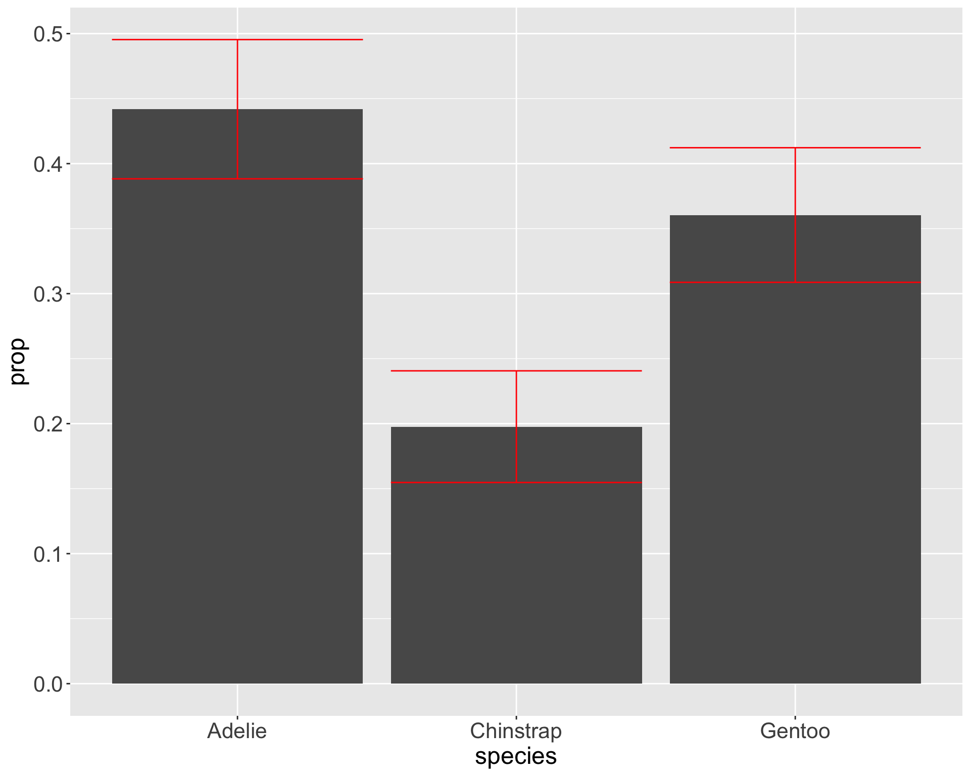
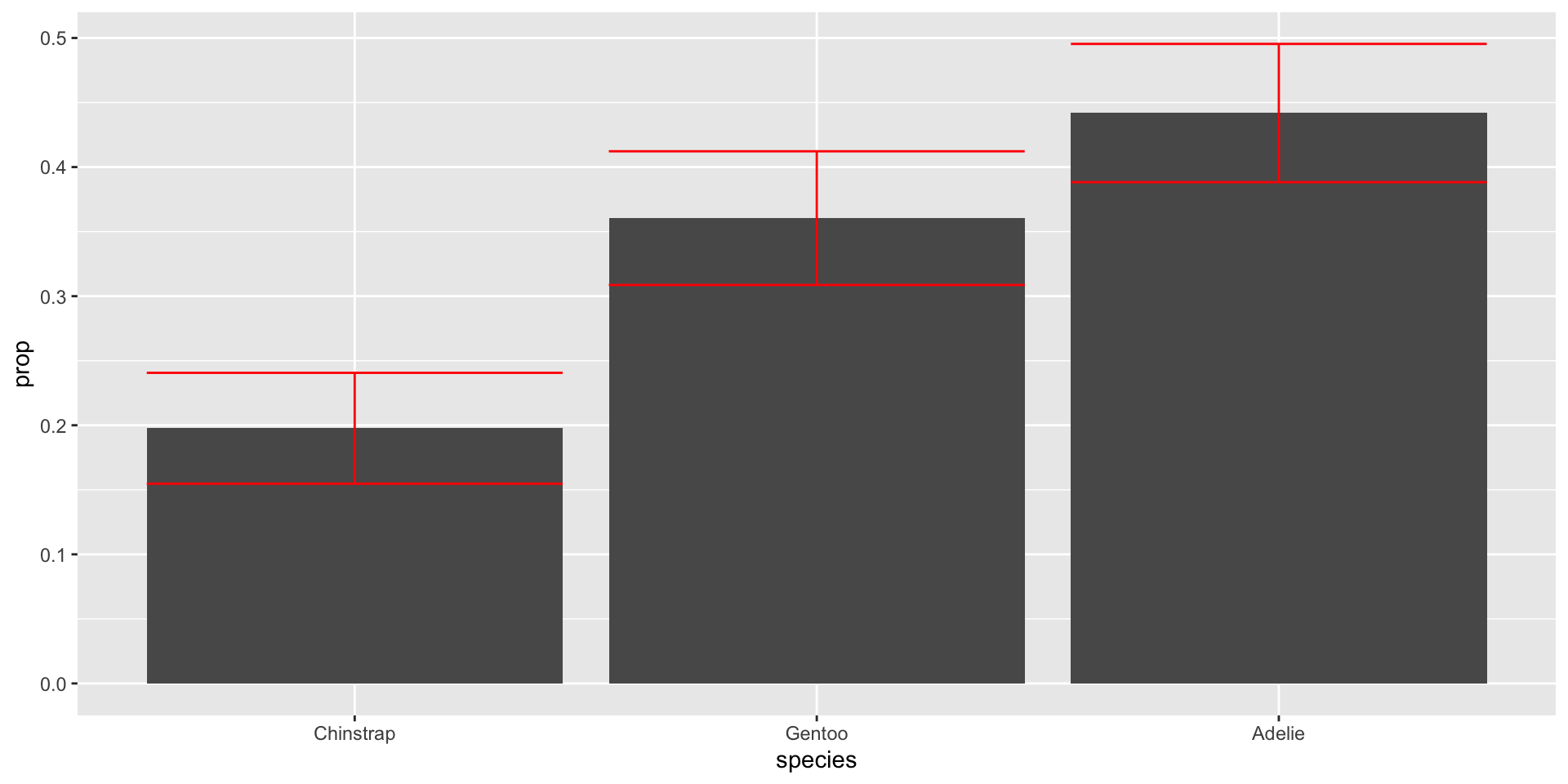
Add standard errors to bars
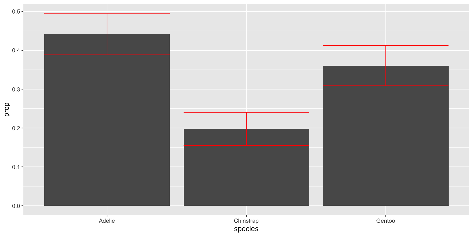
Why does this matter?

Graphs can appear the same with very different statistical conclusions - mainly due to sample size
Useful to order categories by frequency with forcats
So you want to make pie charts…
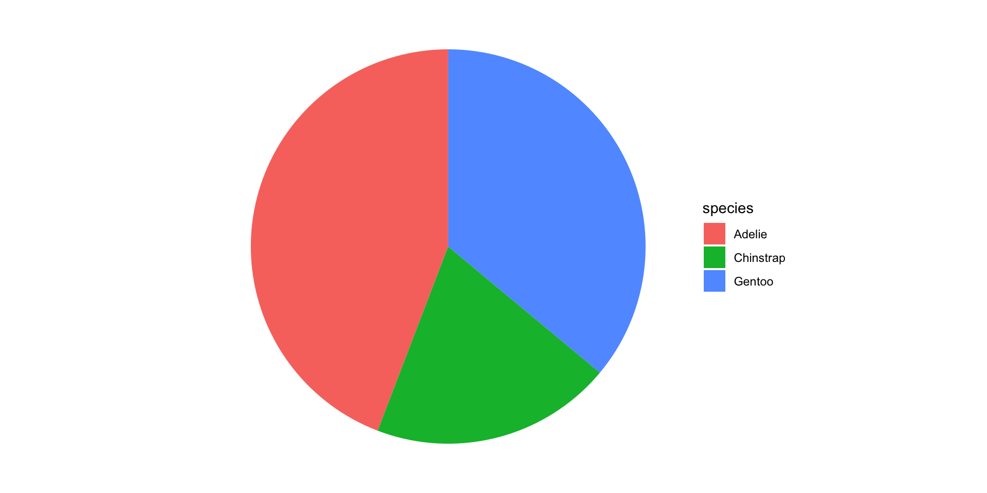
Friends Don’t Let Friends Make Pie Charts

Waffle charts are cooler anyway…