Visualizations for 2D Categorical and 1D Quantitative Data
2024-09-04
So you want to make pie charts…
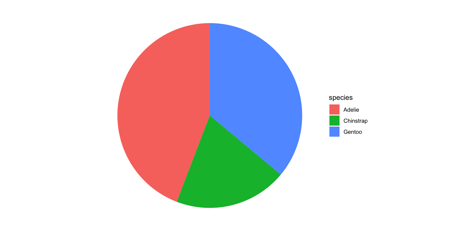
Friends Don’t Let Friends Make Pie Charts

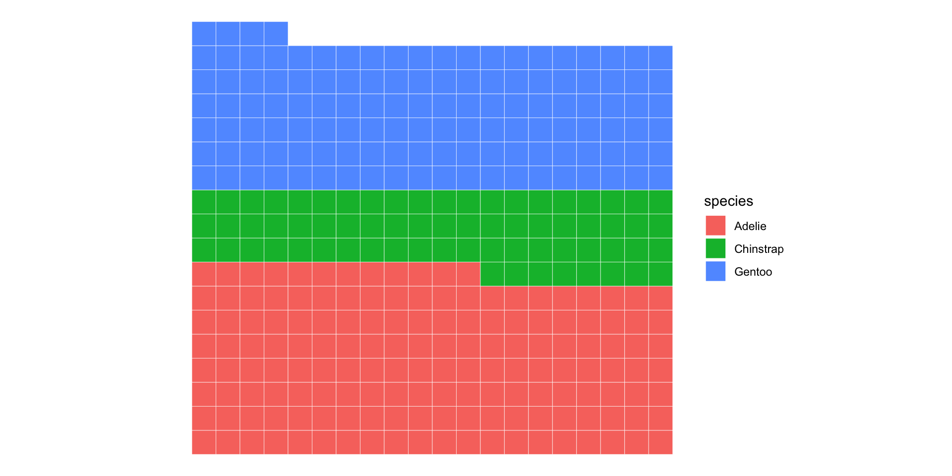
Waffle charts are cooler anyway…
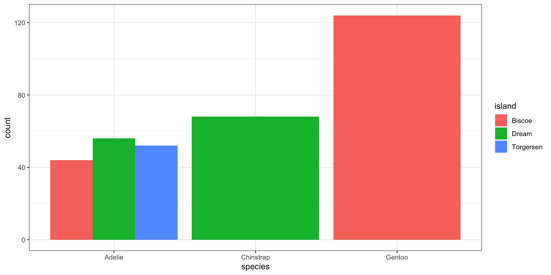
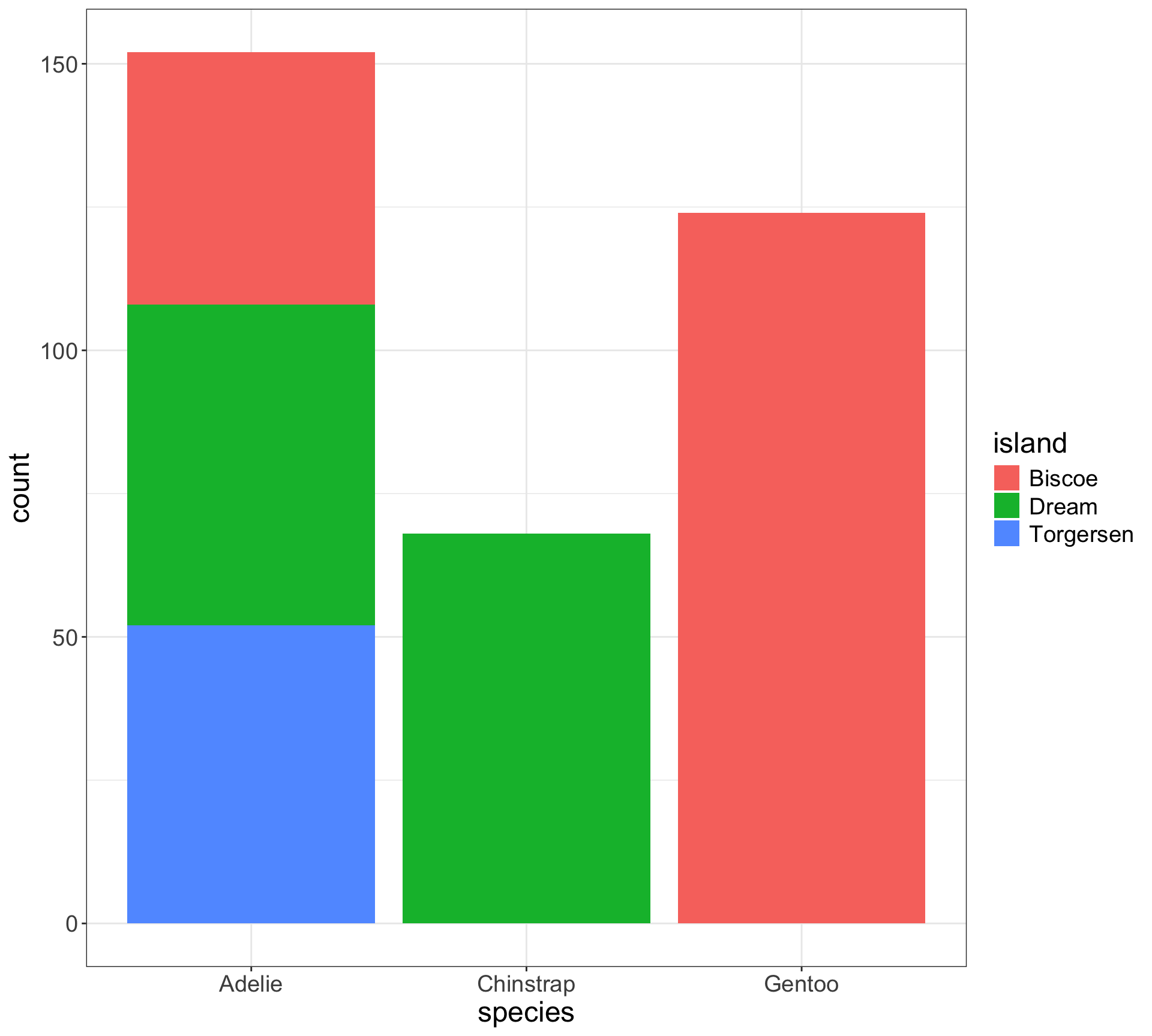
Stacked bar charts - a bar chart of spine charts
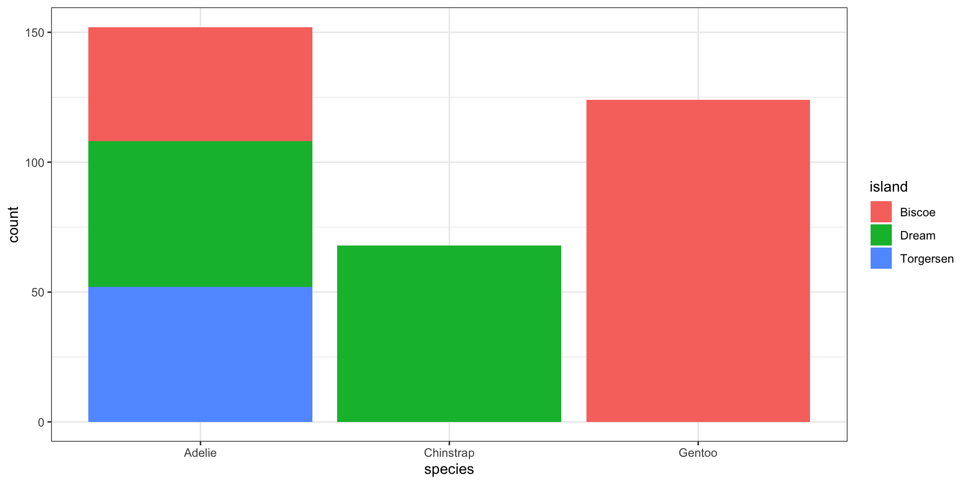
Easy to see marginal of
species, i.e., \(P(\)x\()\)Can see conditional of
island|species, i.e., \(P(\)fill|x\()\)Harder to see conditional of
species|island, i.e., \(P(\)x|fill\()\)
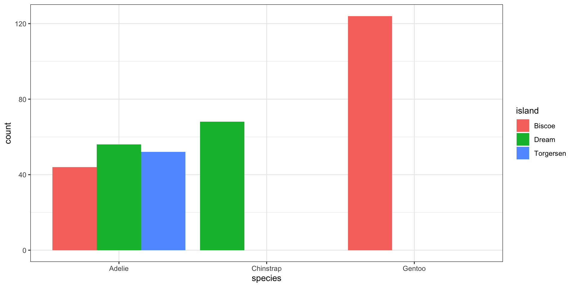
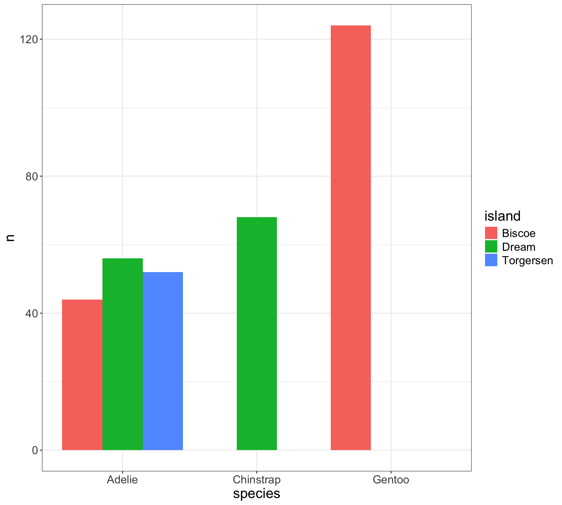
Side-by-side bar charts
Easy to see conditional of
island|species, i.e., \(P(\)fill|x\()\)Can see conditional of
species|island, i.e., \(P(\)x|fill\()\)
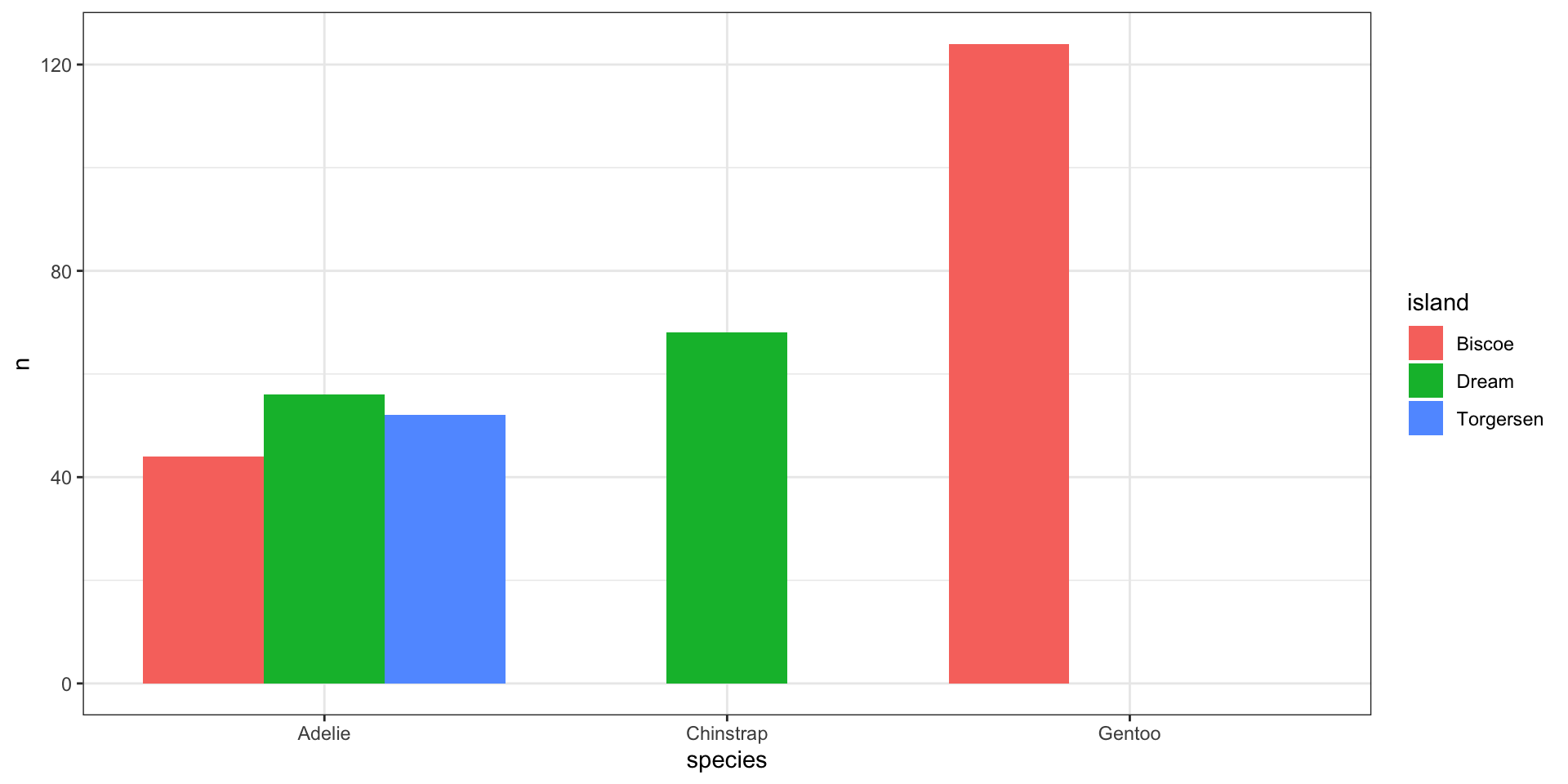
Side-by-side bar charts
Easy to see conditional of
island|species, i.e., \(P(\)fill|x\()\)Can see conditional of
species|island, i.e., \(P(\)x|fill\()\)
Complete missing values to preserve location
What do you prefer?
Hypothesis testing review
Computing \(p\)-values works like this:
Choose a test statistic.
Compute the test statistic in your dataset.
Is test statistic “unusual” compared to what I would expect under \(H_0\)?
Compare \(p\)-value to target error rate \(\alpha\) (typically referred to as target level \(\alpha\) )
Typically choose \(\alpha = 0.05\)
- i.e., if we reject null hypothesis at \(\alpha = 0.05\) then, assuming \(H_0\) is true, there is a 5% chance it is a false positive (aka Type 1 error)

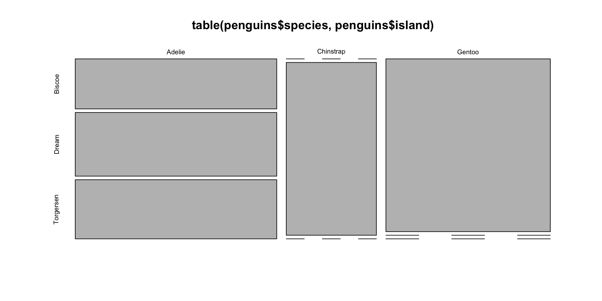
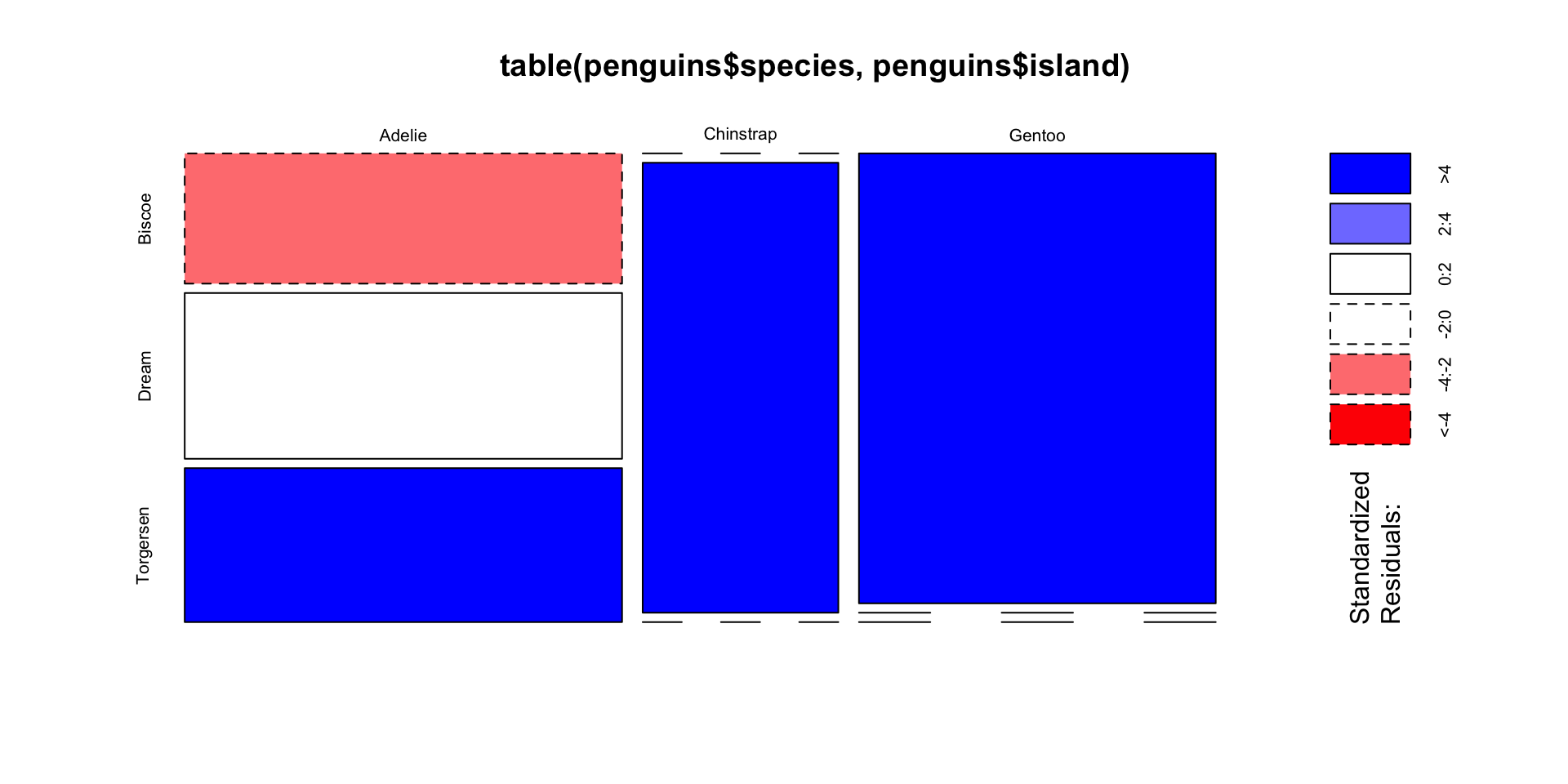
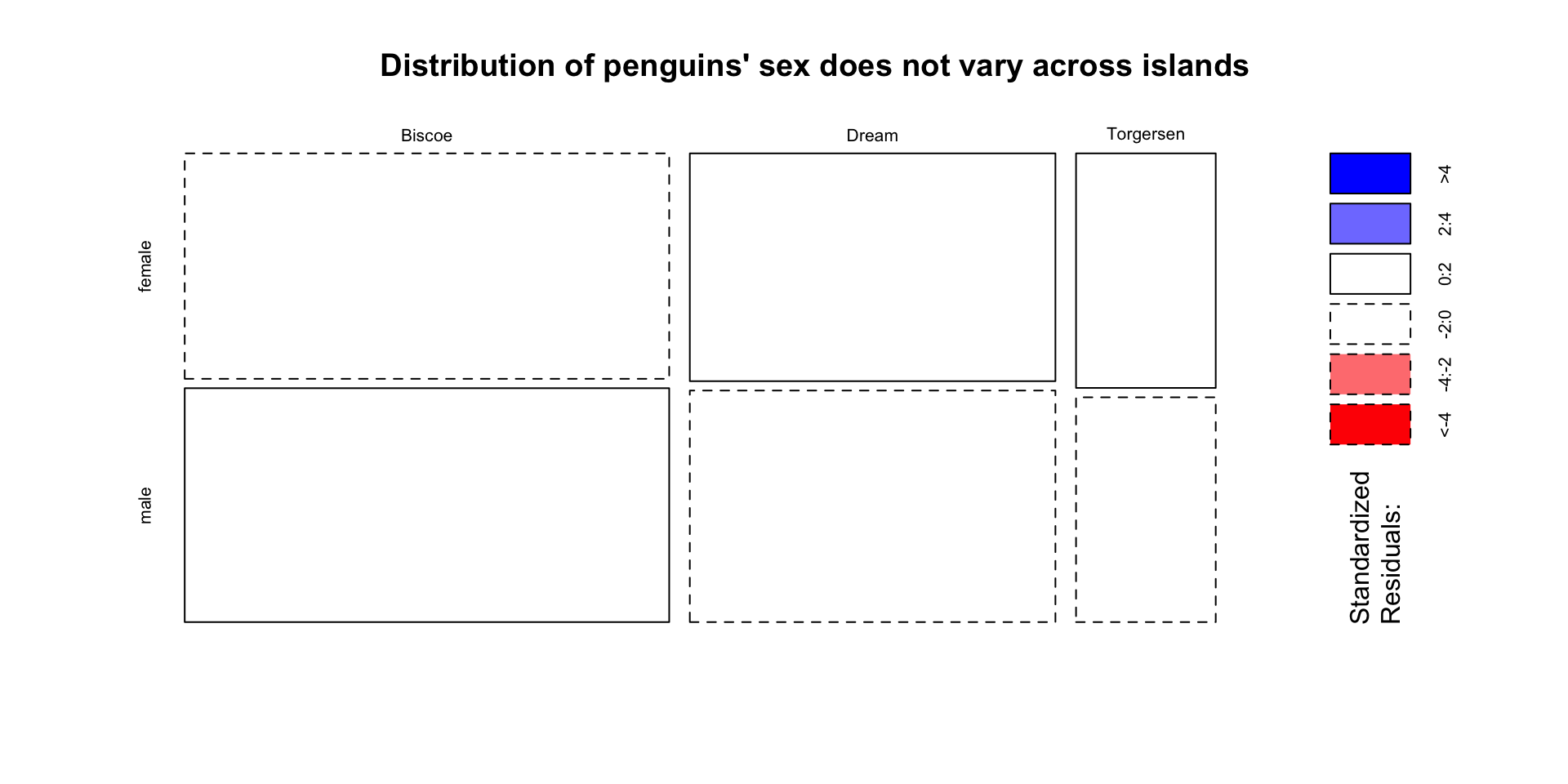
Visualize independence test with mosaic plots
Two variables are independent if knowing the level of one tells us nothing about the other
- i.e. \(P(A | B) = P(A)\), and that \(P(A, B) = P(A) \times P(B)\)
Create a mosaic plot using base R
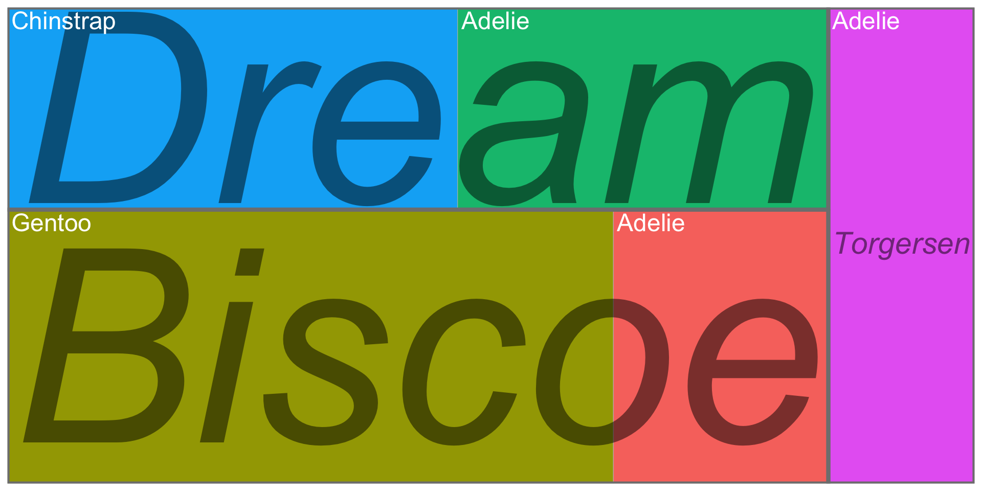
Bonus: Treemaps do not require same categorical levels across subgroups
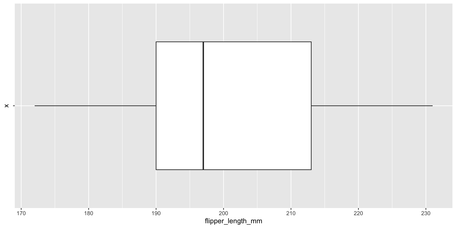
Box plots visualize summary statistics
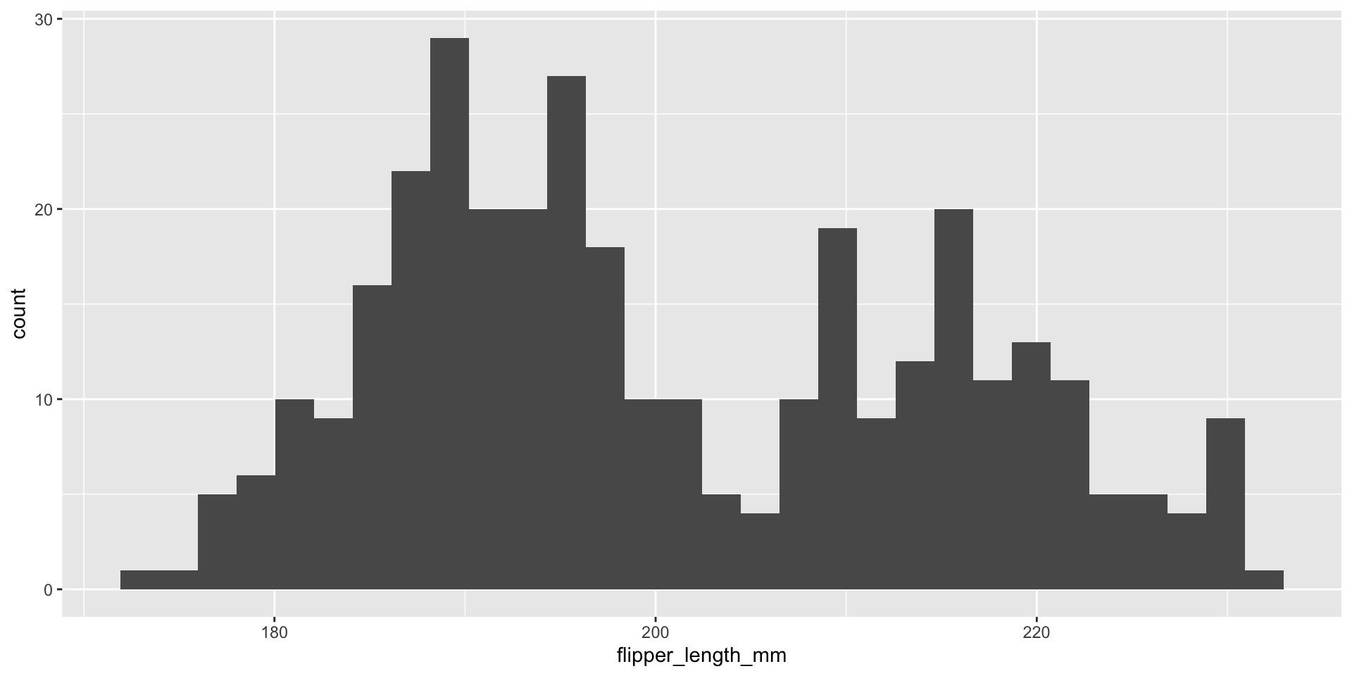
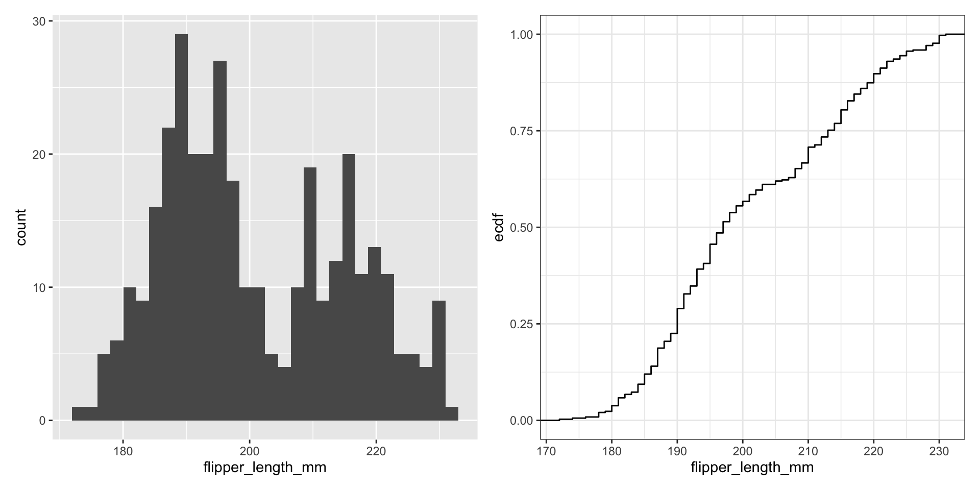
Histograms display 1D continuous distributions
Display full distribution with ECDF plot
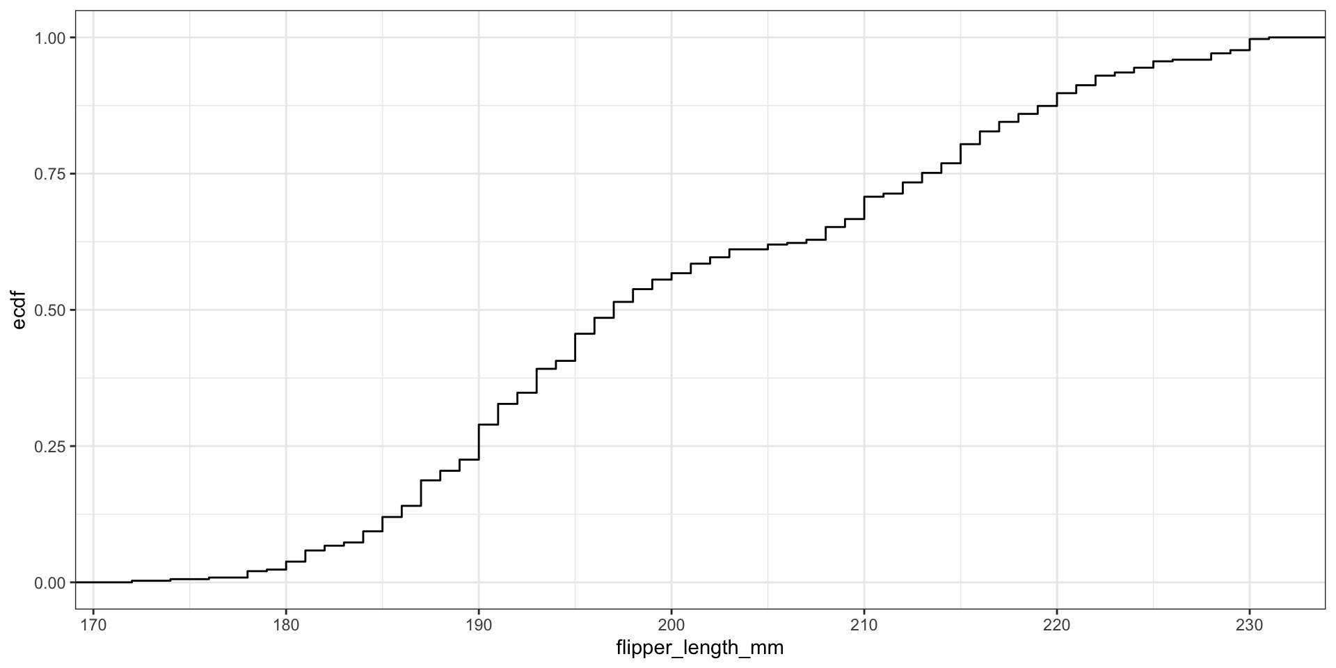
What’s the relationship between these two figures?
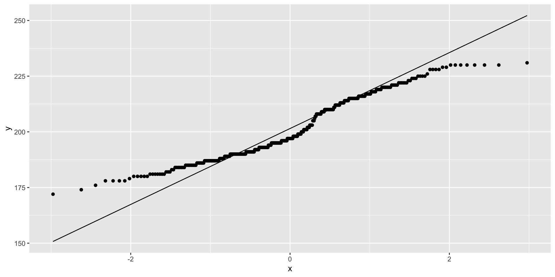
What about comparing to theoretical distributions?

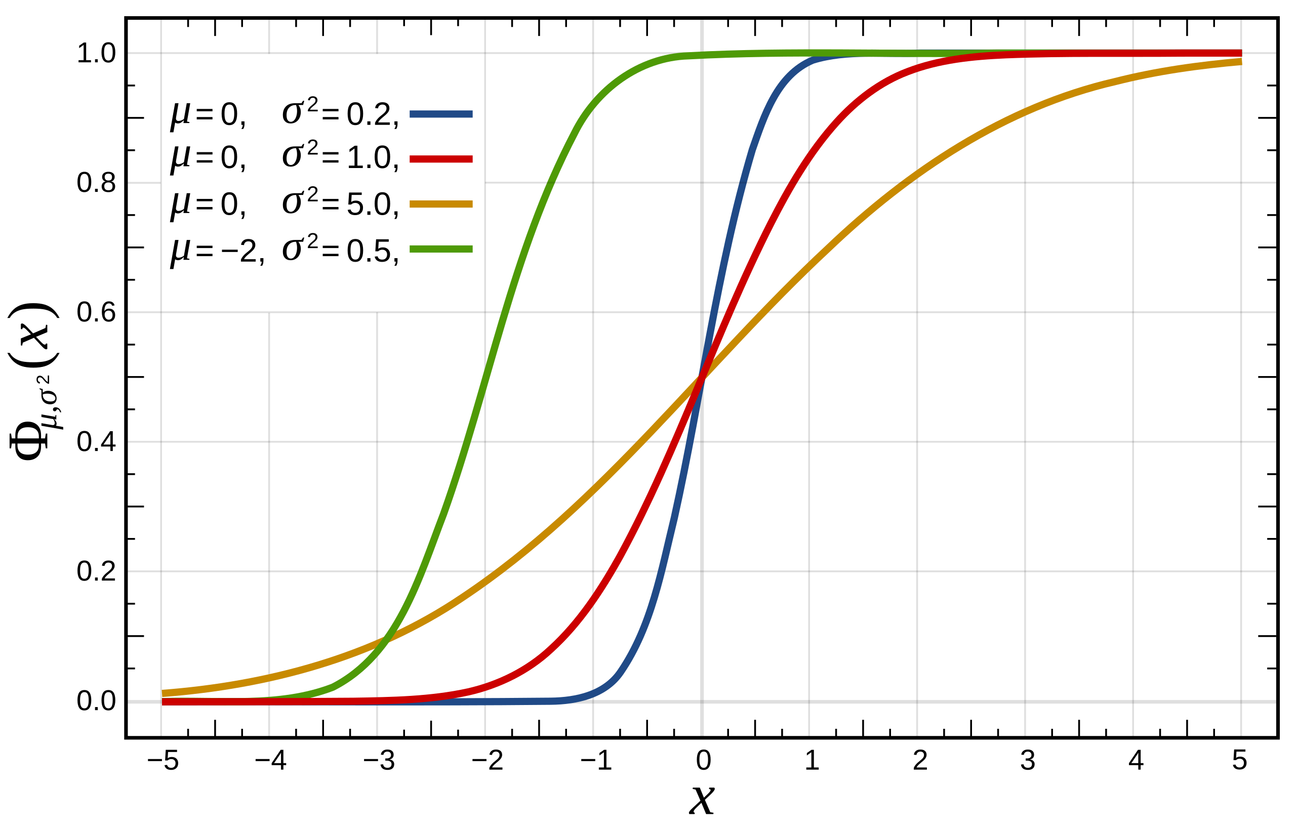
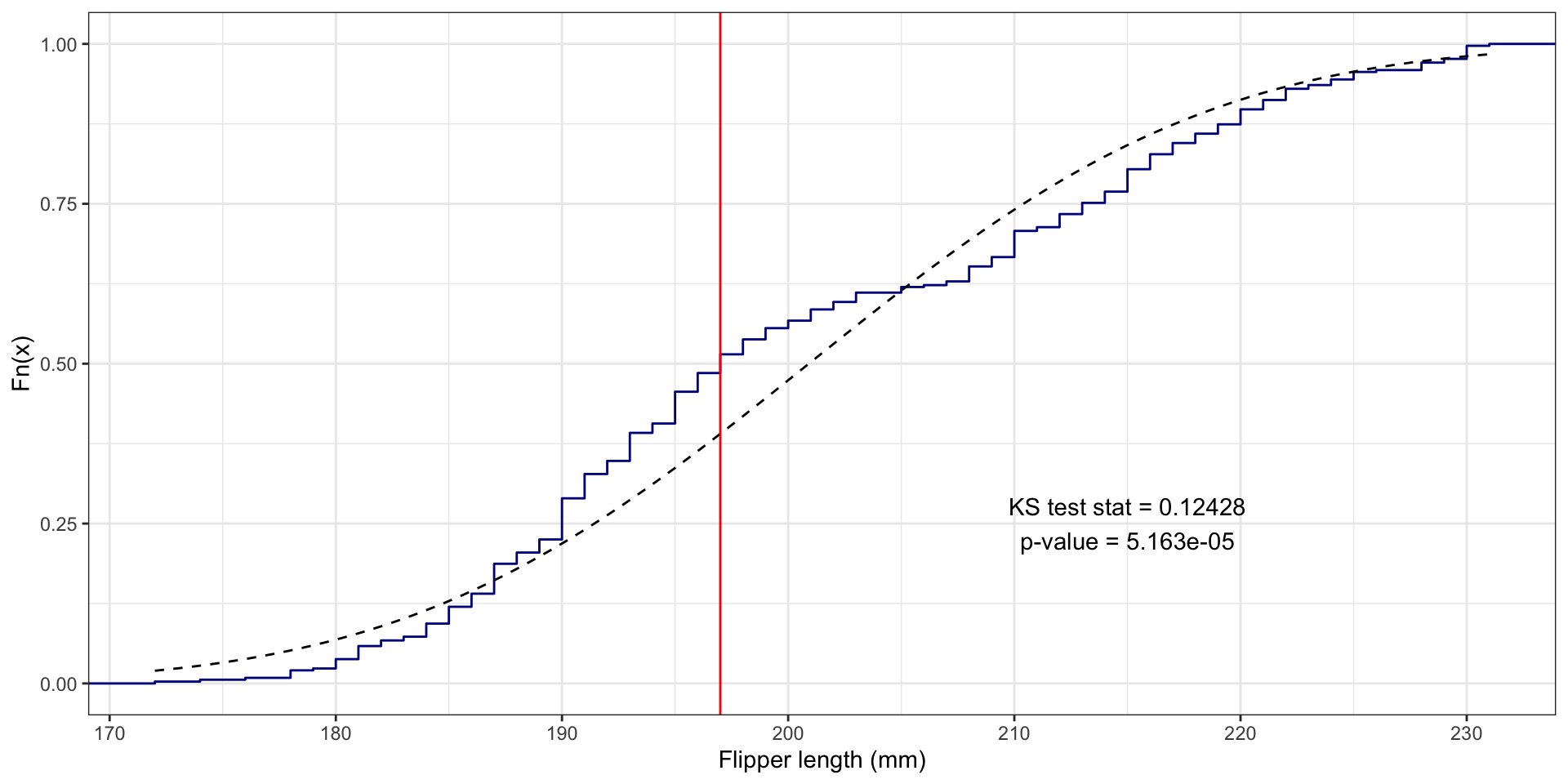
One-Sample Kolmogorov-Smirnov Test
We compare the ECDF \(\hat{F}(x)\) to a theoretical distribution’s CDF \(F(x)\)
The one sample KS test statistic is: \(\text{max}_x |\hat{F}(x) - F(x)|\)

Flipper length example
Visualize distribution comparisons using quantile-quantile (q-q) plots