Visualizing Quantitative Distributions
2024-09-09
Reminders, previously, and today…
Visualized 2D categorical data with more bar charts, include mosaic plots
Walked through different approaches for 1D quantitative data visualization
TODAY:
Thinking carefully about histograms
Introduction to density estimation
Visualization 1D quantitative by 1D categorical distributions
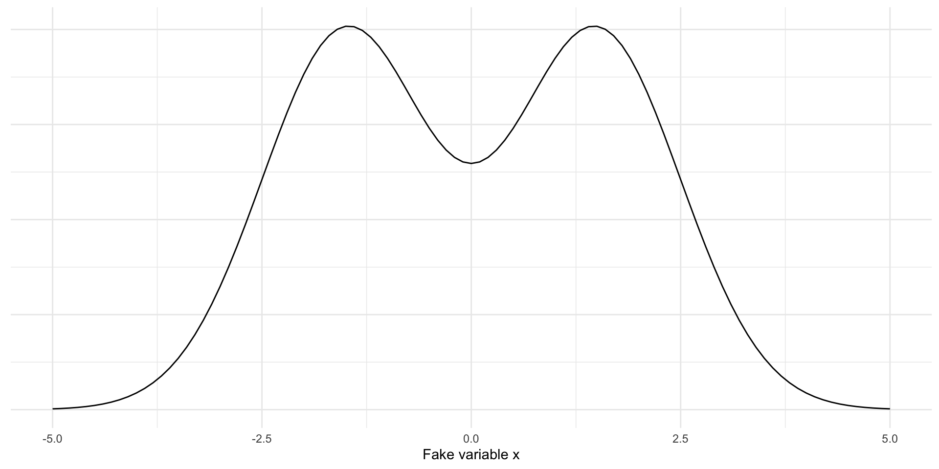
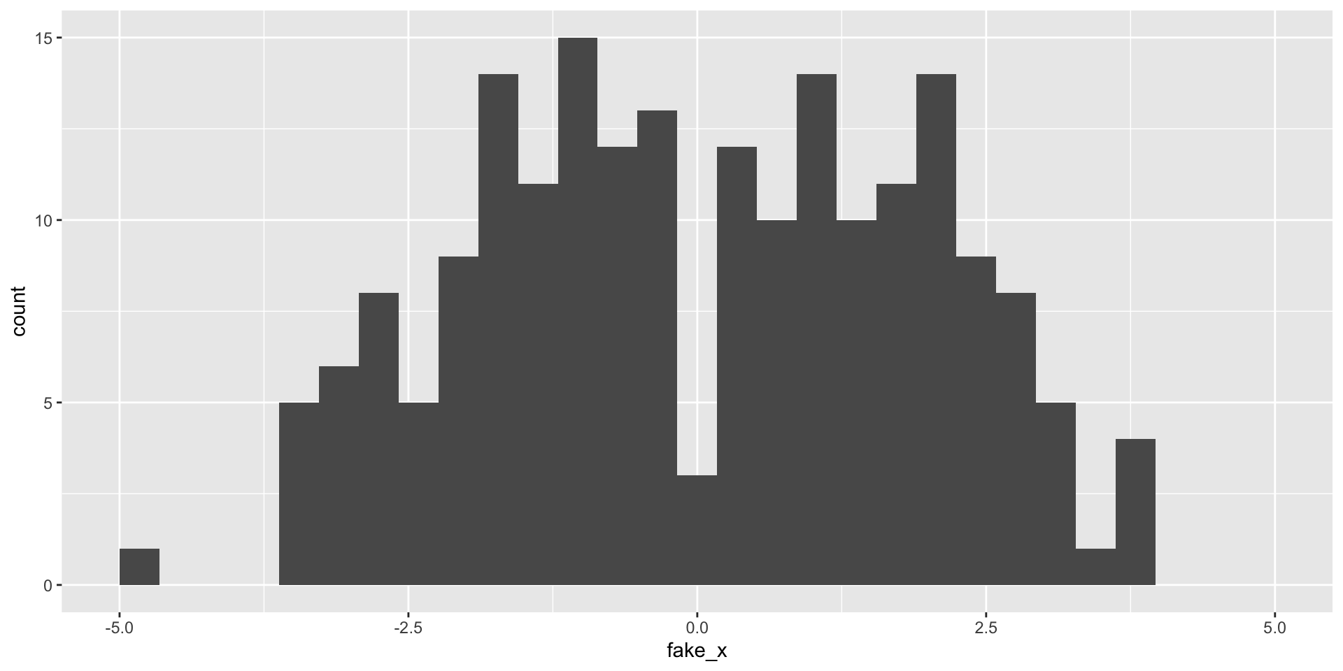
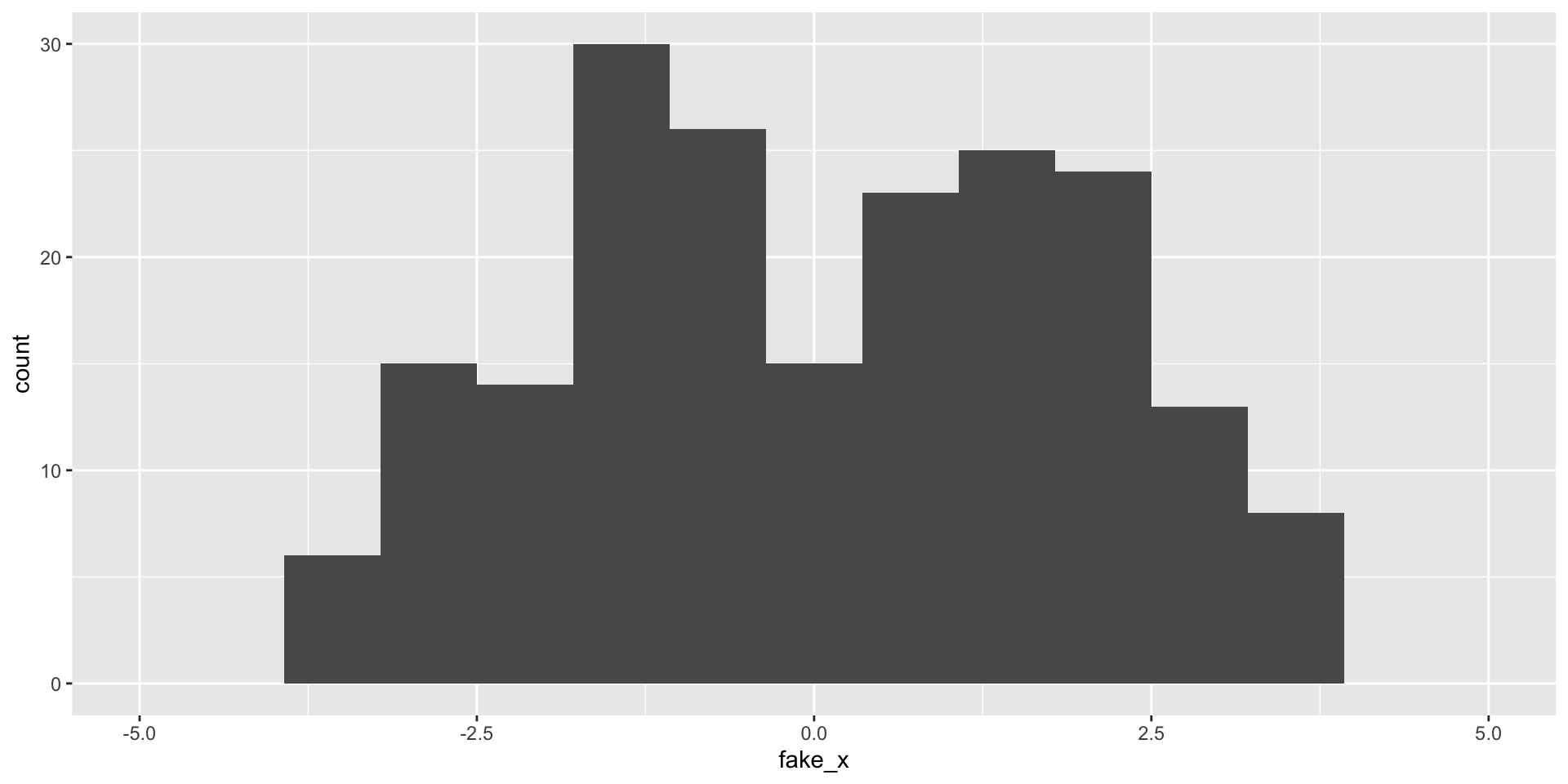
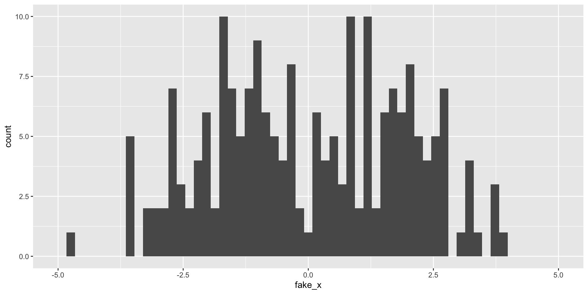
Simulate data from mixture of Normal distributions
Will sample 100 draws from \(N(-1.5, 1)\) and 100 draws from \(N(1.5, 1)\)
Revisit histograms
set.seed (2024 )<- tibble (fake_x = c (rnorm (100 , - 1.5 ), rnorm (100 , 1.5 ))) |> mutate (component = c (rep ("left" , 100 ), rep ("right" , 100 )))|> ggplot (aes (x = fake_x)) + geom_histogram () + scale_x_continuous (limits = c (- 5 , 5 ))
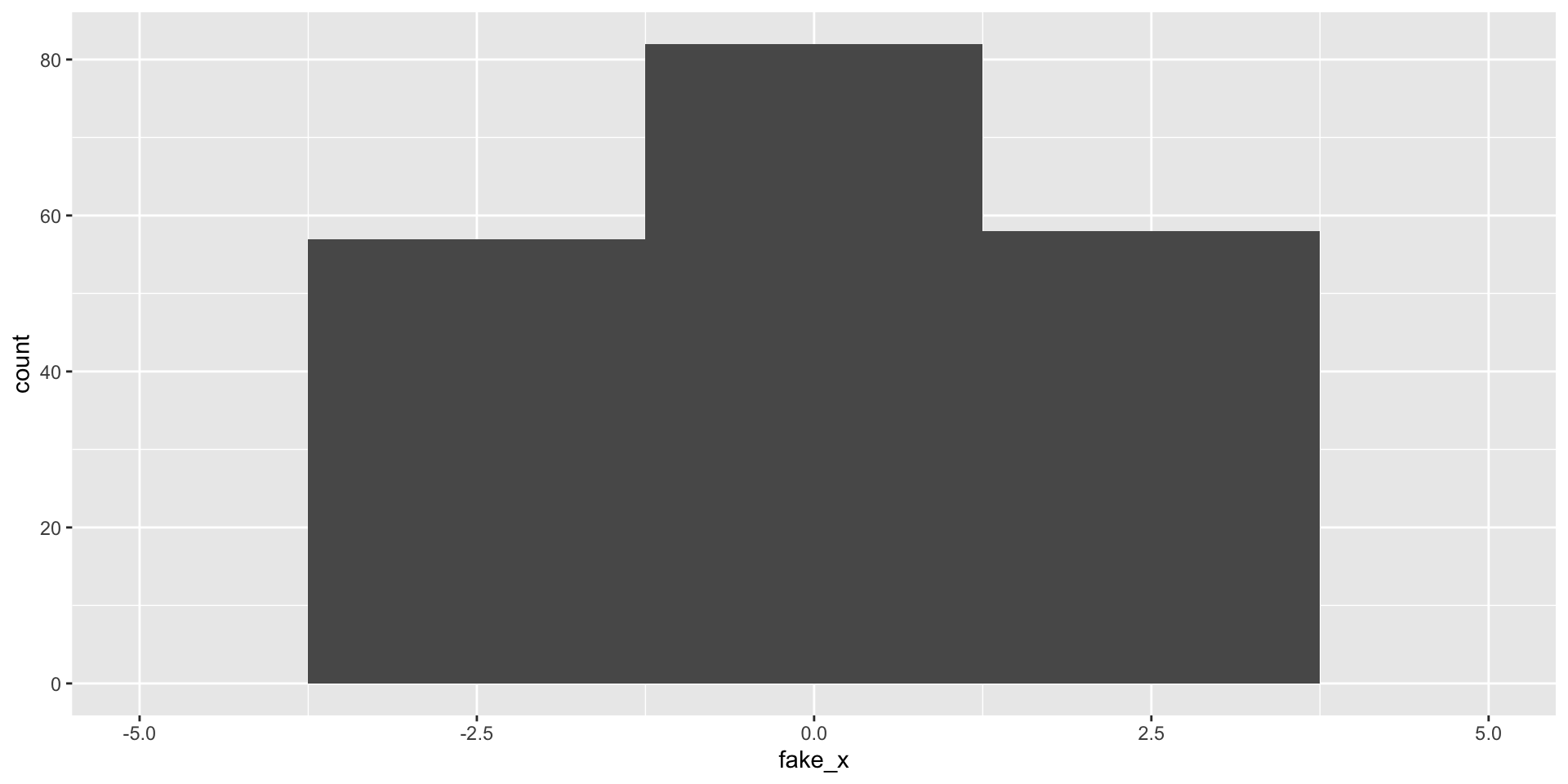
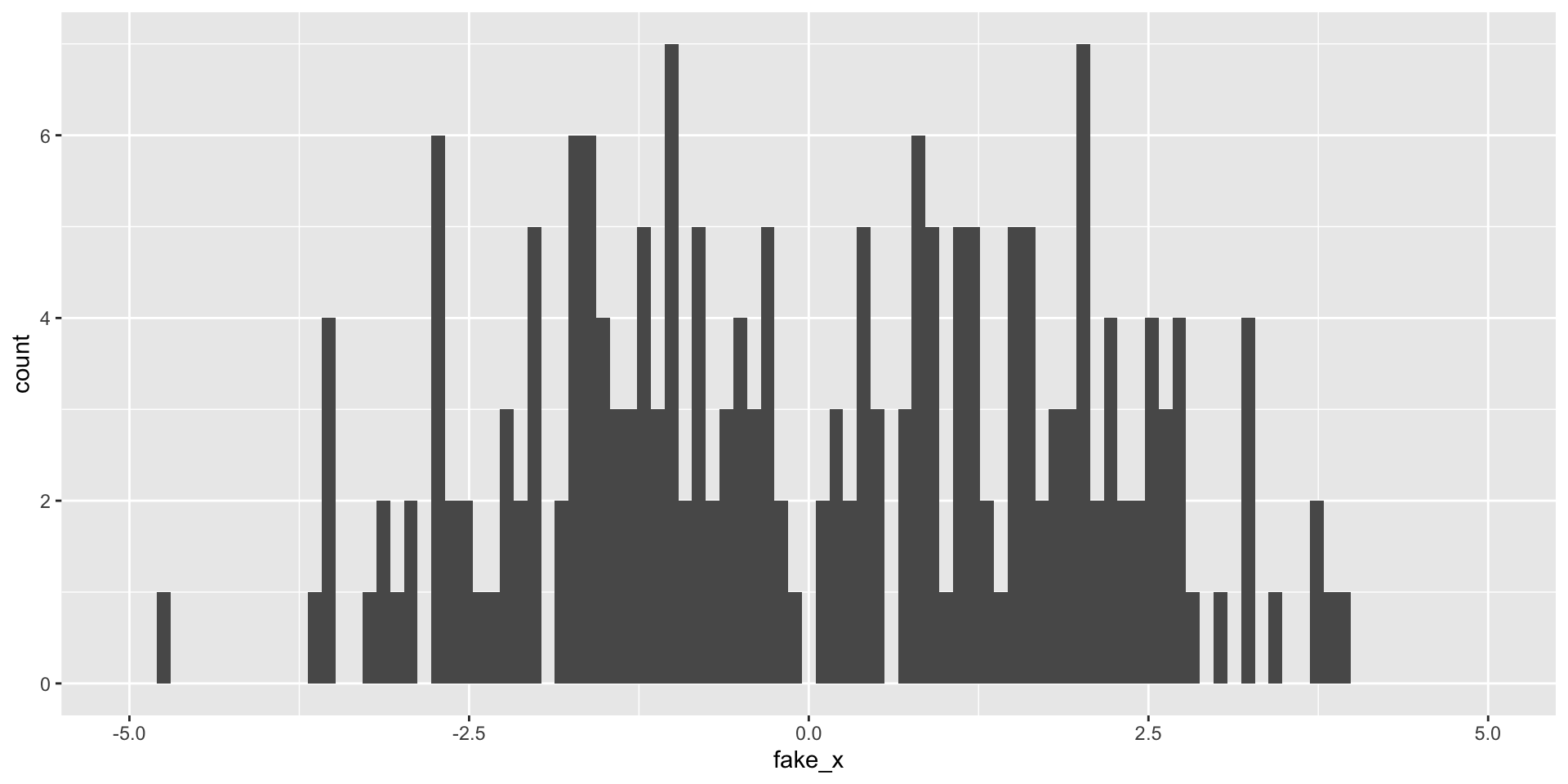
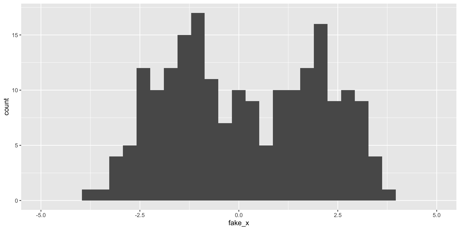
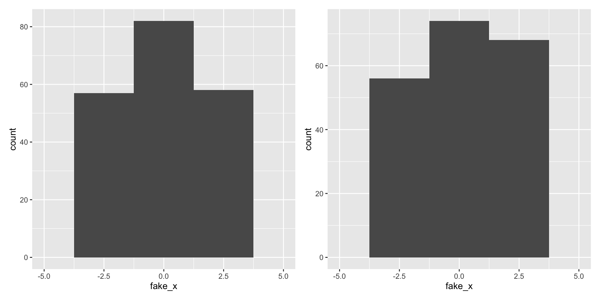
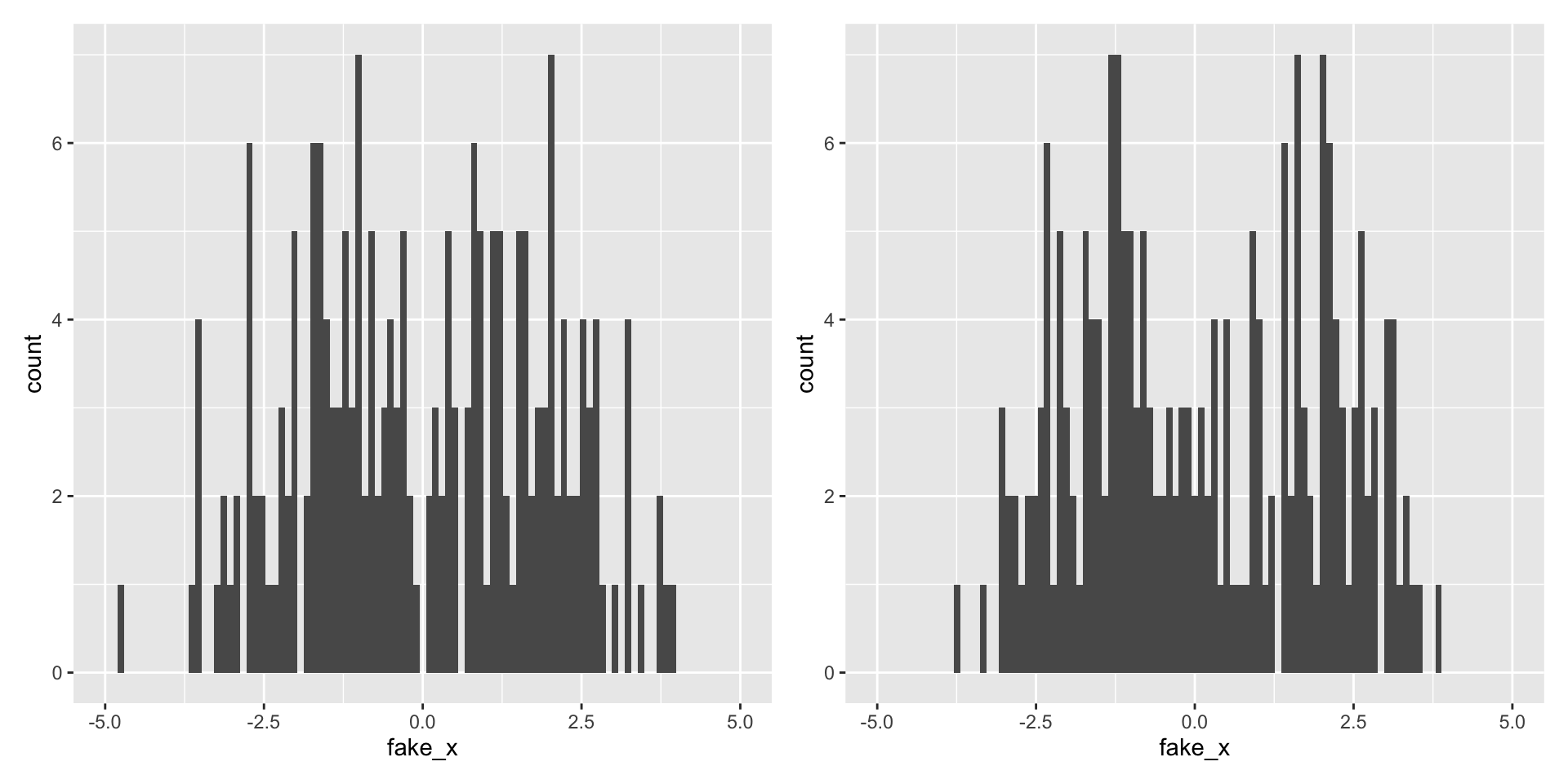
What happens as we change the number of bins?
|> ggplot (aes (x = fake_x)) + geom_histogram (bins = 15 ) + scale_x_continuous (limits = c (- 5 , 5 ))
What happens as we change the number of bins?
|> ggplot (aes (x = fake_x)) + geom_histogram (bins = 60 ) + scale_x_continuous (limits = c (- 5 , 5 ))
What happens as we change the number of bins?
|> ggplot (aes (x = fake_x)) + geom_histogram (bins = 5 ) + scale_x_continuous (limits = c (- 5 , 5 ))
What happens as we change the number of bins?
|> ggplot (aes (x = fake_x)) + geom_histogram (bins = 100 ) + scale_x_continuous (limits = c (- 5 , 5 ))
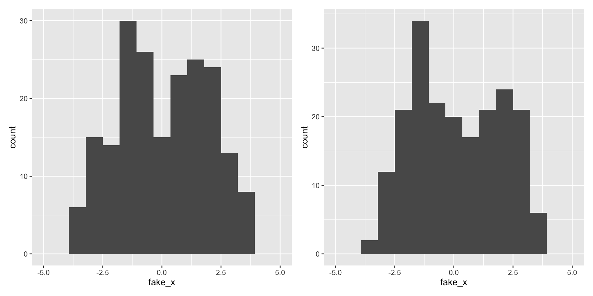
Variability of graphs - 30 bins
set.seed (2024 )<- tibble (fake_x = c (rnorm (100 , - 1.5 ), rnorm (100 , 1.5 ))) |> mutate (component = c (rep ("left" , 100 ), rep ("right" , 100 )))|> ggplot (aes (x = fake_x)) + geom_histogram () + scale_x_continuous (limits = c (- 5 , 5 ))
What happens with a different sample?
set.seed (1979 )<- tibble (fake_x = c (rnorm (100 , - 1.5 ), rnorm (100 , 1.5 ))) |> mutate (component = c (rep ("left" , 100 ), rep ("right" , 100 )))|> ggplot (aes (x = fake_x)) + geom_histogram () + scale_x_continuous (limits = c (- 5 , 5 ))
Variability of graphs - 15 bins
Variability of graphs - 5 bins
Variability of graphs - 100 bins
What do visualizations of continuous distributions display?
Probability that continuous variable \(X\) takes a particular value is 0
e.g., \(P\) (flipper_length_mm \(= 200\) ) \(= 0\) , why ?
Instead we use the probability density function (PDF) to provide a relative likelihood
For continuous variables we can use the cumulative distribution function (CDF) ,
\[
F(x) = P(X \leq x)
\]
For \(n\) observations we can easily compute the Empirical CDF (ECDF) :
\[\hat{F}_n(x) = \frac{\text{# obs. with variable} \leq x}{n} = \frac{1}{n} \sum_{i=1}^{n}1(x_i \leq x)\]
where \(1()\) is the indicator function, i.e. ifelse(x_i <= x, 1, 0)
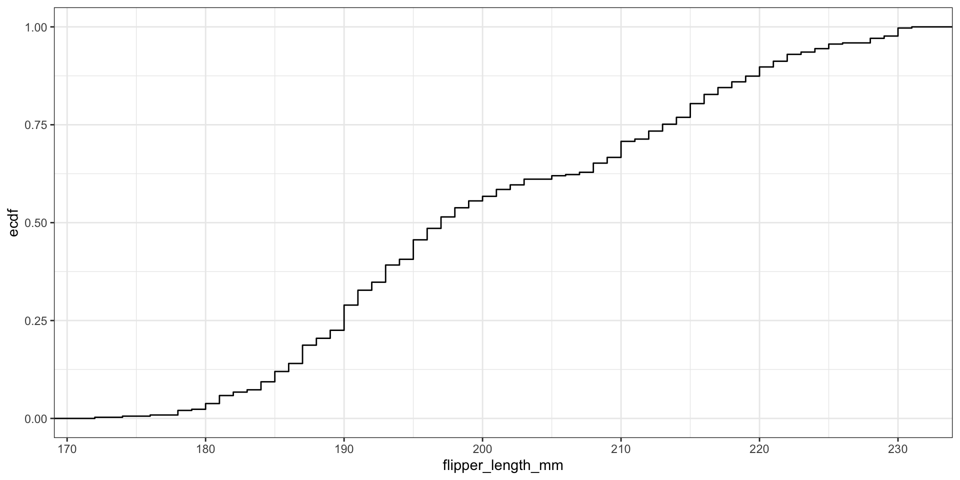
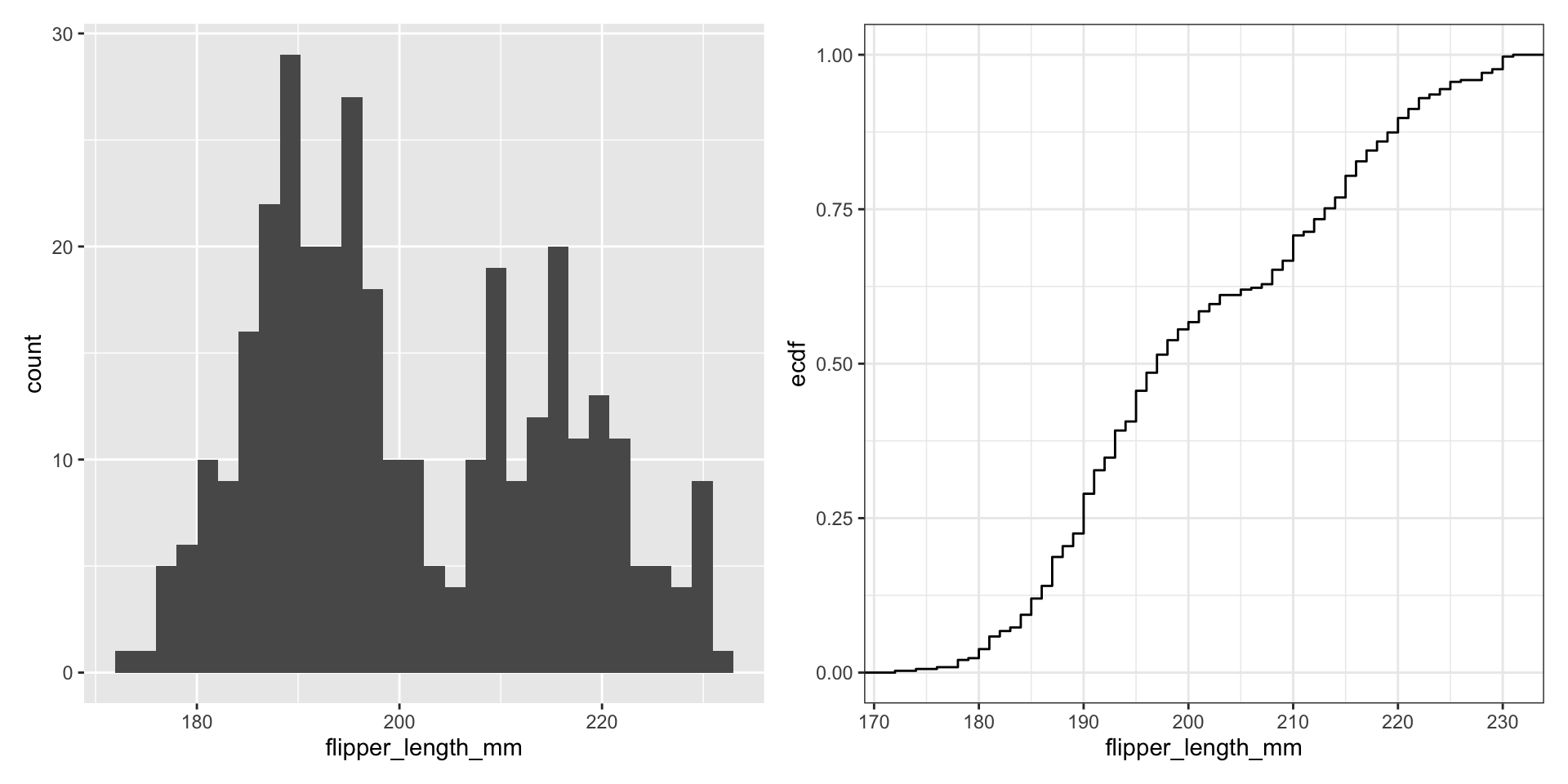
Display full distribution with ECDF plot
|> ggplot (aes (x = flipper_length_mm)) + stat_ecdf () + theme_bw ()
What about comparing to theoretical distributions?
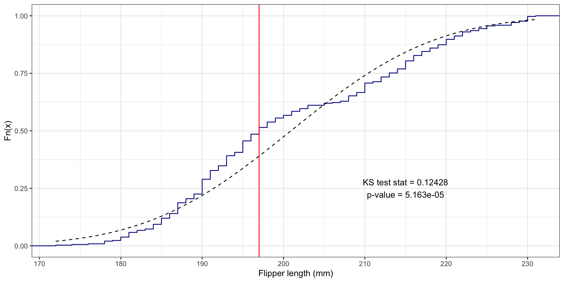
One-Sample Kolmogorov-Smirnov Test
Flipper length example
What if we assume flipper_length_mm follows Normal distribution?
i.e., flipper_length_mm \(\sim N(\mu, \sigma^2)\)
Need estimates for mean \(\mu\) and standard deviation \(\sigma\) :
<- mean (penguins$ flipper_length_mm, na.rm = TRUE )<- sd (penguins$ flipper_length_mm, na.rm = TRUE )
Perform one-sample KS test using ks.test()
ks.test (x = penguins$ flipper_length_mm, y = "pnorm" ,mean = flipper_length_mean, sd = flipper_length_sd)
    Asymptotic one-sample Kolmogorov-Smirnov test

data:  penguins$flipper_length_mm
D = 0.12428, p-value = 5.163e-05
alternative hypothesis: two-sided
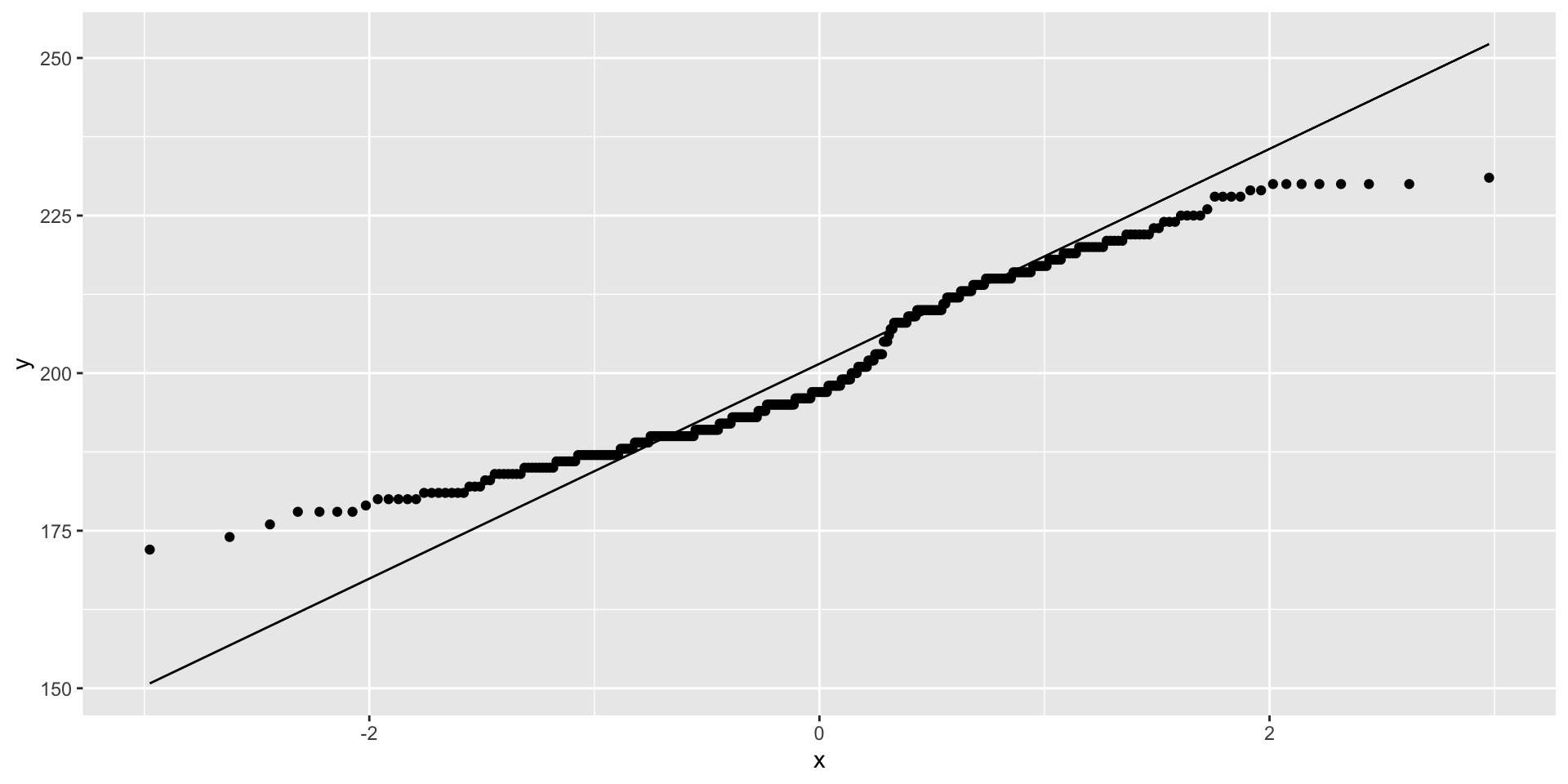
Flipper length example
Visualize distribution comparisons using quantile-quantile (q-q) plots
|> ggplot (aes (sample = flipper_length_mm)) + stat_qq () + stat_qq_line ()
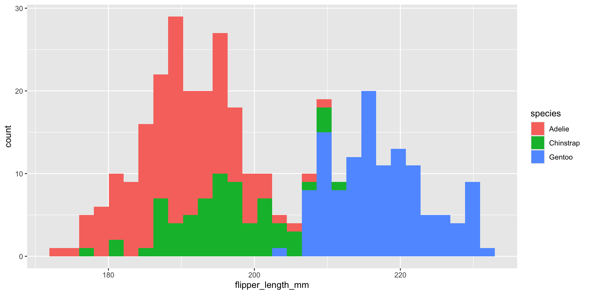
What about displaying conditional distributions?
|> ggplot (aes (x = flipper_length_mm)) + geom_histogram (aes (fill = species))
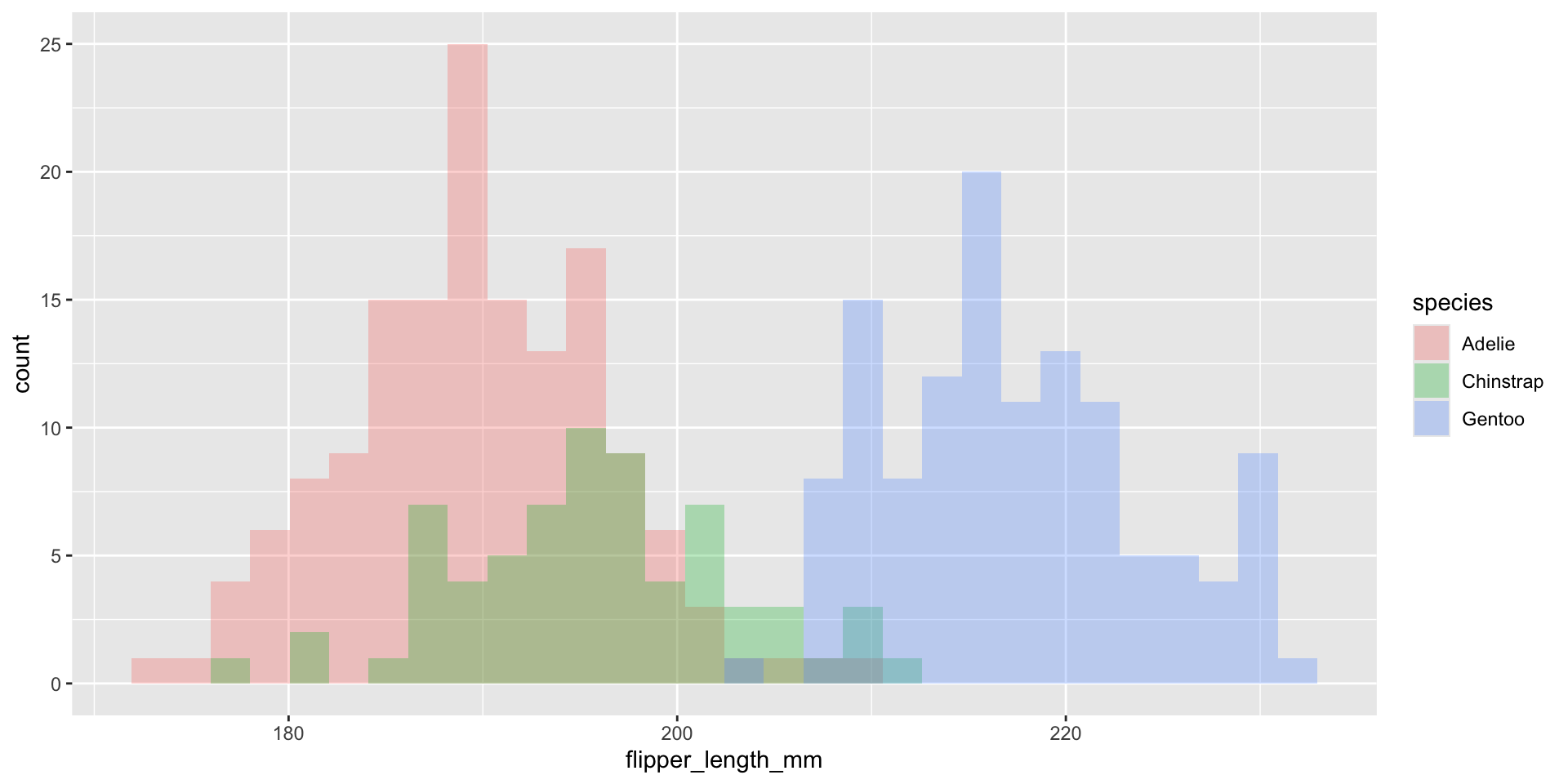
What about displaying conditional distributions?
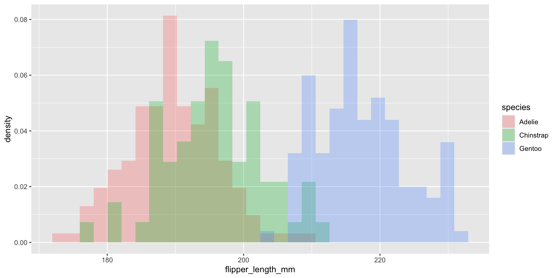
|> ggplot (aes (x = flipper_length_mm)) + geom_histogram (aes (fill = species),position = "identity" , alpha = 0.3 )
Normalize histogram frequencies with density values
|> ggplot (aes (x = flipper_length_mm)) + geom_histogram (aes (y = after_stat (density), fill = species),position = "identity" , alpha = 0.3 )
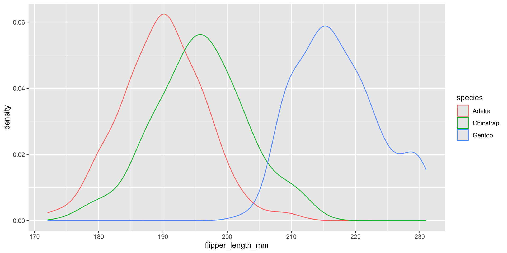
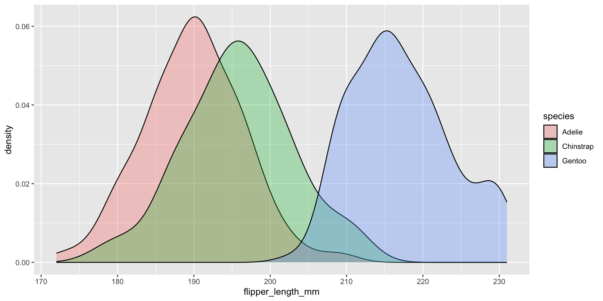
Use density curves instead for comparison
|> ggplot (aes (x = flipper_length_mm)) + geom_density (aes (color = species))
We should NOT fill the density curves
|> ggplot (aes (x = flipper_length_mm)) + geom_density (aes (fill = species), alpha = .3 )
Kernel density estimation
Goal : estimate the PDF \(f(x)\) for all possible values (assuming it is continuous / smooth)
\[
\text{Kernel density estimate: } \hat{f}(x) = \frac{1}{n} \sum_{i=1}^n \frac{1}{h} K_h(x - x_i)
\]
\(n =\) sample size, \(x =\) new point to estimate \(f(x)\) (does NOT have to be in dataset!)
\(h =\) bandwidth , analogous to histogram bin width, ensures \(\hat{f}(x)\) integrates to 1
\(x_i =\) \(i\) th observation in dataset
\(K_h(x - x_i)\) is the Kernel function, creates weight given distance of \(i\) th observation from new point
as \(|x - x_i| \rightarrow \infty\) then \(K_h(x - x_i) \rightarrow 0\) , i.e. further apart \(i\) th row is from \(x\) , smaller the weight
as bandwidth \(h \uparrow\) weights are more evenly spread out (as \(h \downarrow\) more concentrated around \(x\) )
typically use Gaussian / Normal\(\propto e^{-(x - x_i)^2 / 2h^2}\)
\(K_h(x - x_i)\) is large when \(x_i\) is close to \(x\)
We display kernel density estimates with geom_density()
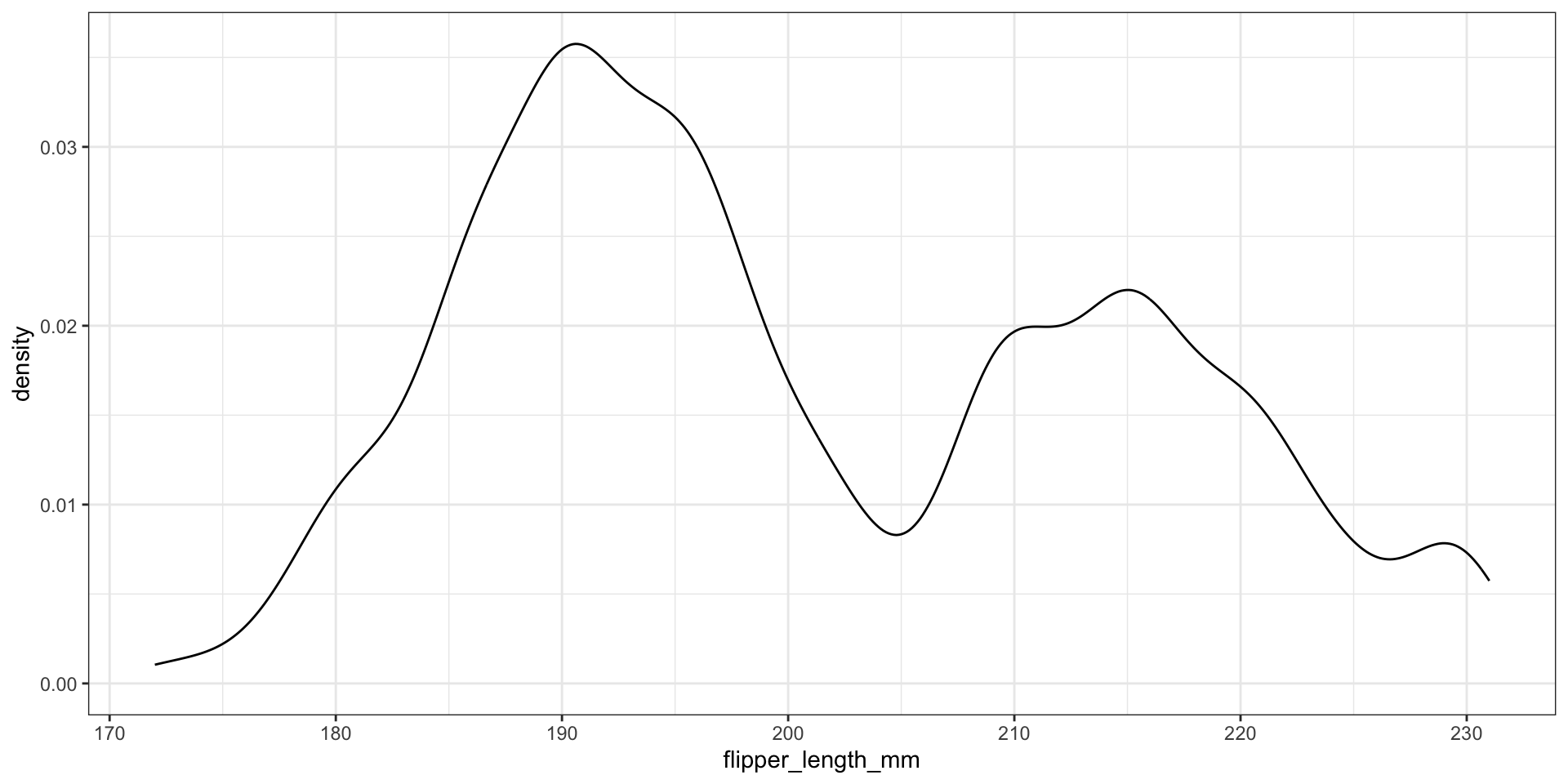
|> ggplot (aes (x = flipper_length_mm)) + geom_density () + theme_bw ()
What about the bandwidth?
Use Gaussian reference rule (rule-of-thumb ) \(\approx 1.06 \cdot \sigma \cdot n^{-1/5}\) , where \(\sigma\) is the observed standard deviation
Modify the bandwidth using the adjust argument - value to multiply default bandwidth by
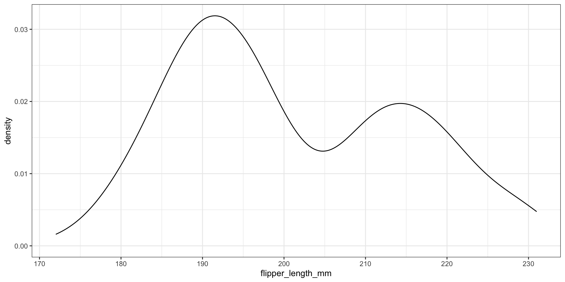
|> ggplot (aes (x = flipper_length_mm)) + geom_density (adjust = 0.5 ) + theme_bw ()
What about the bandwidth?
Use Gaussian reference rule (rule-of-thumb ) \(\approx 1.06 \cdot \sigma \cdot n^{-1/5}\) , where \(\sigma\) is the observed standard deviation
Modify the bandwidth using the adjust argument - value to multiply default bandwidth by
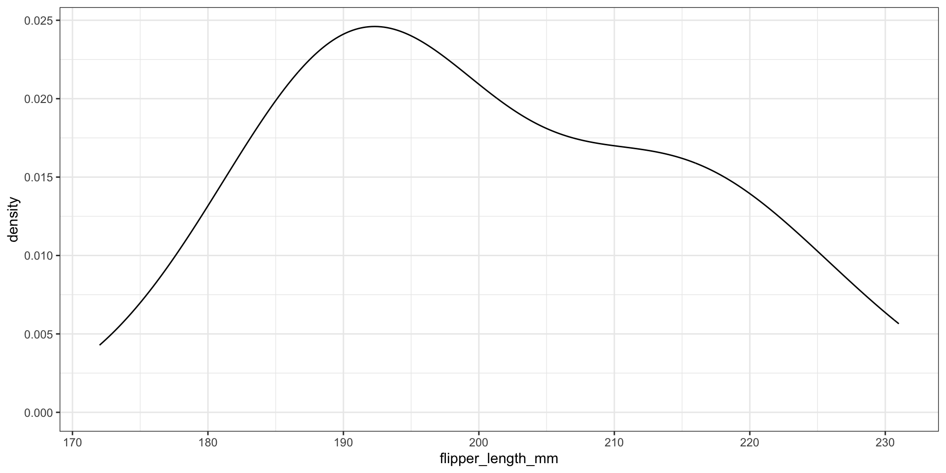
|> ggplot (aes (x = flipper_length_mm)) + geom_density (adjust = 2 ) + theme_bw ()
CAUTION: dealing with bounded data…
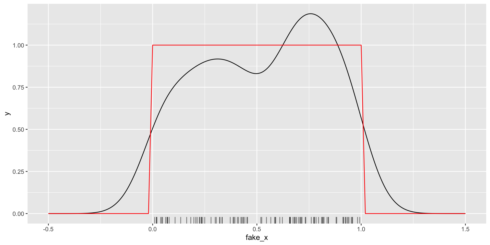
set.seed (101 )<- tibble (fake_x = runif (100 ))|> ggplot (aes (x = fake_x)) + geom_density () + geom_rug (alpha = 0.5 ) + #<< stat_function (data = tibble (fake_x = c (0 , 1 )),fun = dunif, color = "red" ) + scale_x_continuous (limits = c (- .5 , 1.5 ))
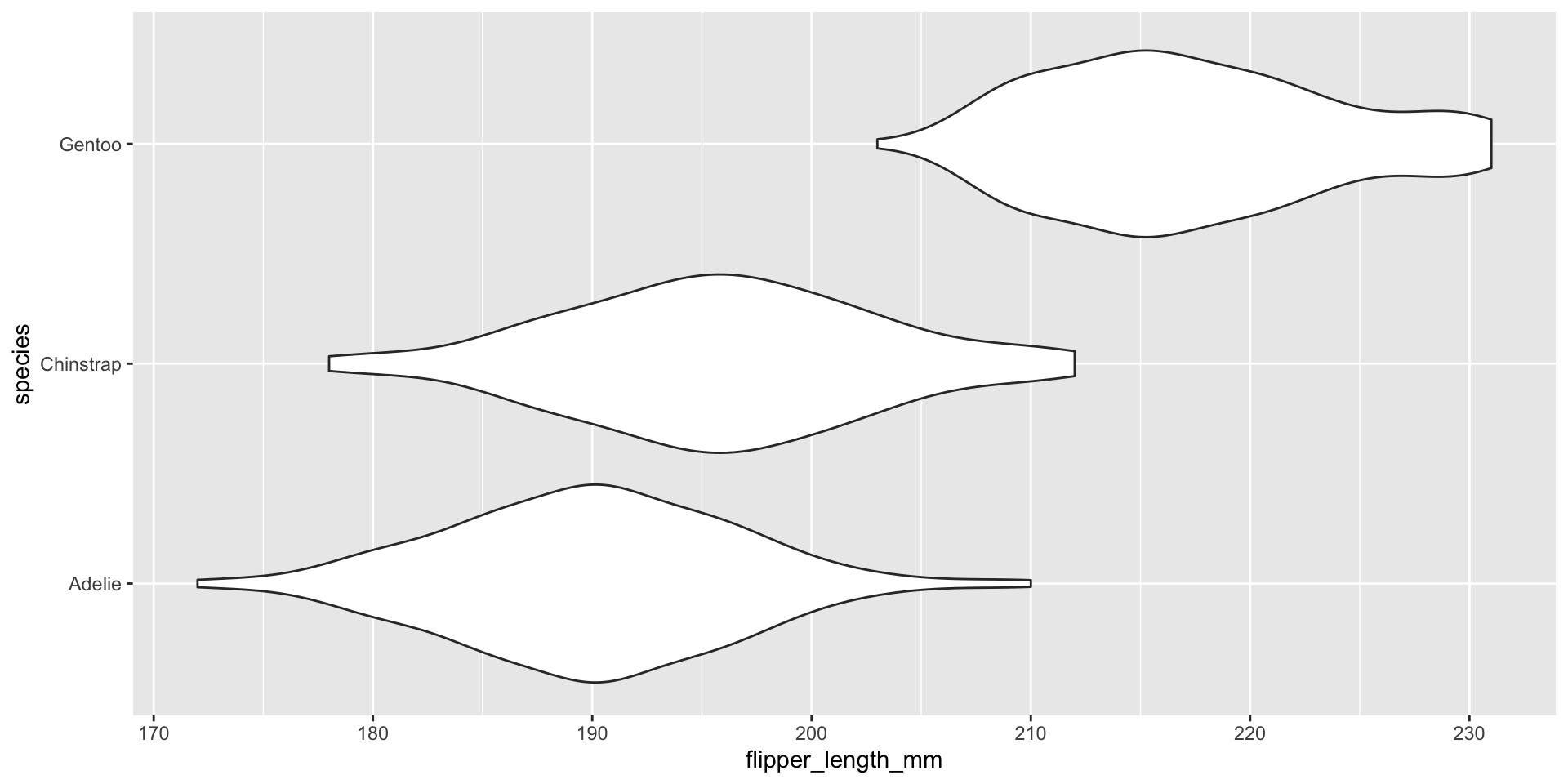
Visualizing conditional distributions with violin plots
|> ggplot (aes (x = species, y = flipper_length_mm)) + geom_violin () + coord_flip ()
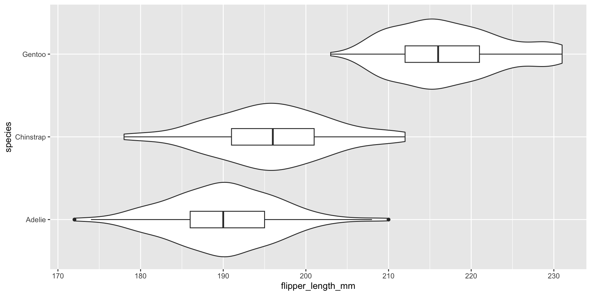
Visualizing conditional distributions with violin plots
|> ggplot (aes (x = species, y = flipper_length_mm)) + geom_violin () + geom_boxplot (width = .2 ) + coord_flip ()
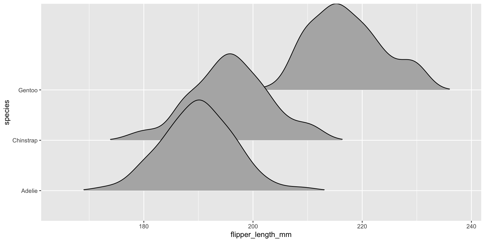
Visualizing conditional distributions with ggridges package
library (ggridges)|> ggplot (aes (x = flipper_length_mm, y = species)) + geom_density_ridges (rel_min_height = 0.01 )
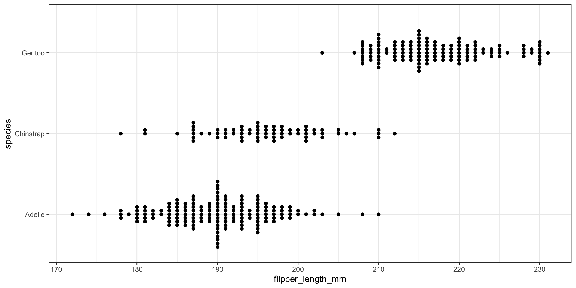
Visualizing conditional distributions with ggbeeswarm package
library (ggbeeswarm)|> ggplot (aes (x = flipper_length_mm, y = species)) + geom_beeswarm (cex = 1.5 ) + theme_bw ()
Recap and next steps
Discussed impact of bins on histograms
Covered ECDFs and connection to KS-tests
Walked through density estimation
Discussed ways of visualizing conditional distributions
BONUS: Visualizing the KS test statistic
# First create the ECDF function for the variable: <- ecdf (penguins$ flipper_length_mm)# Compute the absolute value of the differences between the ECDF for the values # and the theoretical values with assumed Normal distribution: <- abs (fl_ecdf (penguins$ flipper_length_mm) - pnorm (penguins$ flipper_length_mm,mean = flipper_length_mean, sd = flipper_length_sd))# Now find where the maximum difference is: <- which.max (abs_ecdf_diffs)# Get this flipper length value: <- penguins$ flipper_length_mm[max_abs_ecdf_diff_i]# Plot the ECDF with the theoretical Normal and KS test info: |> ggplot (aes (x = flipper_length_mm)) + stat_ecdf (color = "darkblue" ) + # Use stat_function to draw the Normal ECDF stat_function (fun = pnorm, args = list (mean = flipper_length_mean, sd = flipper_length_sd), color = "black" , linetype = "dashed" ) + # Draw KS test line: geom_vline (xintercept = max_fl_diff_value, color = "red" ) + # Add text with the test results (x and y are manually entered locations) annotate (geom = "text" , x = 215 , y = .25 , label = "KS test stat = 0.12428 \n p-value = 5.163e-05" ) + labs (x = "Flipper length (mm)" , y = "Fn(x)" ) + theme_bw ()