# A tibble: 3 × 8
  species island    bill_length_mm bill_depth_mm flipper_length_mm body_mass_g
  <fct>   <fct>              <dbl>         <dbl>             <int>       <int>
1 Adelie  Torgersen           39.1          18.7               181        3750
2 Adelie  Torgersen           39.5          17.4               186        3800
3 Adelie  Torgersen           40.3          18                 195        3250
# ℹ 2 more variables: sex <fct>, year <int>Into High-Dimensional Data
2024-09-16
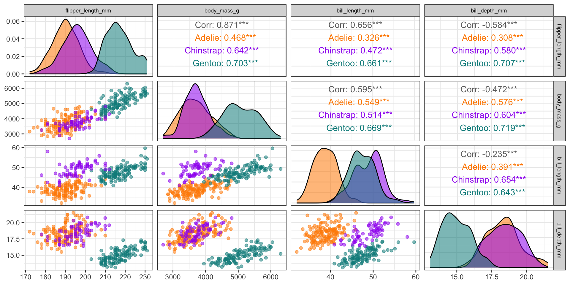
Create pairs plots with GGally
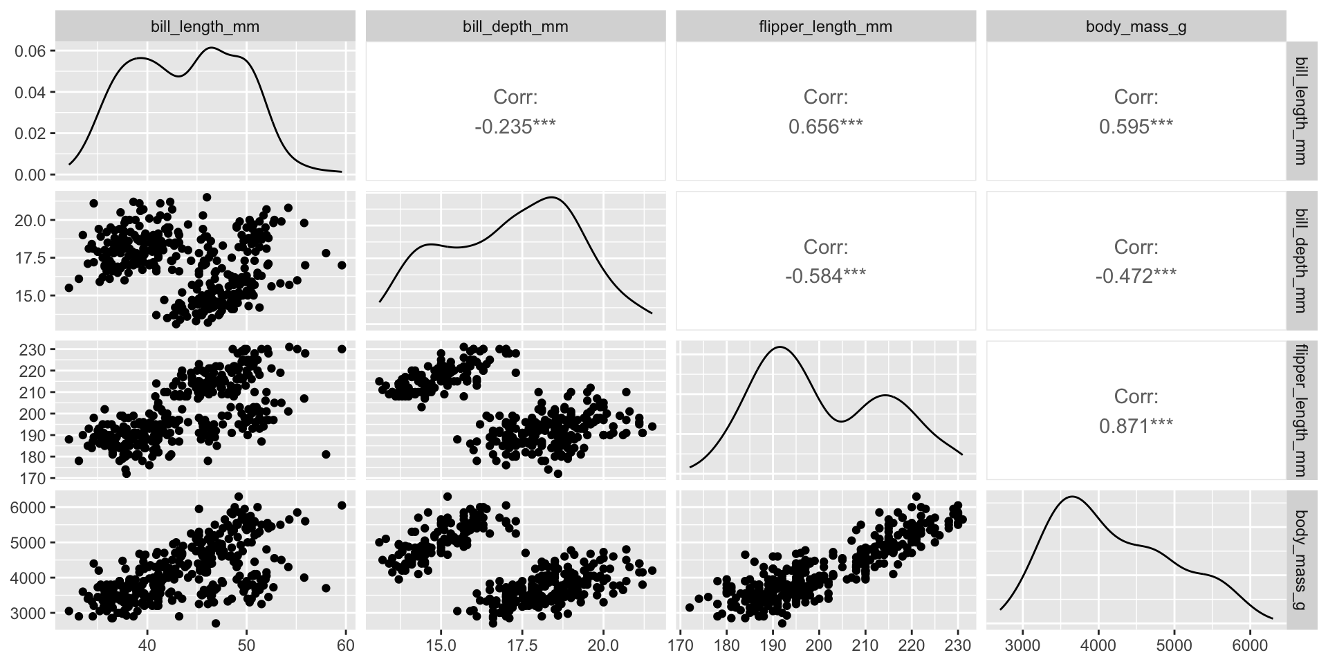
Create pairs plots with GGally
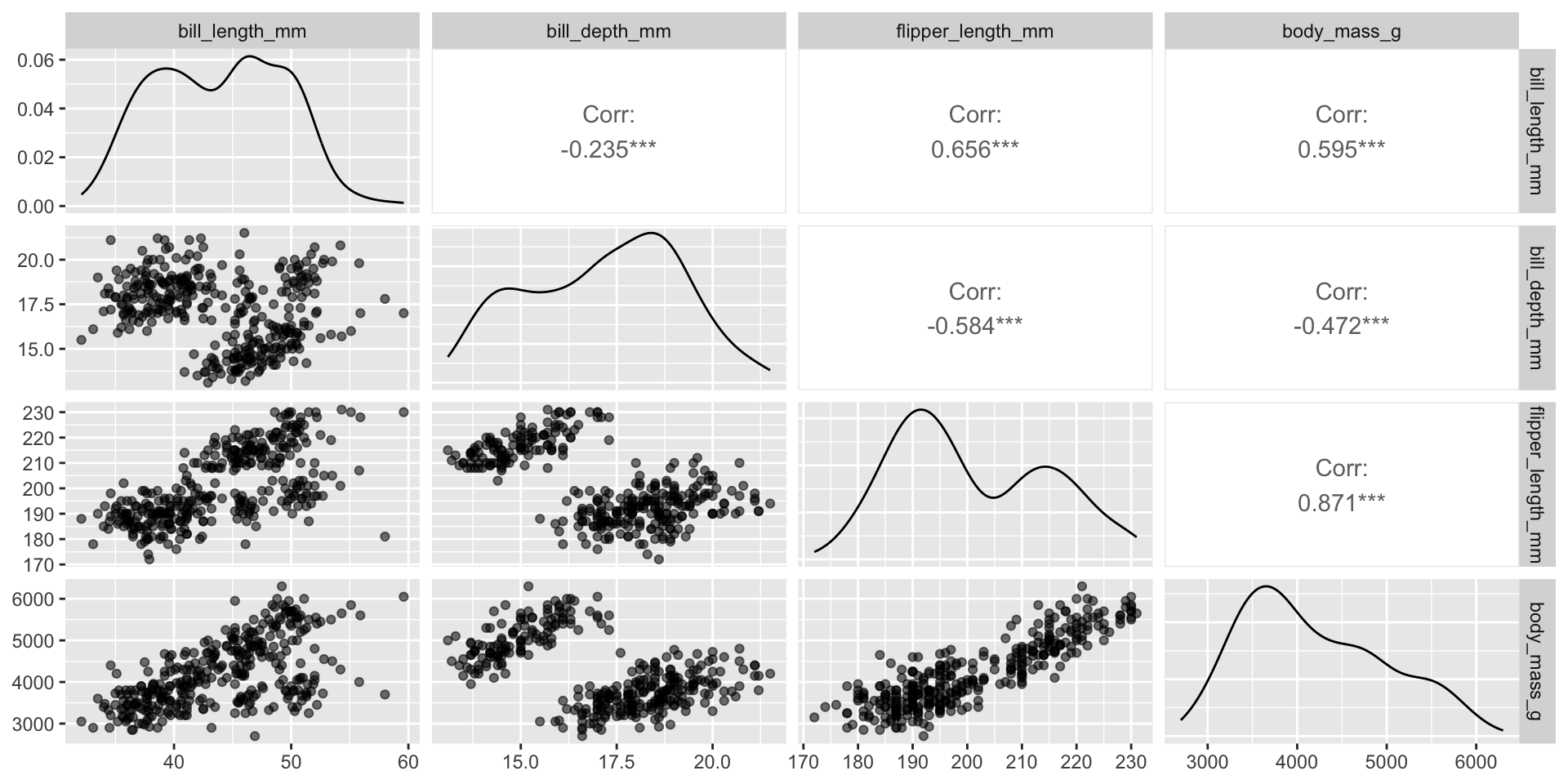
Flexibility in customization
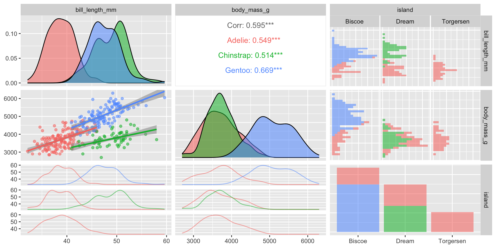
See Demo 03 for more!
Correlogram to visualize correlation matrix
Use the ggcorrplot package:
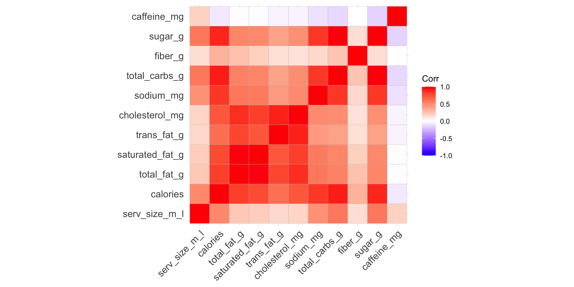
Options to customize correlogram
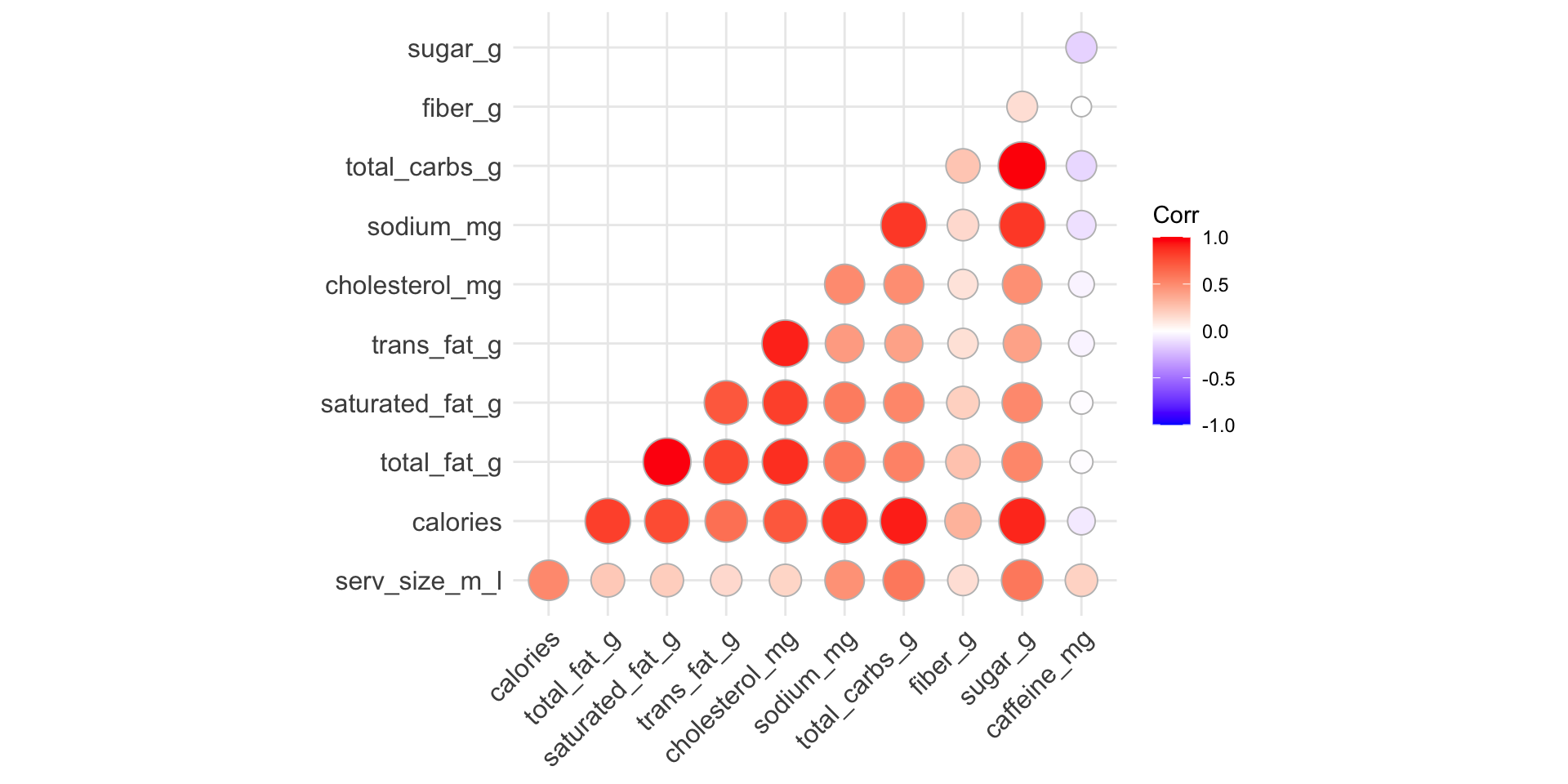
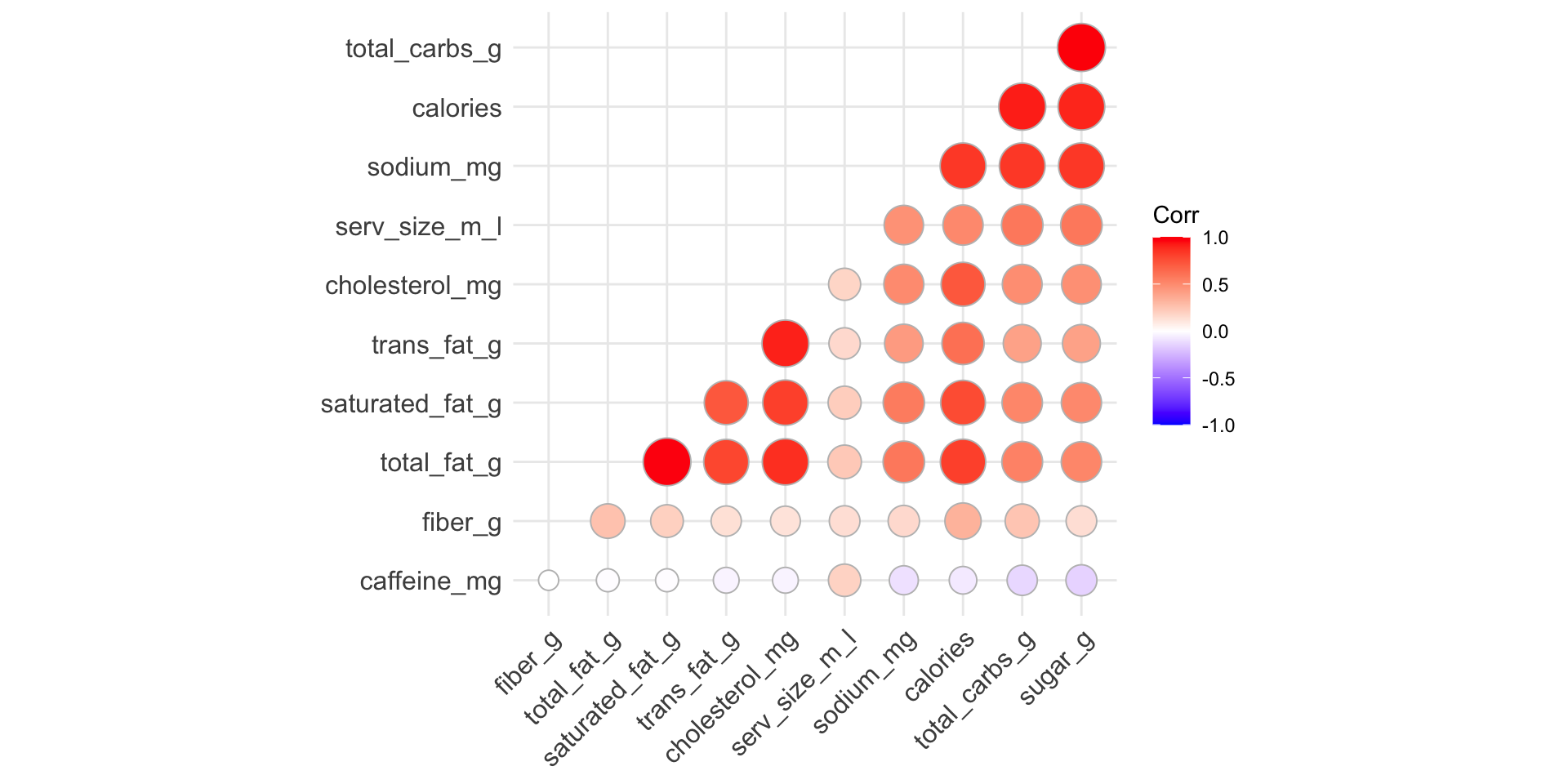
Reorder variables based on correlation
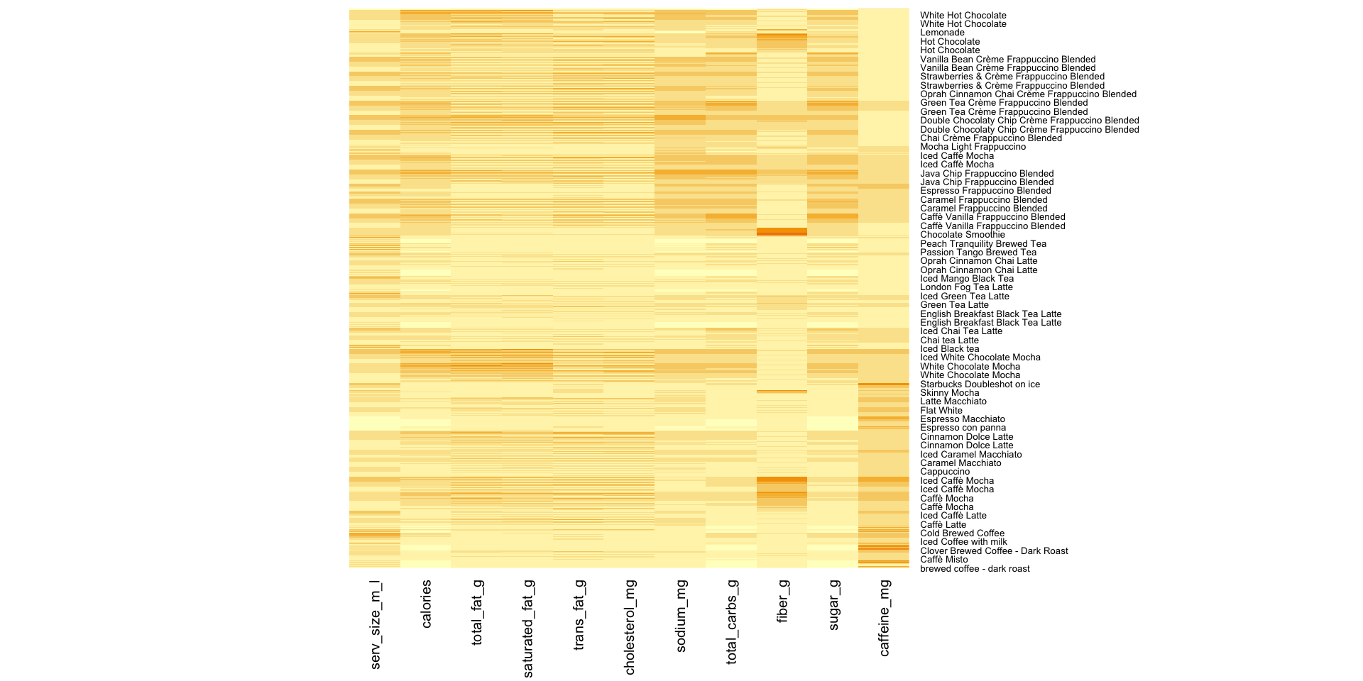
Heatmap displays of observations
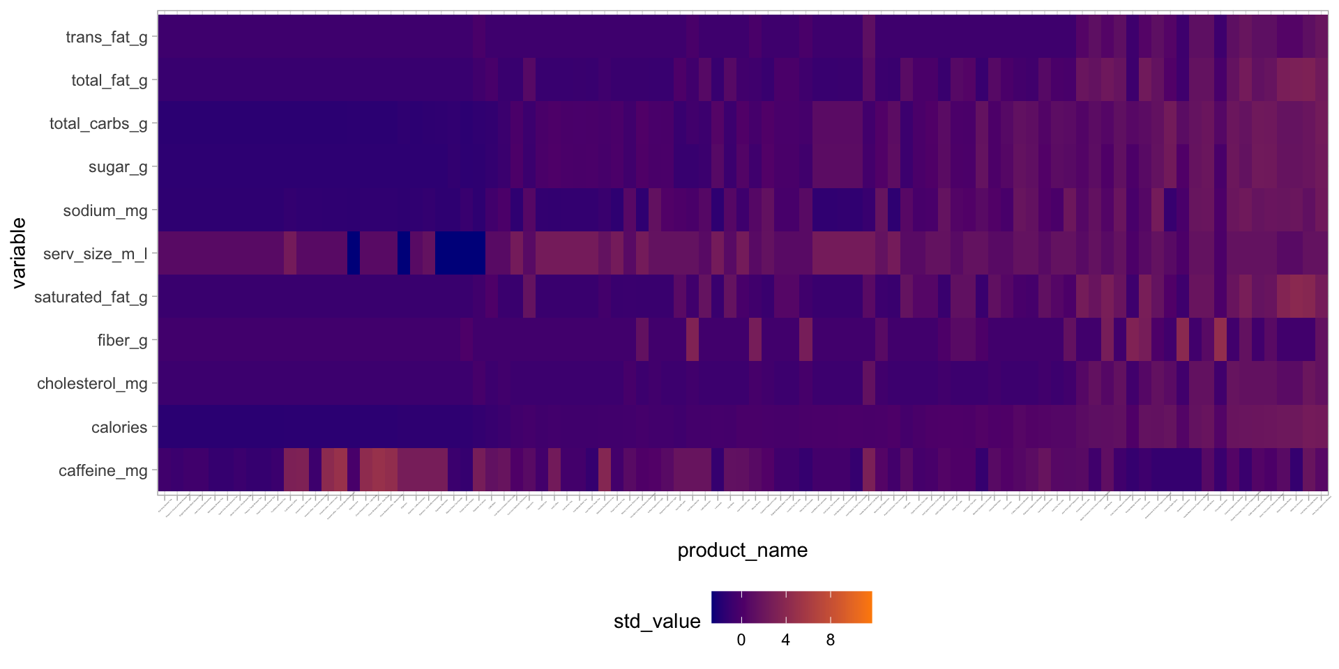
Manual version of heatmaps
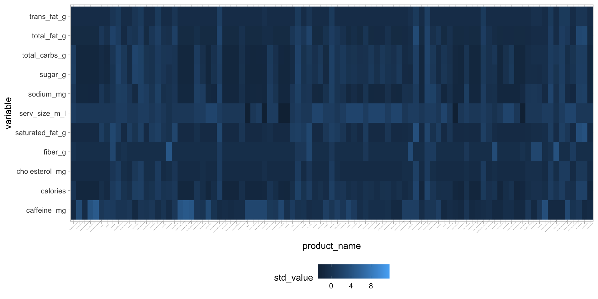
Manual version of heatmaps
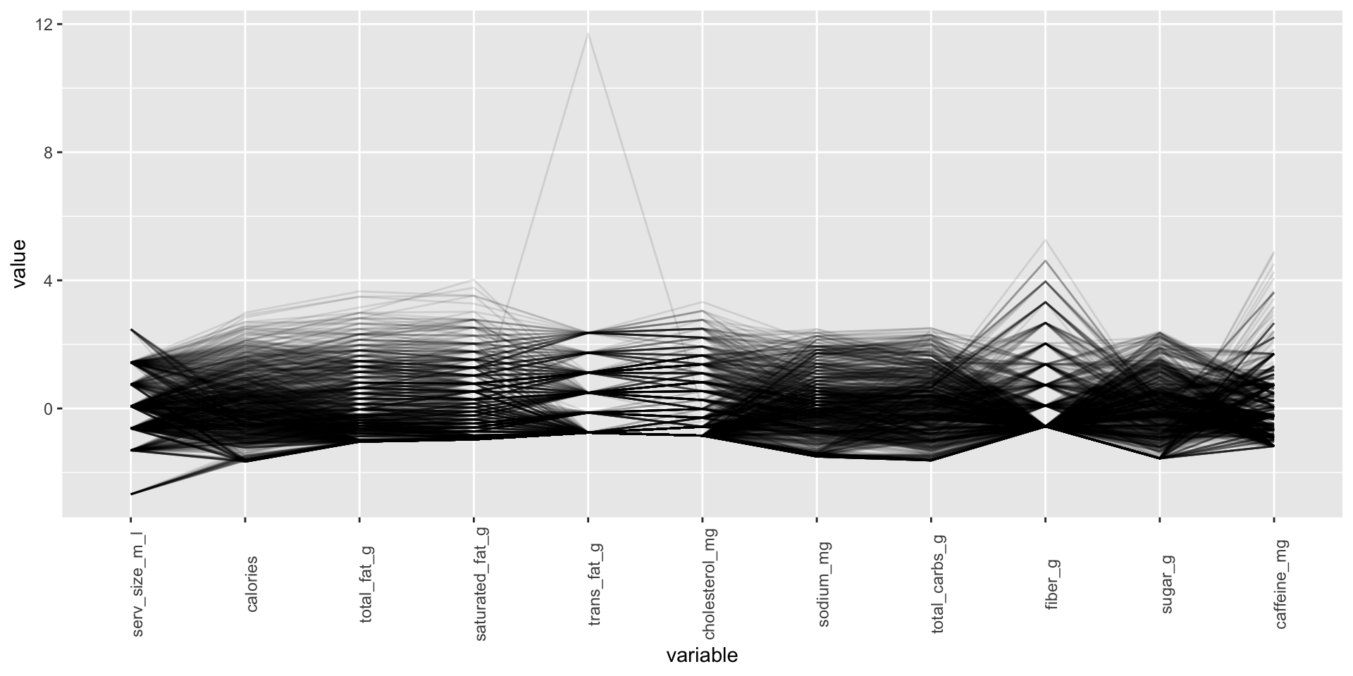
Parallel coordinates plot with ggparcoord