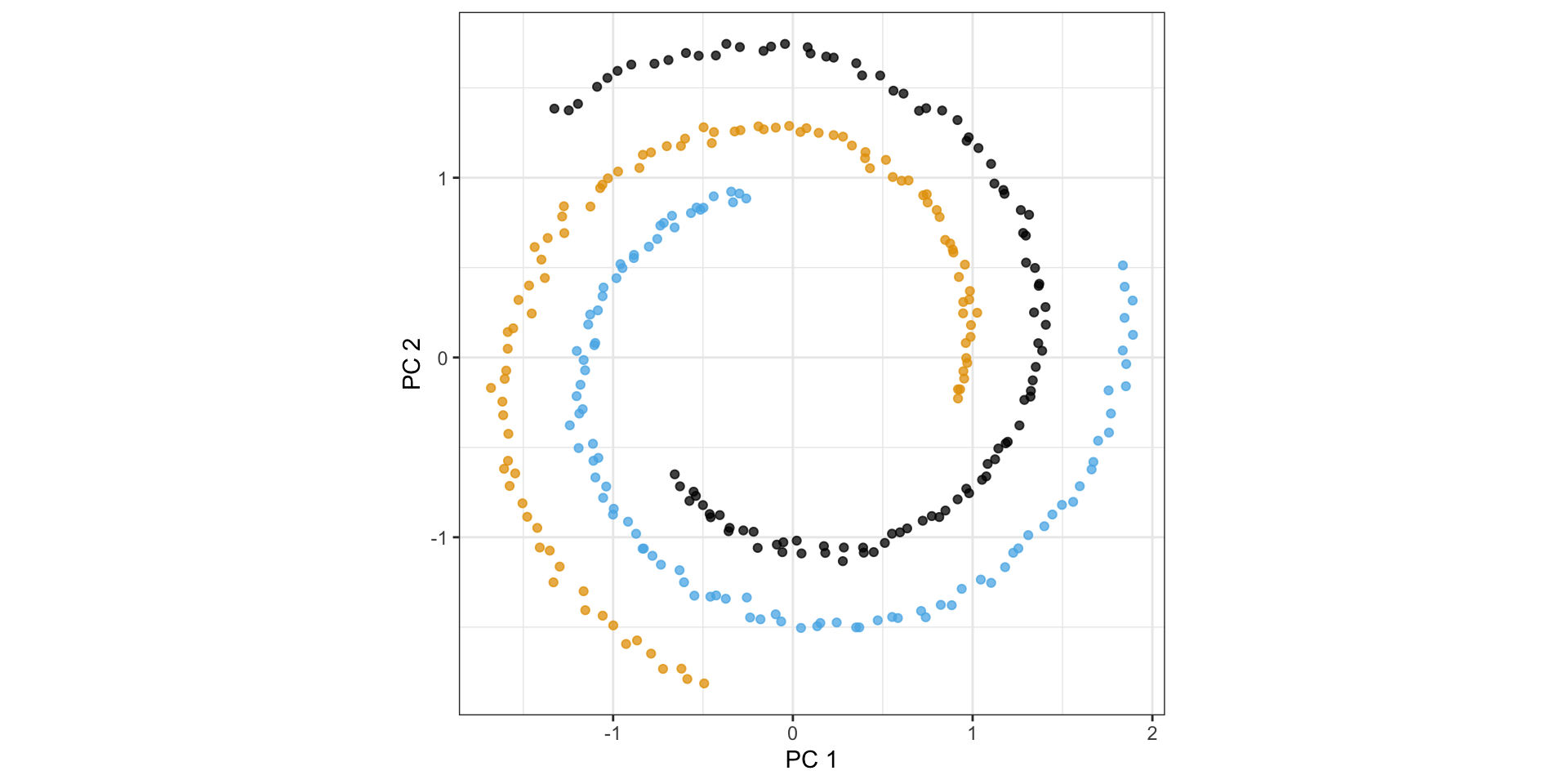
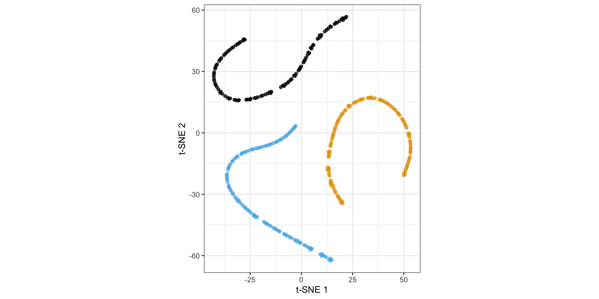
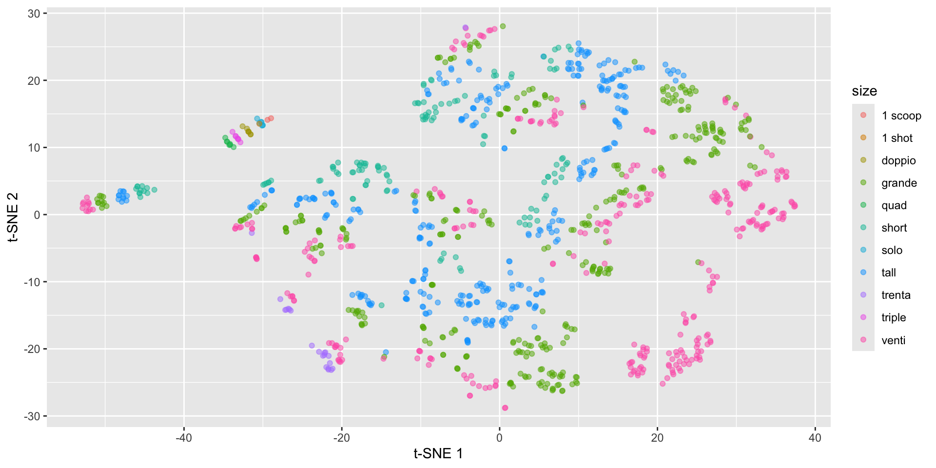
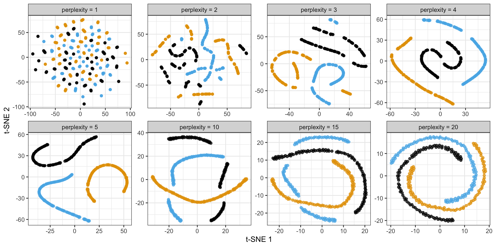
\(\sigma_i\) is the variance of Gaussian centered at \(x_i\) controlled by perplexity: \(\log (\text { perplexity })=-\sum_j p_{j \mid i} \log _2 p_{j \mid i}\)
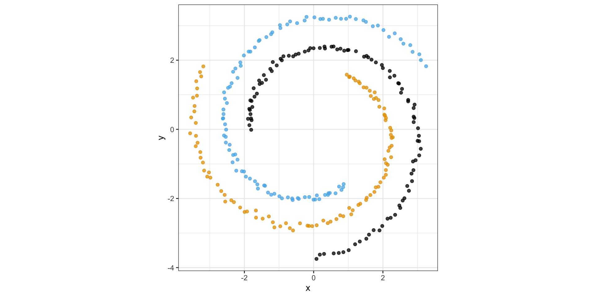
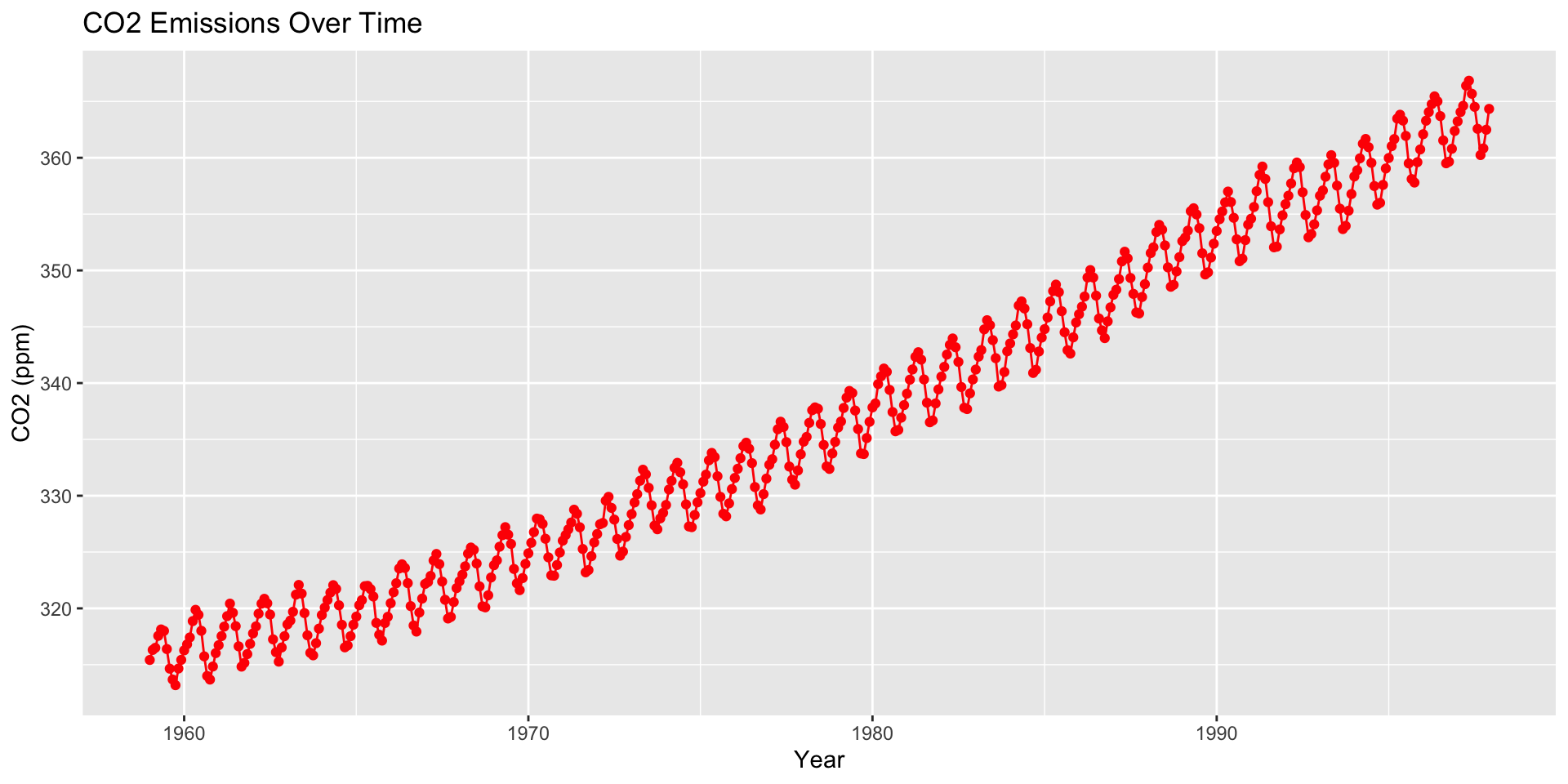
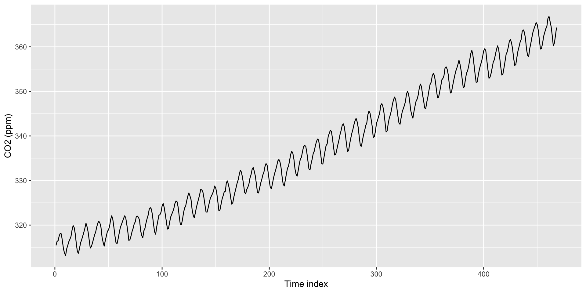
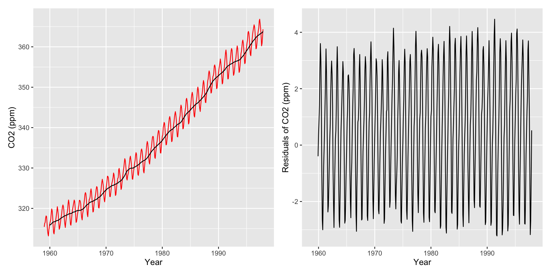
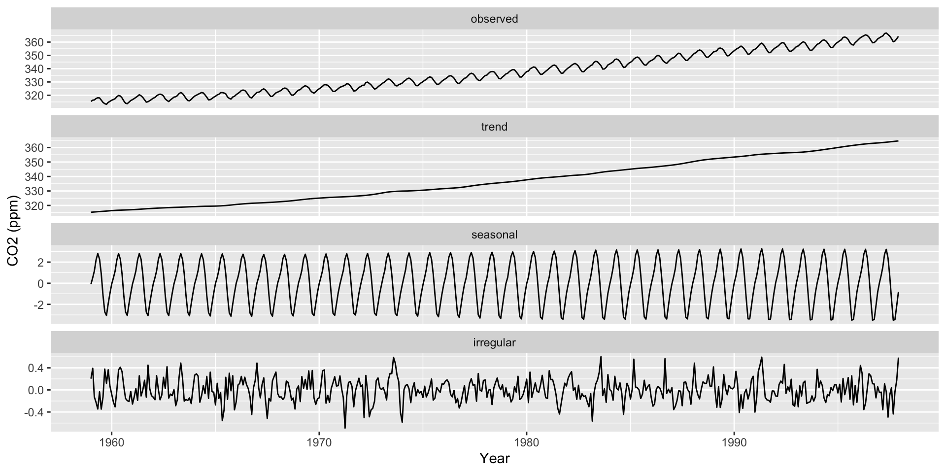
Consider a single observation measured across time
Variable
\(T_1\)
\(T_2\)
\(\dots\)
\(T_J\)
\(X_1\)
\(x_{11}\)
\(x_{12}\)
\(\dots\)
\(x_{1J}\)
\(X_2\)
\(x_{21}\)
\(x_{22}\)
\(\dots\)
\(x_{2J}\)
\(\vdots\)
\(\vdots\)
\(\vdots\)
\(\dots\)
\(\vdots\)
\(X_P\)
\(x_{P1}\)
\(x_{P2}\)
\(\dots\)
\(x_{PJ}\)
With \(N\) observations we have \(N\) of these matrices
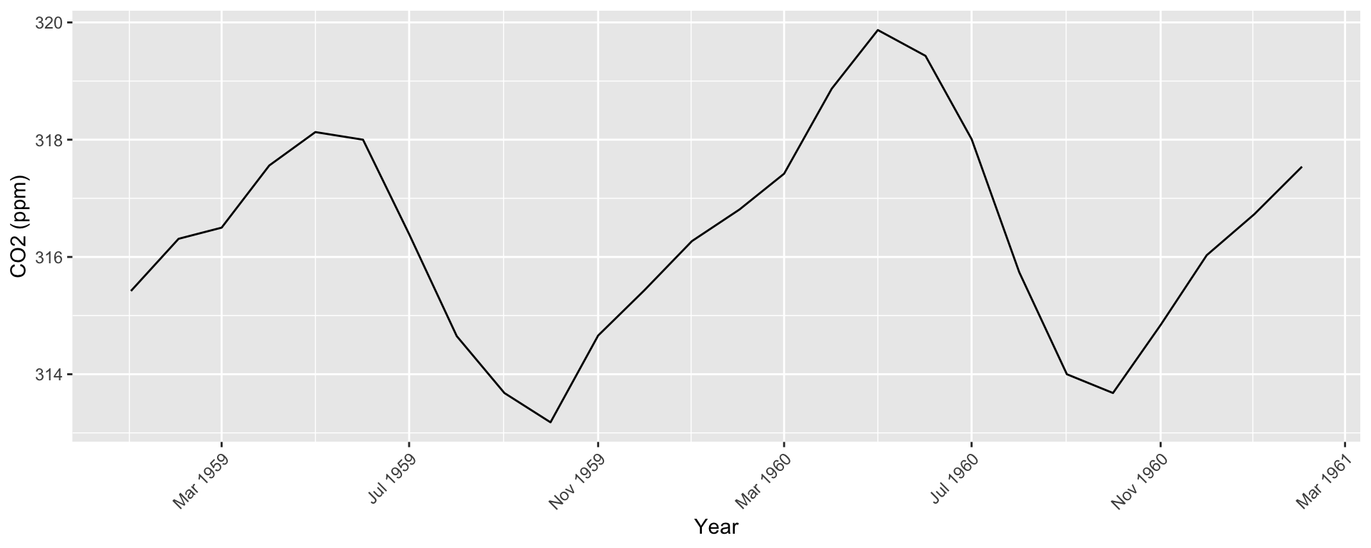
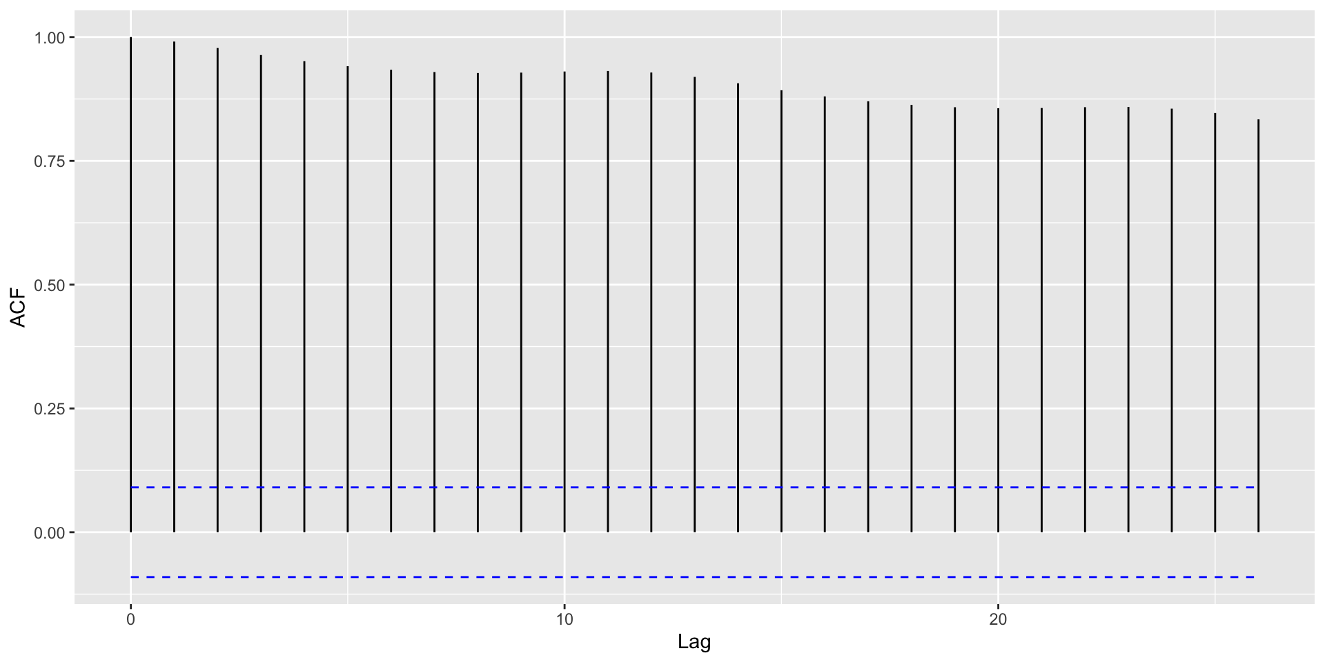
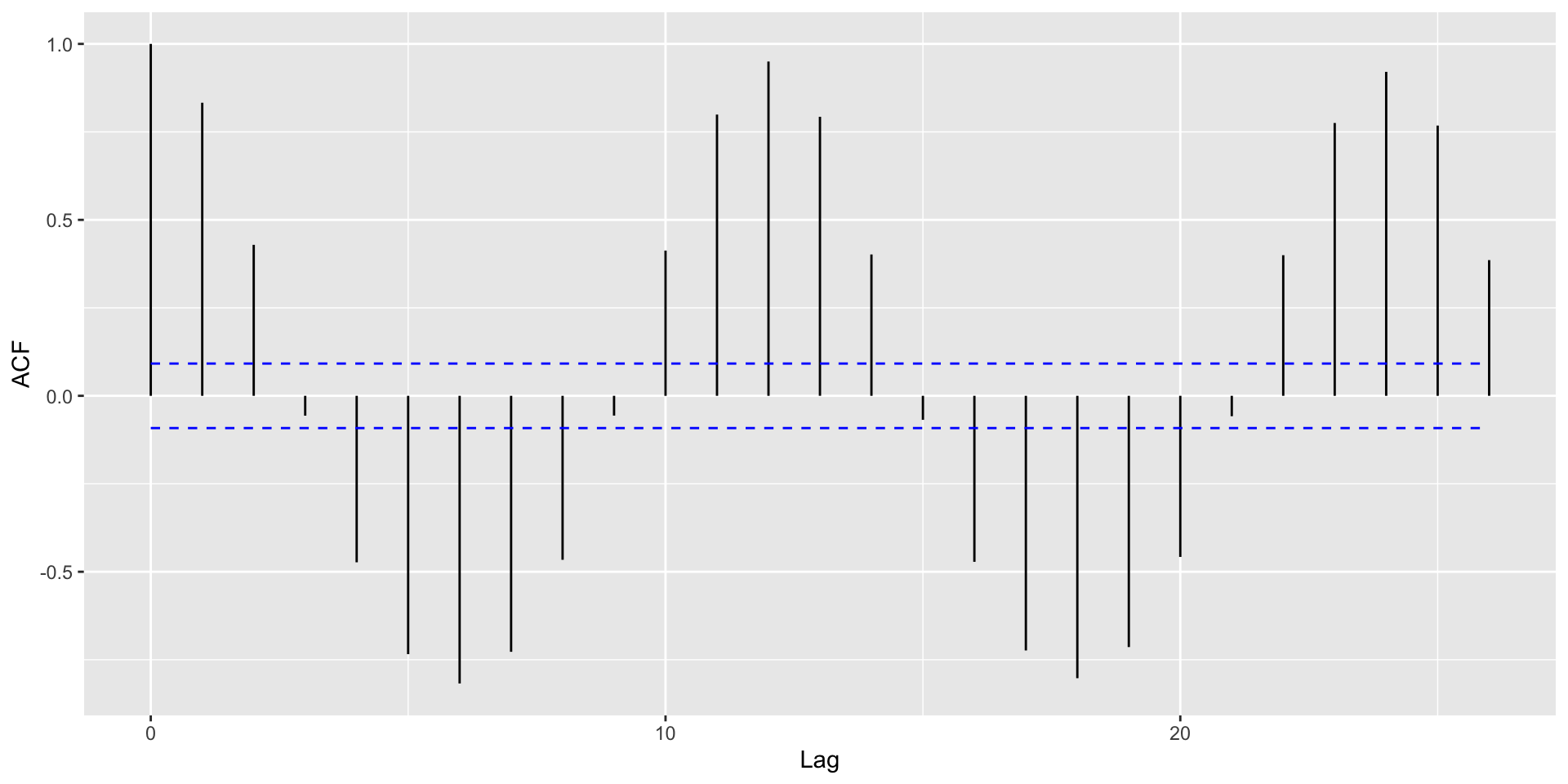
Time may consist of regularly spaced intervals
For example, \(T_1 = t\), \(T_2 = t + h\), \(T_3 = t + 2h\), etc.
Irregularly spaced intervals, then work with the raw \(T_1,T_2,...\)
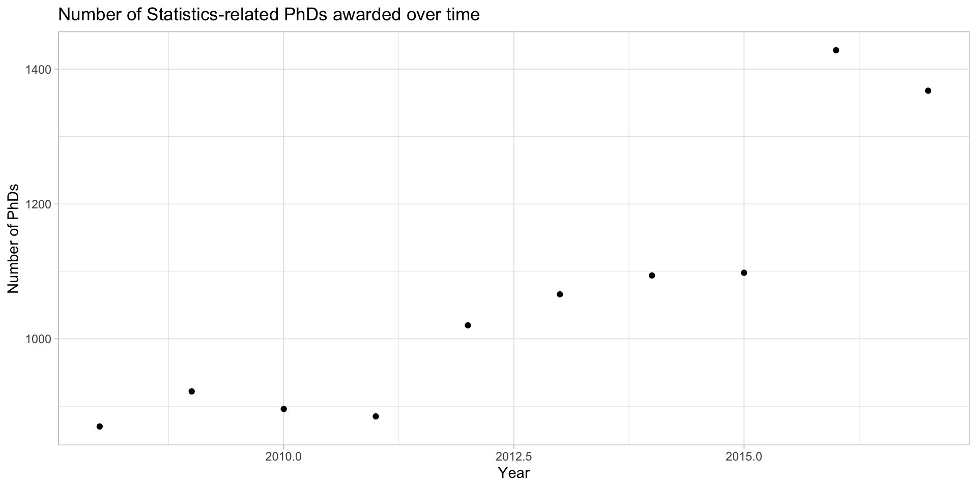
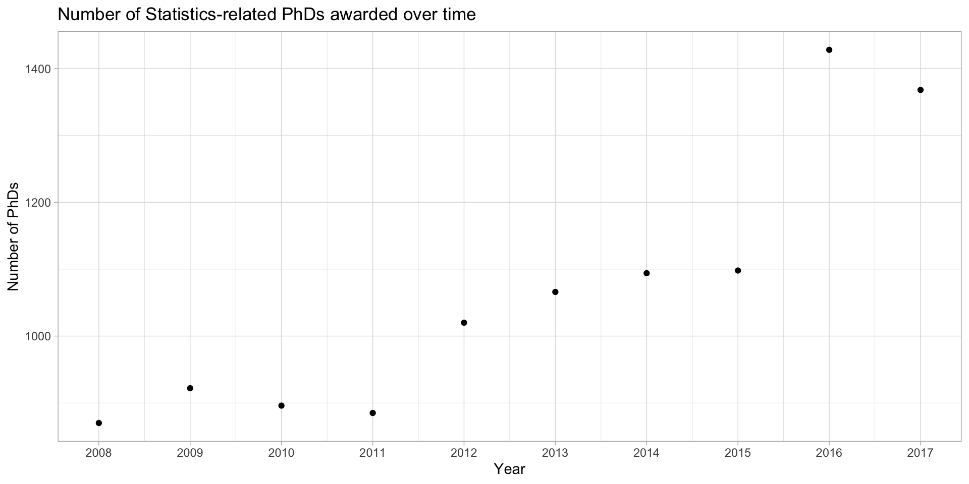
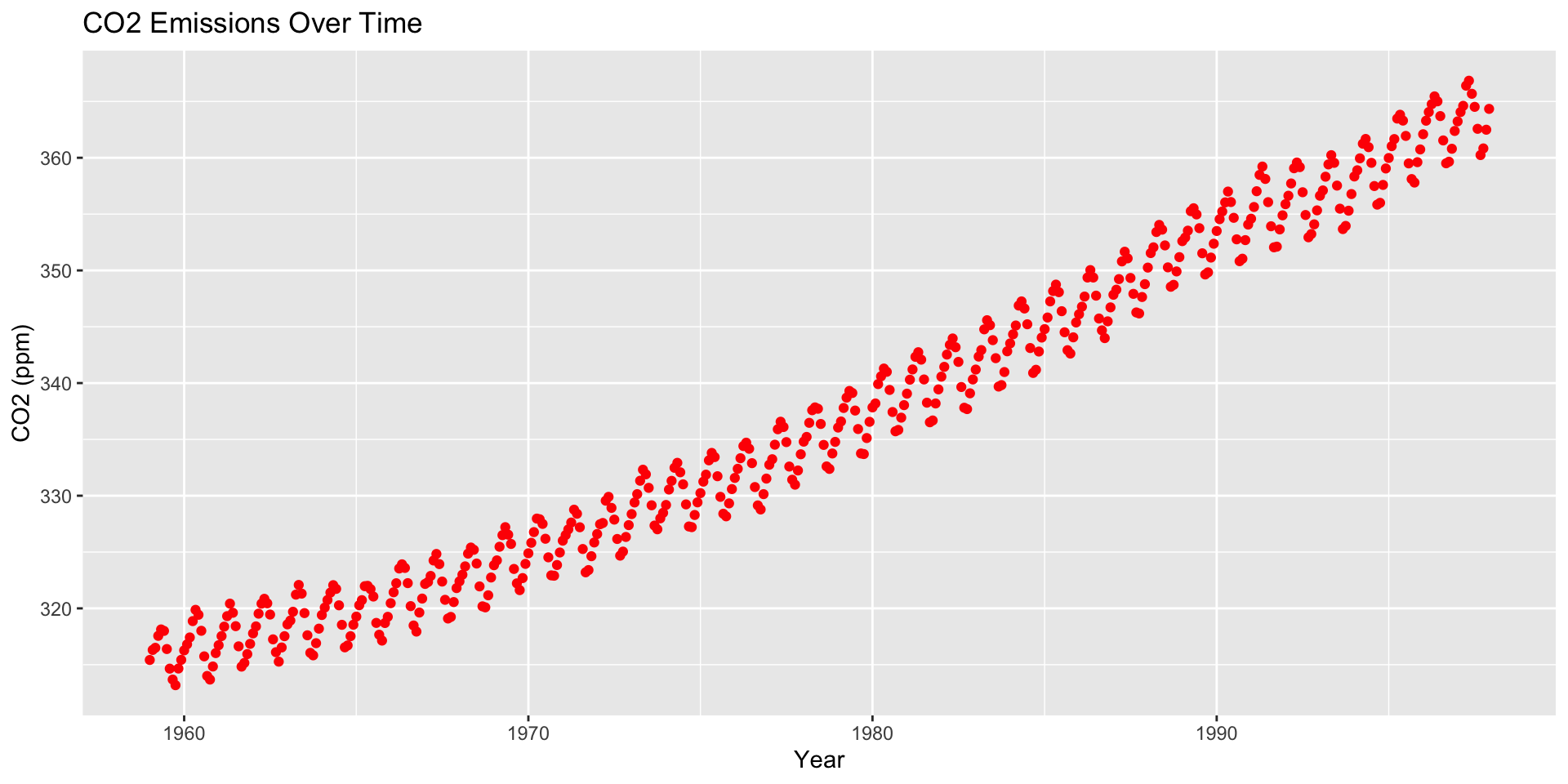
Example: Statistics PhDs by year
stat_phd_year_summary |>ggplot(aes(x = year, y = n_phds)) +geom_point() +theme_light() +labs(x ="Year", y ="Number of PhDs", title ="Number of Statistics-related PhDs awarded over time")
Example: Statistics PhDs by year
stat_phd_year_summary |>ggplot(aes(x = year, y = n_phds)) +geom_point() +scale_x_continuous(breaks =unique(stat_phd_year_summary$year), labels =unique(stat_phd_year_summary$year)) +theme_light() +labs(x ="Year", y ="Number of PhDs", title ="Number of Statistics-related PhDs awarded over time")
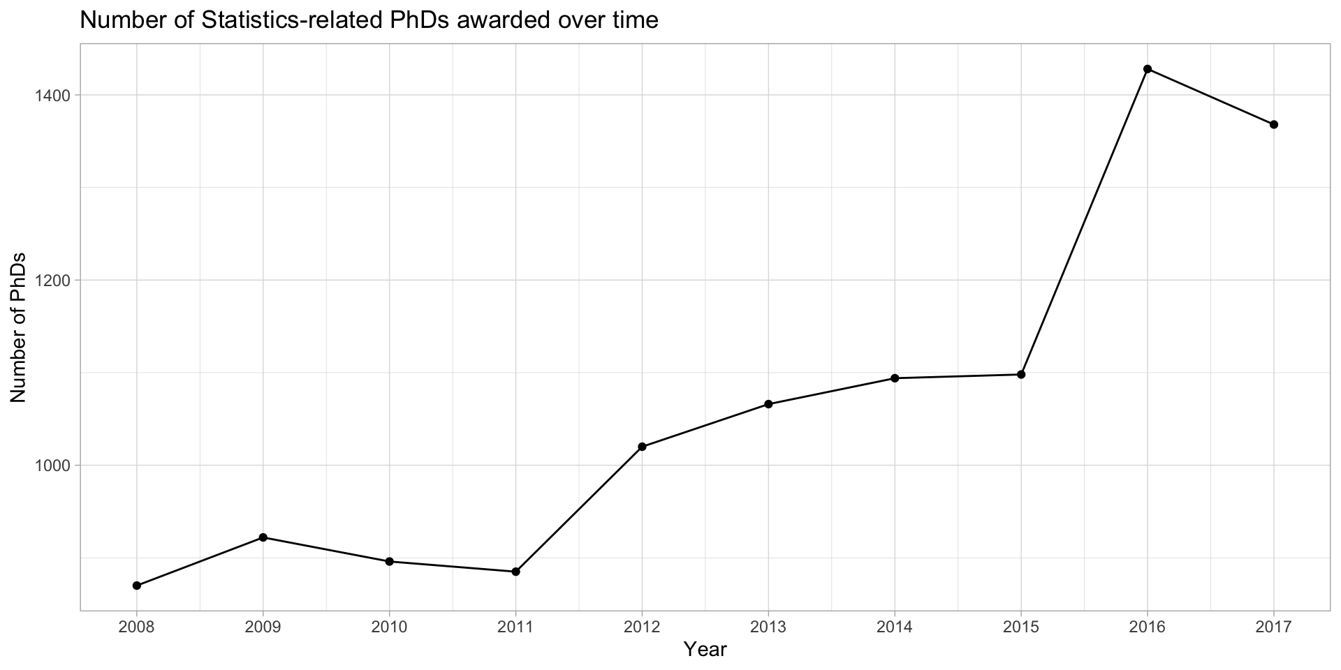
Add lines to emphasize order
stat_phd_year_summary |>ggplot(aes(x = year, y = n_phds)) +geom_point() +geom_line() +scale_x_continuous(breaks =unique(stat_phd_year_summary$year),labels =unique(stat_phd_year_summary$year)) +theme_light() +labs(x ="Year", y ="Number of PhDs",title ="Number of Statistics-related PhDs awarded over time")
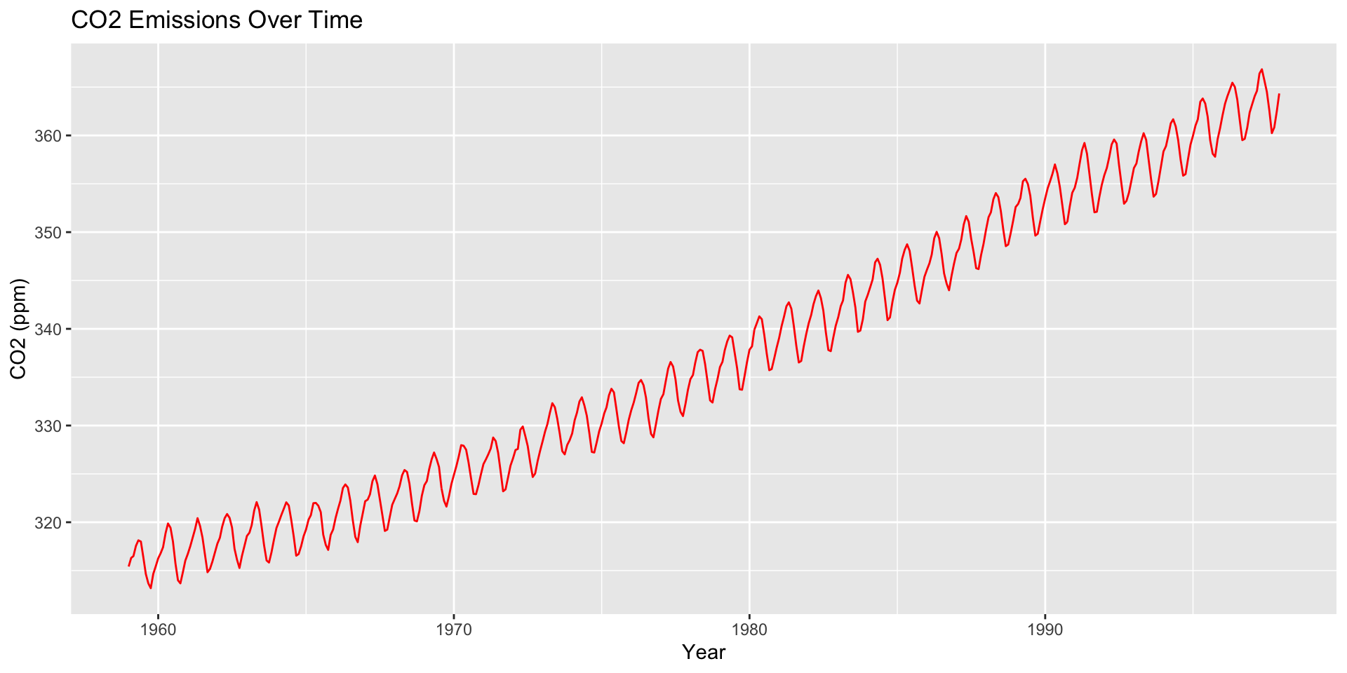
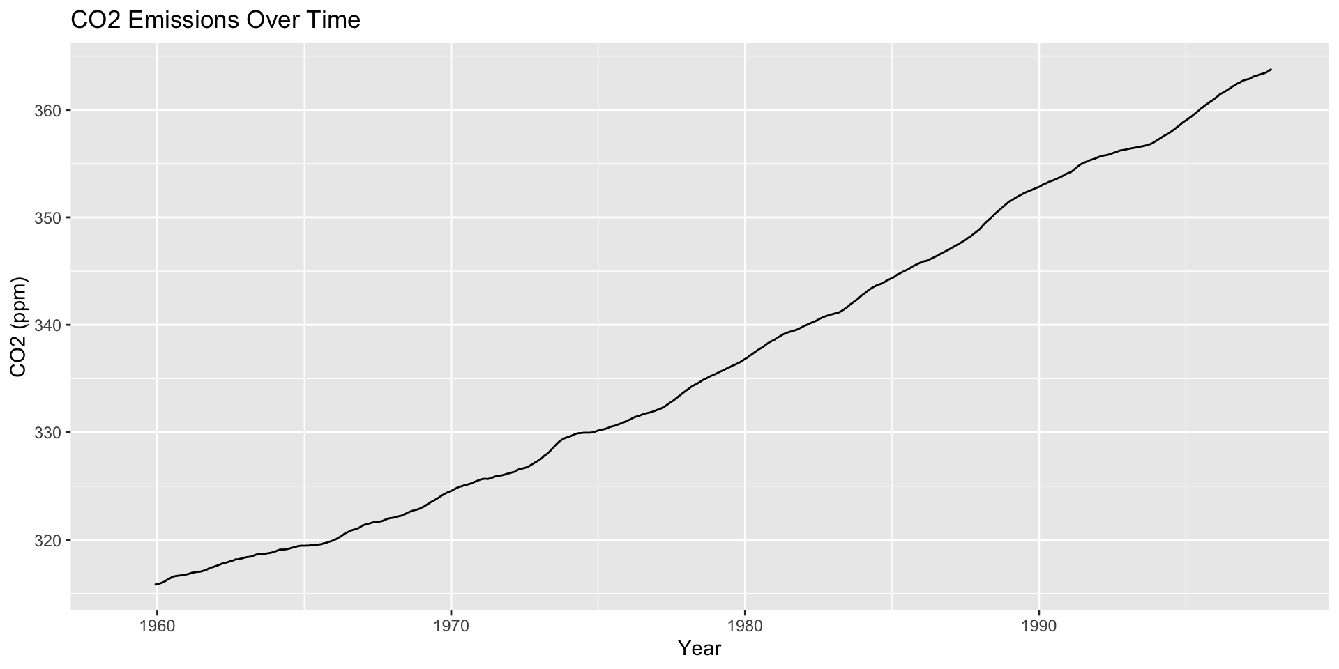
Drop points to emphasize trends
stat_phd_year_summary |>ggplot(aes(x = year, y = n_phds)) +geom_line() +scale_x_continuous(breaks =unique(stat_phd_year_summary$year),labels =unique(stat_phd_year_summary$year)) +theme_light() +labs(x ="Year", y ="Number of PhDs",title ="Number of Statistics-related PhDs awarded over time")
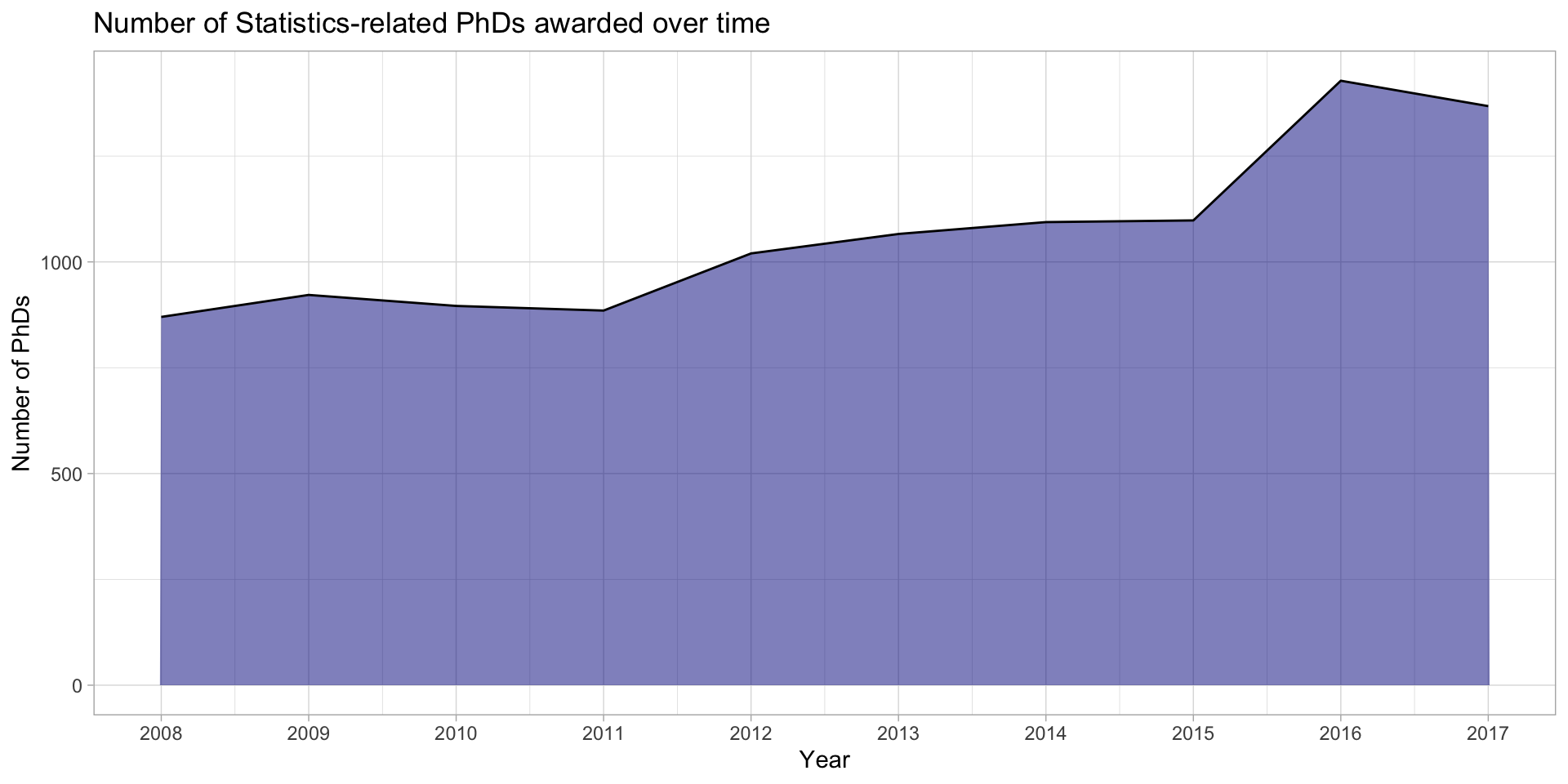
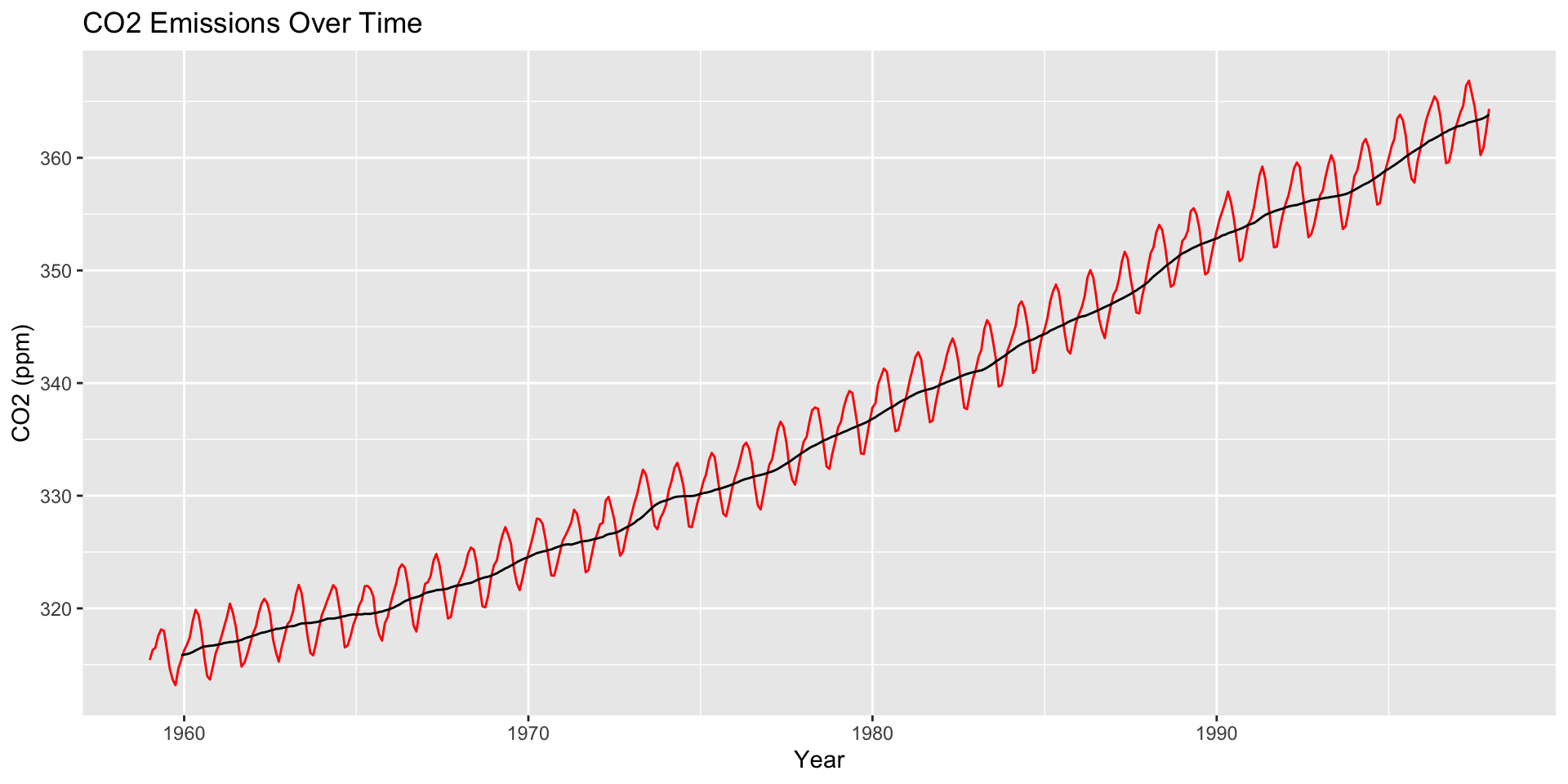
Can fill the area under the line
stat_phd_year_summary |>ggplot(aes(x = year, y = n_phds)) +geom_area(fill ="darkblue", alpha =0.5) +geom_line() +scale_x_continuous(breaks =unique(stat_phd_year_summary$year),labels =unique(stat_phd_year_summary$year)) +theme_light() +labs(x ="Year", y ="Number of PhDs",title ="Number of Statistics-related PhDs awarded over time")
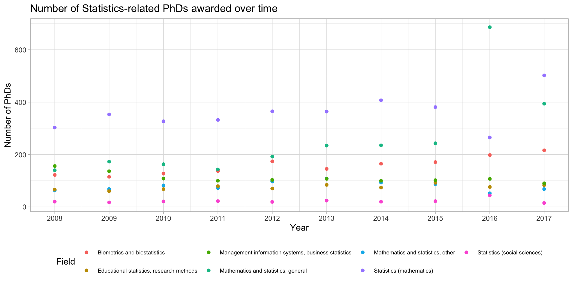
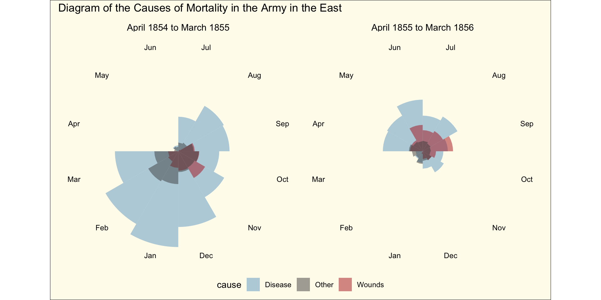
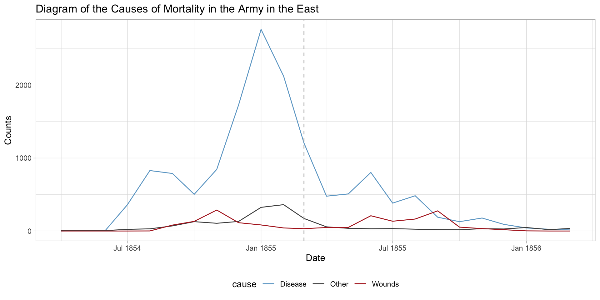
Several time series? Do NOT only use points
stats_phds |>ggplot(aes(x = year, y = n_phds, color = field)) +geom_point() +scale_x_continuous(breaks =unique(stat_phd_year_summary$year),labels =unique(stat_phd_year_summary$year)) +theme_light() +theme(legend.position ="bottom", legend.text =element_text(size =7)) +labs(x ="Year", y ="Number of PhDs",title ="Number of Statistics-related PhDs awarded over time",color ="Field")
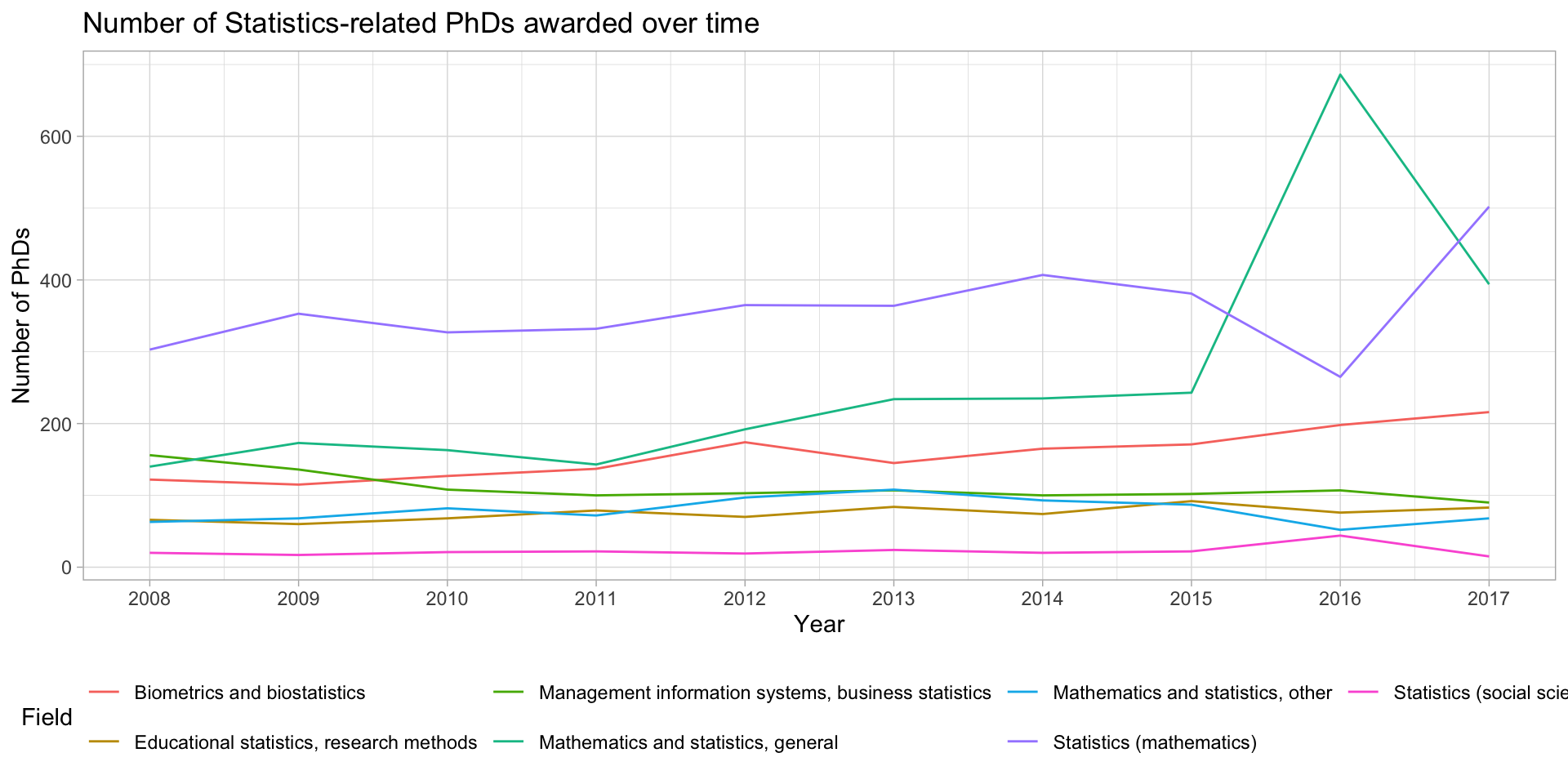
Several time series? Use lines!
stats_phds |>ggplot(aes(x = year, y = n_phds, color = field)) +geom_line() +scale_x_continuous(breaks =unique(stat_phd_year_summary$year),labels =unique(stat_phd_year_summary$year)) +theme_light() +theme(legend.position ="bottom") +labs(x ="Year", y ="Number of PhDs", color ="Field",title ="Number of Statistics-related PhDs awarded over time")
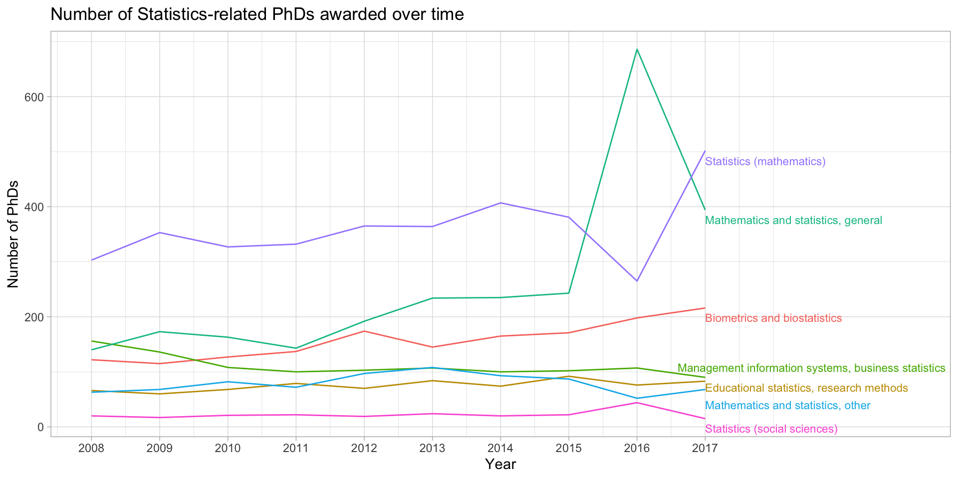
stats_phds_2017 <- stats_phds |>filter(year ==2017)library(ggrepel)stats_phds |>ggplot(aes(x = year, y = n_phds, color = field)) +geom_line() +# Add the labels:geom_text_repel(data = stats_phds_2017, aes(label = field),size =3, # Drop the segment connection:segment.color =NA, # Move labels up or down based on overlapdirection ="y",# Try to align the labels horizontally on the left hand sidehjust ="left") +scale_x_continuous(breaks =unique(stat_phd_year_summary$year),labels =unique(stat_phd_year_summary$year),# Update the limits so that there is some padding on the# x-axis but don't label the new maximumlimits =c(min(stat_phd_year_summary$year),max(stat_phd_year_summary$year) +3)) +theme_light() +theme(legend.position ="none") +labs(x ="Year", y ="Number of PhDs", color ="Field",title ="Number of Statistics-related PhDs awarded over time")
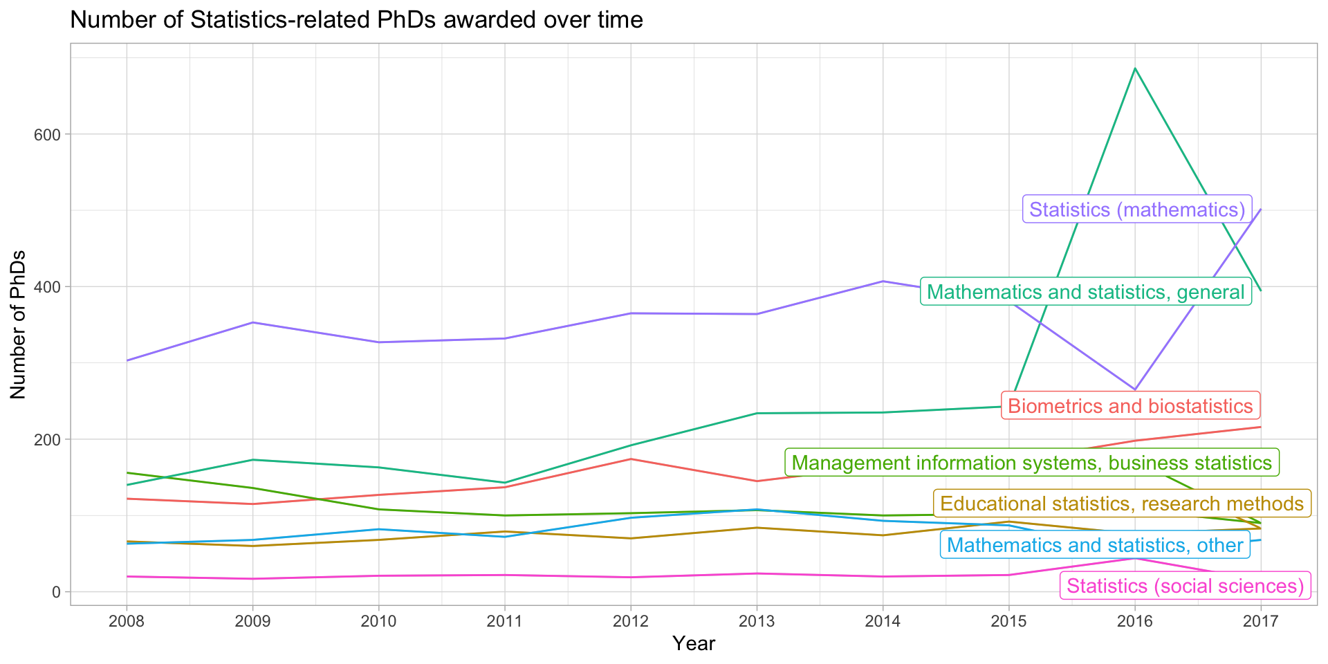
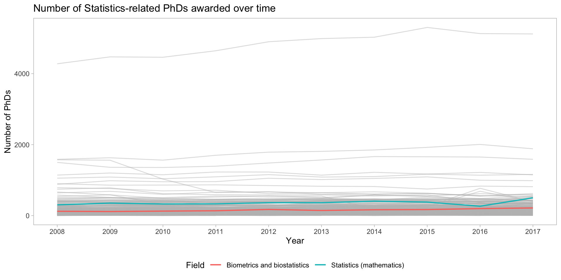
library(gghighlight)stats_phds |>ggplot(aes(x = year, y = n_phds, color = field)) +geom_line() +gghighlight() +scale_x_continuous(breaks =unique(stat_phd_year_summary$year),labels =unique(stat_phd_year_summary$year)) +theme_light() +theme(legend.position ="none") +labs(x ="Year", y ="Number of PhDs", color ="Field",title ="Number of Statistics-related PhDs awarded over time")
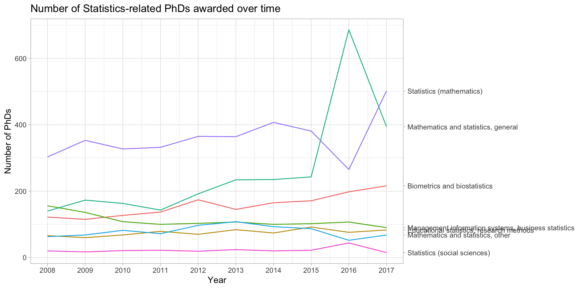
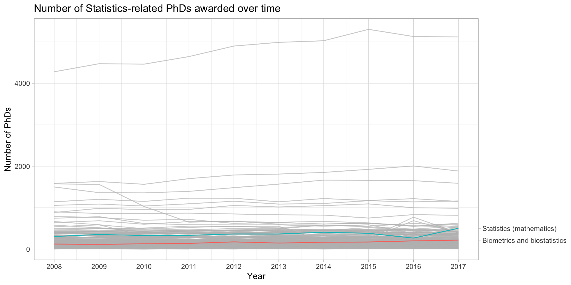
library(gghighlight)stats_phds |>ggplot(aes(x = year, y = n_phds, color = field)) +geom_line() +gghighlight(line_label_type ="sec_axis") +scale_x_continuous(breaks =unique(stat_phd_year_summary$year),labels =unique(stat_phd_year_summary$year)) +theme_light() +theme(legend.position ="none") +labs(x ="Year", y ="Number of PhDs", color ="Field",title ="Number of Statistics-related PhDs awarded over time")
phd_field |>ggplot(aes(x = year, y = n_phds, color = field)) +geom_line() +scale_x_continuous(breaks =unique(stat_phd_year_summary$year),labels =unique(stat_phd_year_summary$year)) +theme_light() +theme(legend.position ="none") +labs(x ="Year", y ="Number of PhDs", color ="Field",title ="Number of Statistics-related PhDs awarded over time")
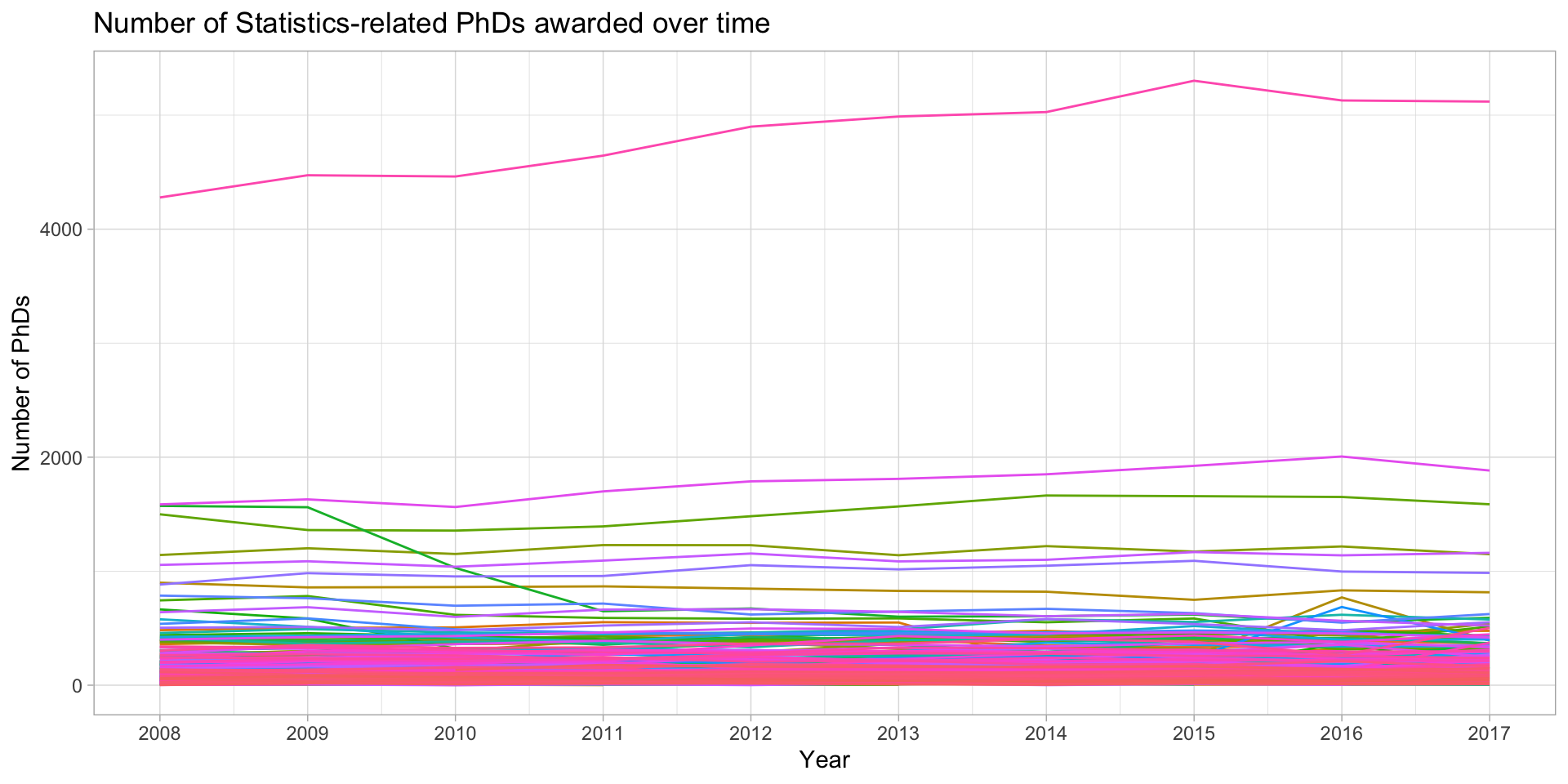
How do we plot many lines? NOT LIKE THIS!
Instead we highlight specific lines
phd_field |>filter(!(field %in%c("Biometrics and biostatistics", "Statistics (mathematics)"))) |>ggplot() +# Add the background lines - need to specify the group to be the fieldgeom_line(aes(x = year, y = n_phds, group = field),color ="gray", size = .5, alpha = .5) +# Now add the layer with the lines of interest:geom_line(data =filter(phd_field,# Note this is just the opposite of the above since ! is removed field %in%c("Biometrics and biostatistics", "Statistics (mathematics)")),aes(x = year, y = n_phds, color = field),# Make the size largersize = .75, alpha =1) +scale_x_continuous(breaks =unique(stat_phd_year_summary$year),labels =unique(stat_phd_year_summary$year)) +theme_light() +theme(legend.position ="bottom", # Drop the panel lines making the gray difficult to seepanel.grid =element_blank()) +labs(x ="Year", y ="Number of PhDs", color ="Field",title ="Number of Statistics-related PhDs awarded over time")
phd_field |>ggplot(aes(x = year, y = n_phds, color = field)) +geom_line() +gghighlight(field %in%c("Biometrics and biostatistics", "Statistics (mathematics)"),line_label_type ="sec_axis") +scale_x_continuous(breaks =unique(stat_phd_year_summary$year),labels =unique(stat_phd_year_summary$year)) +theme_light() +theme(legend.position ="none") +labs(x ="Year", y ="Number of PhDs", color ="Field",title ="Number of Statistics-related PhDs awarded over time")