Time series and intro to spatial data
2024-09-25
Reminders, previously, and today…
Walked through non-linear dimension reduction with t-SNE
Discussed visualizing trends, highglighting points of emphasis
Things of interest for time series data
Time series can be characterized by three features:
Trends : Does the variable increase or decrease over time, on average?
Seasonality : Are there changes in the variable that regularly happen (e.g., every winter, every hour, etc.)? Sometimes called periodicity.
Noise : Variation in the variable beyond average trends and seasonality.
Moving averages are a starting point for visualizing how a trend changes over time
Be responsible with your axes!
Be responsible with your axes!
Moving Average Plots
The Financial Times COVID-19 plots displayed a moving average (sometimes called a rolling average )
Intuition
Divide your data into small subsets (“windows”)
Compute the average within each window
Connect the averages together to make a trend line
Sometimes called a simple moving average
This is exactly what we did with LOESS… we called this a sliding window , but it’s the same thing
How are moving averages computed?
Intuition
Divide your data into small subsets (windows )
Compute the average within each window
Connect the averages together to make a trend line
Mathematically, a moving average can be written as the following:
\[\mu_k = \frac{\sum_{t=k - h + 1}^k X_t}{h}\]
Working with Time Series
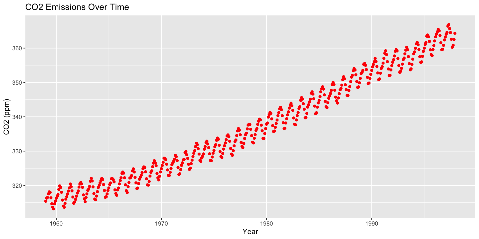
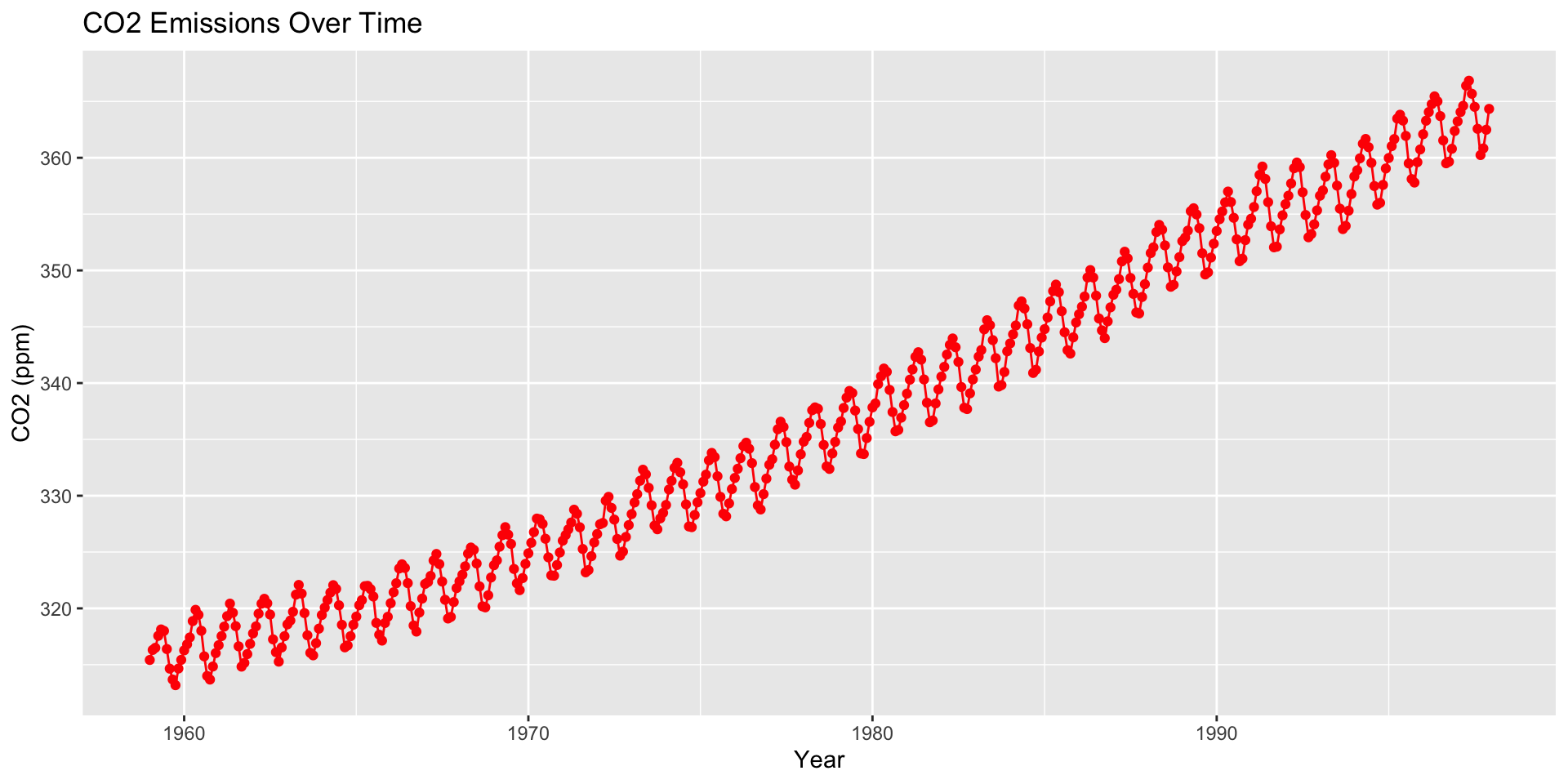
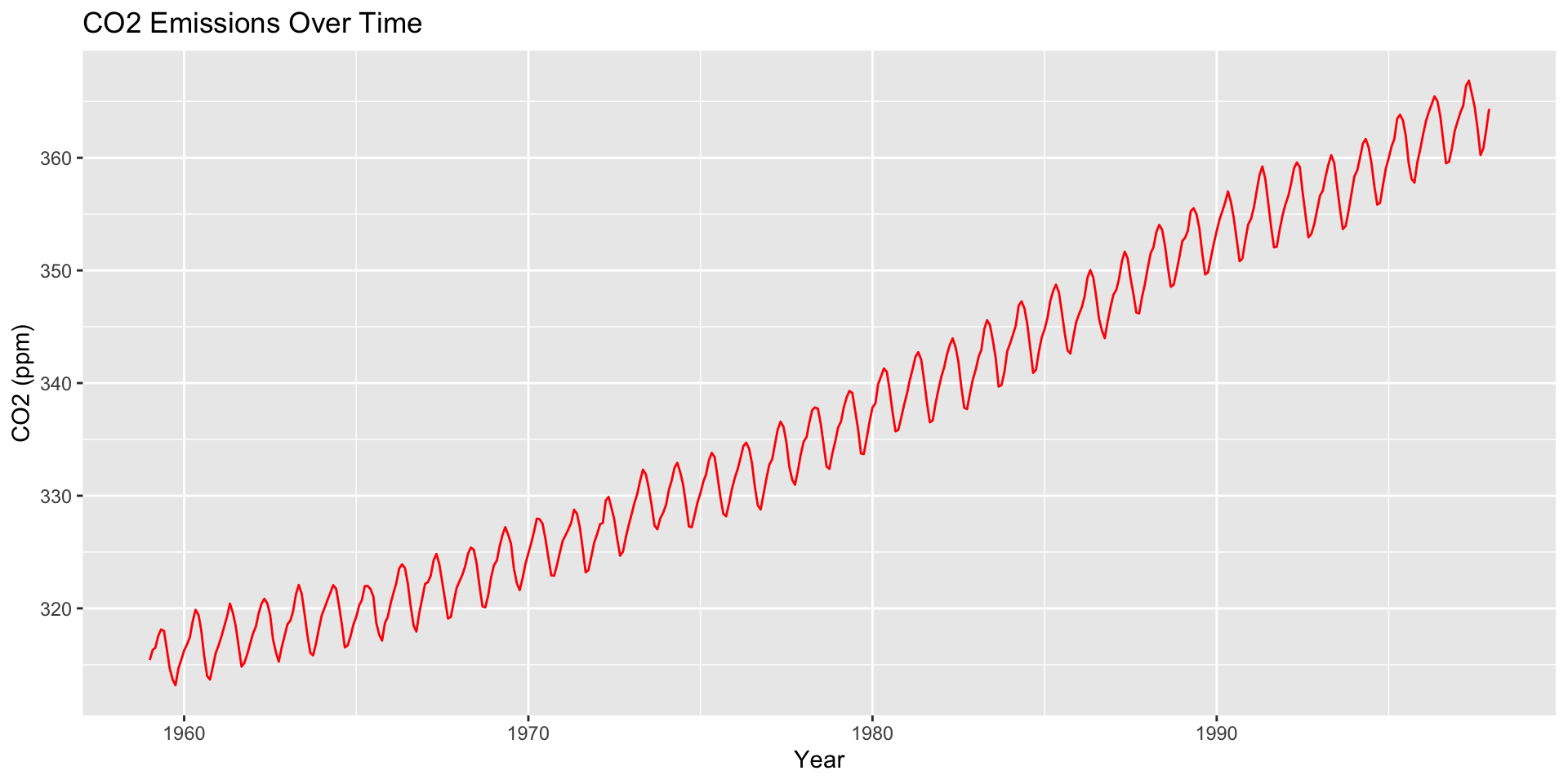
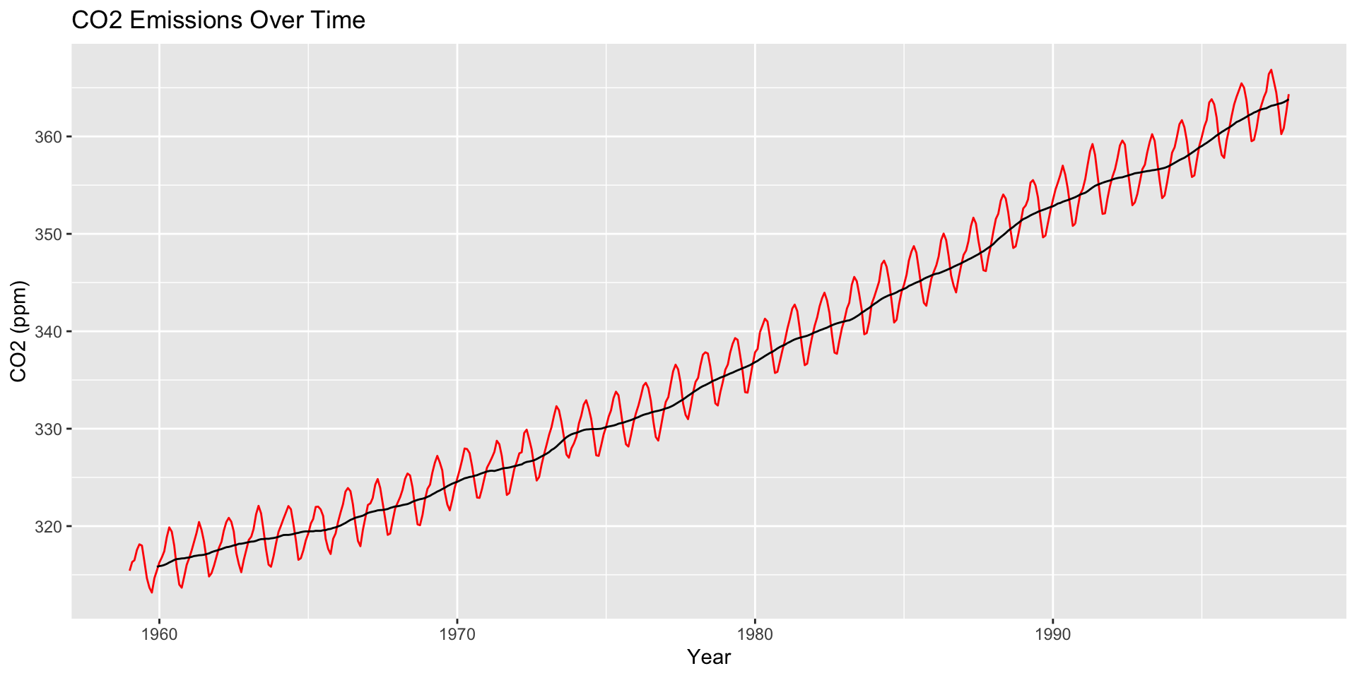
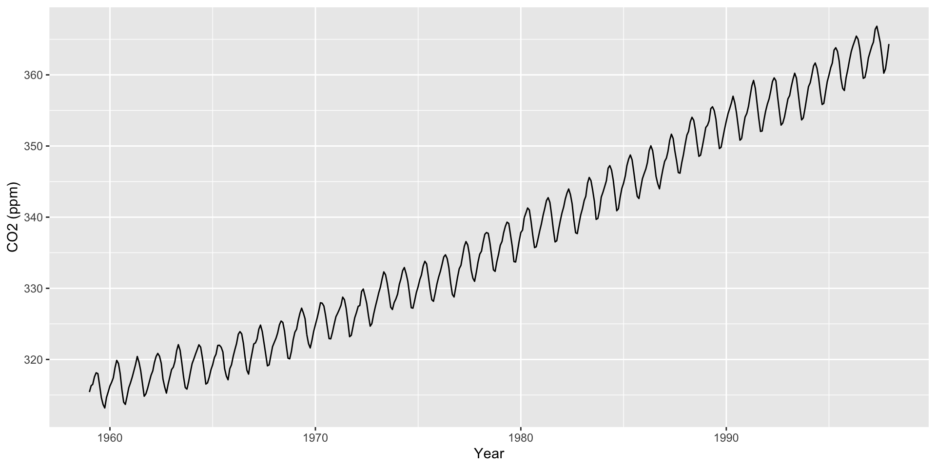
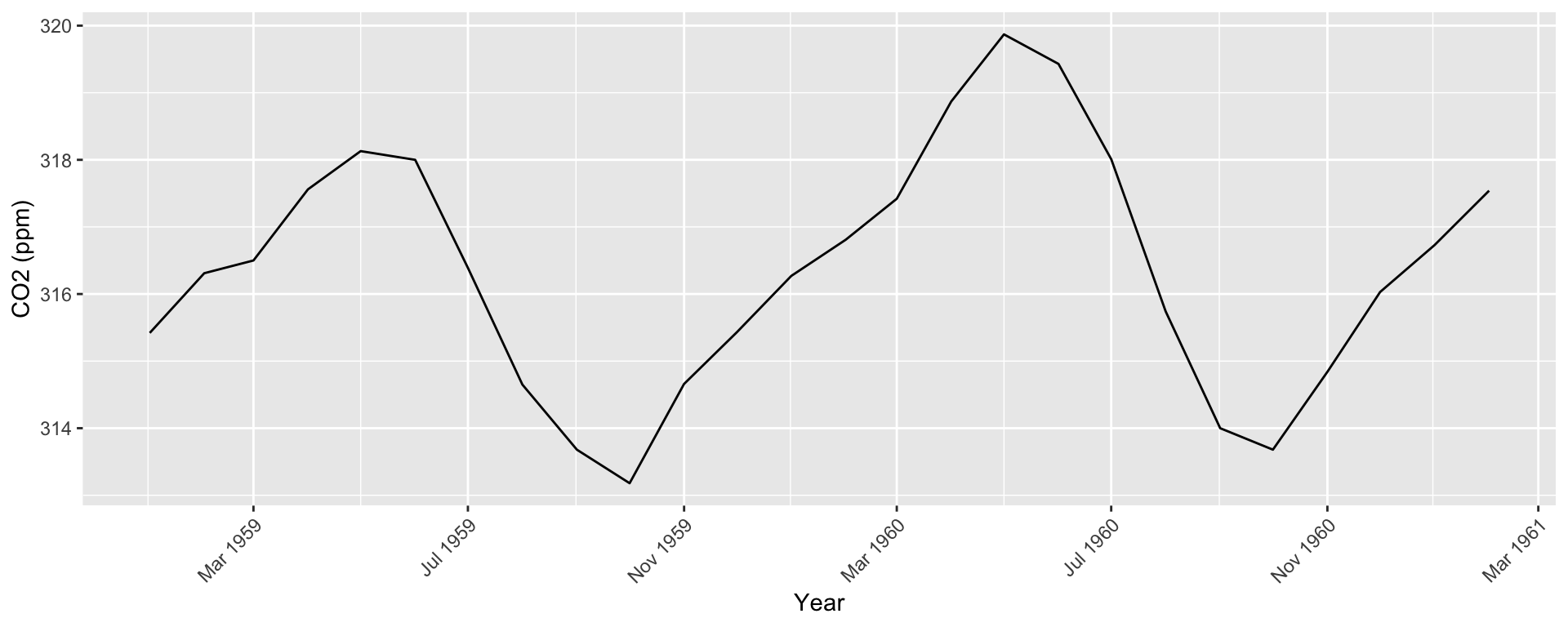
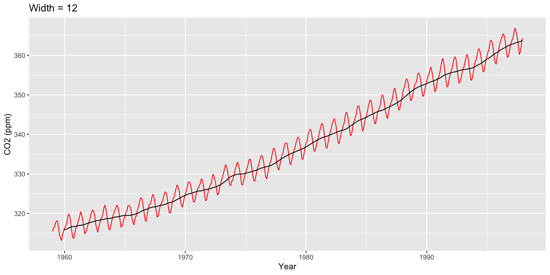
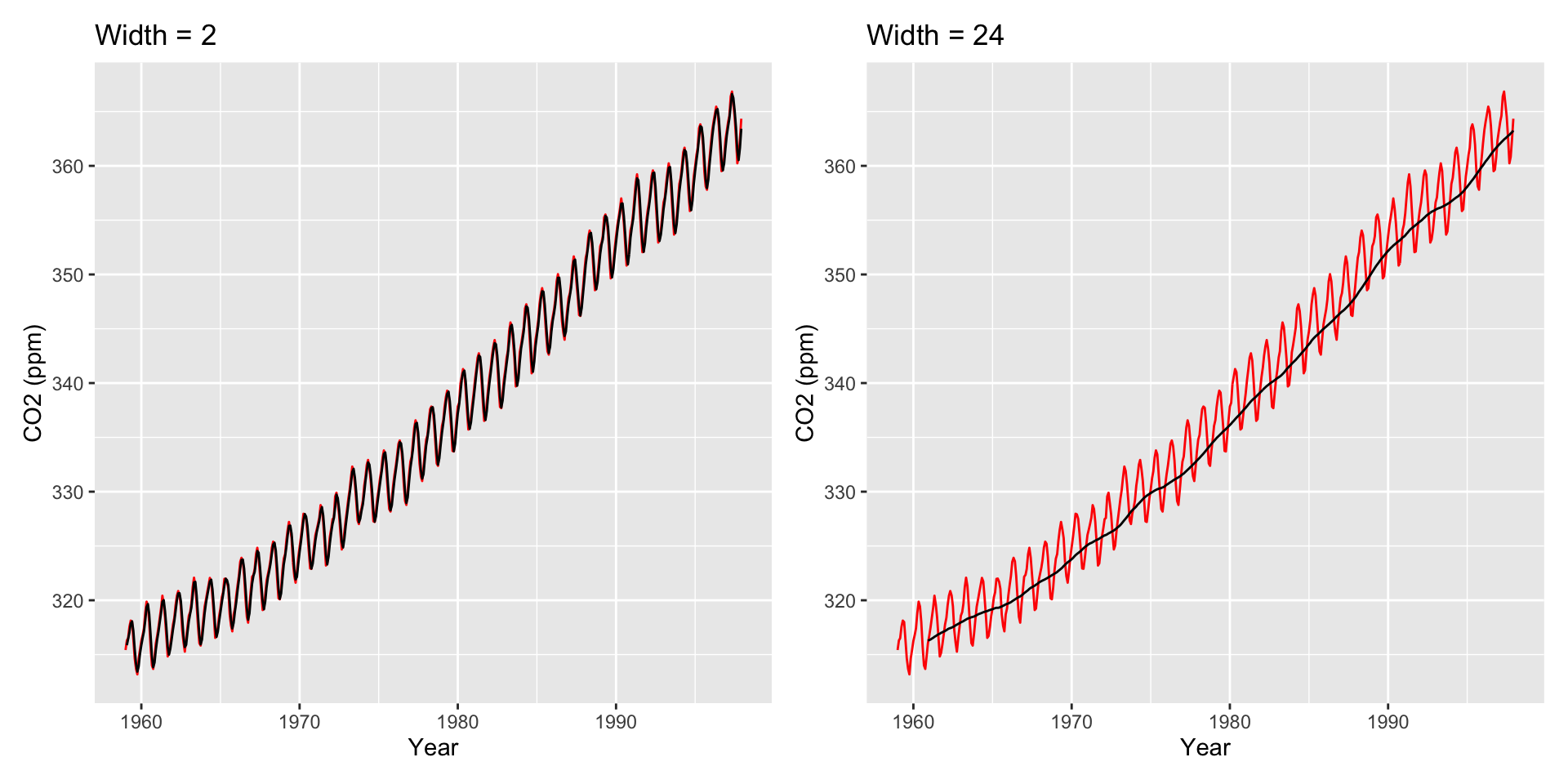
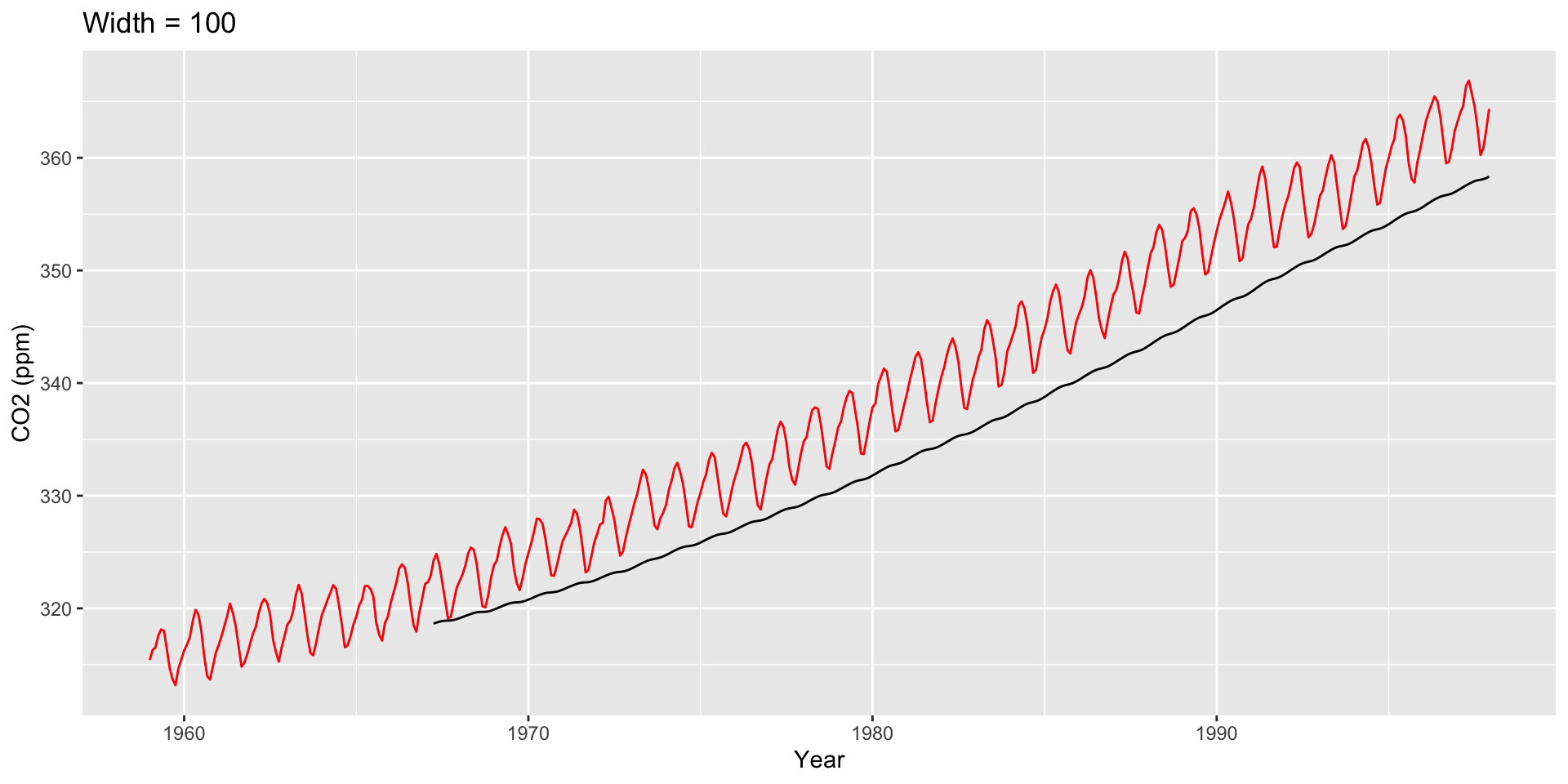
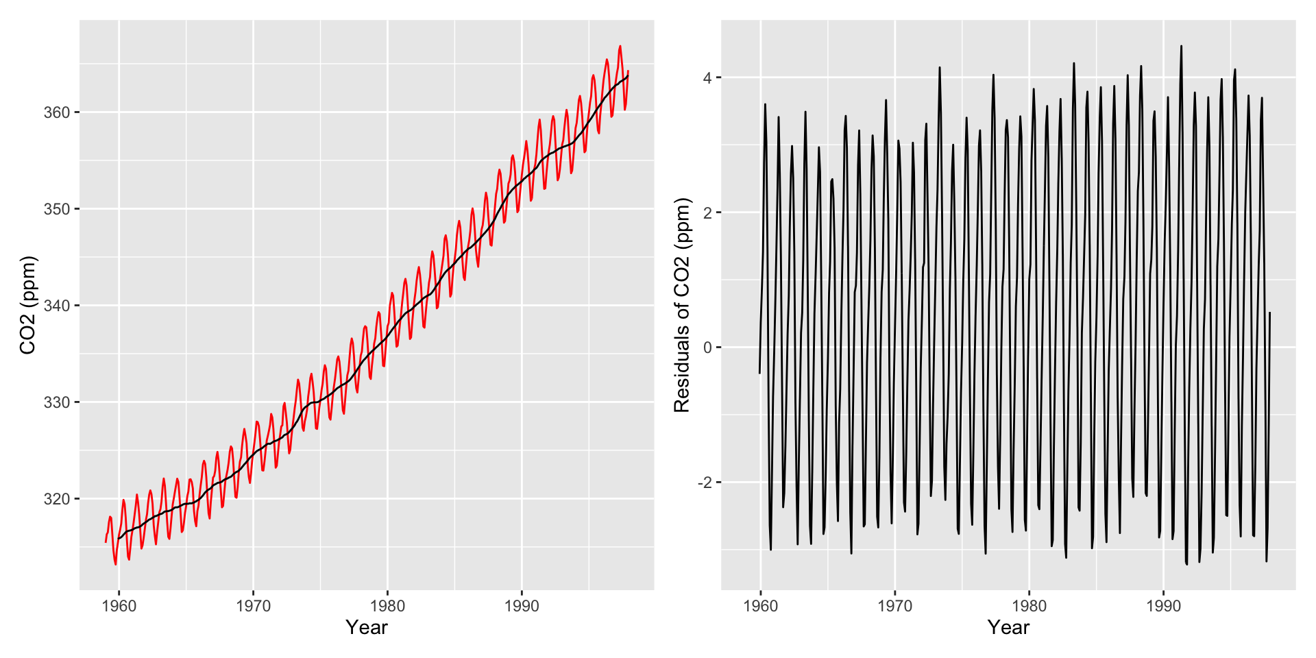
co2: Mauna Loa Atmospheric CO2 Concentration dataset (monthly \(\text{CO}^2\) concentration 1959 to 1997)
|> ggplot (aes (x = obs_i, y = co2_val)) + geom_line () + labs (x = "Time index" , y = "CO2 (ppm)" )
Use scale_x_date() to create interpretable axis labels
Use ggseas
library (ggseas)|> ggplot (aes (x = obs_date, y = co2_val)) + geom_line (color = "red" ) + stat_rollapplyr (width = 12 , align = "right" ) + labs (x = "Year" , y = "CO2 (ppm)" , title = "Width = 12" )
Other Moving Averages
Two other common averages: Cumulative moving averages and weighted moving averages.
Cumulative moving average : The average at time \(k\) is the average of all points at and before \(k\) . Mathematically:
\[\mu_k^{(CMA)} = \frac{\sum_{t=1}^k X_t}{k}\]
Weighted moving average : Same as simple moving average, but different measurements get different weights for the average.
\[\mu_k^{(WMA)} = \frac{\sum_{t=k - h + 1}^k X_t \cdot w_t}{ \sum_{t=k - h + 1}^k w_t}\]
Working with lags
Time series data is fundamentally different from other data problems we’ve worked with because measurements are not independent
Obvious example: The temperature today is correlated with temperature yesterday. (Maybe not in Pittsburgh? )
Important term: lags . Used to determine if one time point influences future time points.
Lag 1: Comparing time series at time \(t\) with time series at time \(t - 1\) .
Lag 2: Comparing time series at time \(t\) with time series at time \(t - 2\) .
And so on…
Let’s say we have time measurements \((X_1, X_2, X_3, X_4, X_5)\) .
The \(\ell = 1\) lag is \((X_2, X_3, X_4, X_5)\) vs \((X_1, X_2, X_3, X_4)\) .
The \(\ell = 2\) lag is \((X_3, X_4, X_5)\) vs \((X_1, X_2, X_3)\) .
Consider: Are previous outcomes (lags) predictive of future outcomes?
Autocorrelation
Autocorrelation : Correlation between a time series and a lagged version of itself.
Define \(r_{\ell}\) as the correlation between a time series and Lag \(\ell\) of that time series.
Lag 1: \(r_1\) is correlation between \((X_2, X_3, X_4, X_5)\) and \((X_1,X_2,X_3,X_4)\)
Lag 2: \(r_2\) is correlation between \((X_3, X_4, X_5)\) and \((X_1,X_2,X_3)\)
And so on…
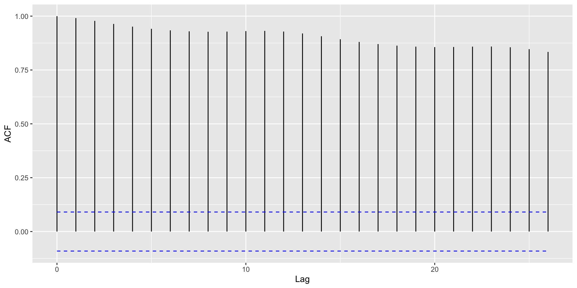
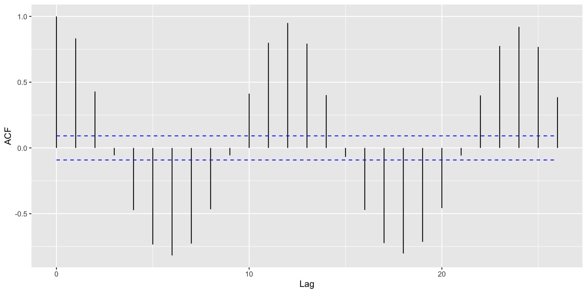
Common diagnostic: Plot \(\ell\) on x-axis, \(r_{\ell}\) on y-axis.
Tells us if correlations are “significantly large” or “significantly small” for certain lags
To make an autocorrelation plot, we use the acf() function; the ggplot version uses autoplot()
Autocorrelation plots
library (ggfortify)<- acf (co2_tbl$ co2_val, plot = FALSE )autoplot (auto_corr)
Autocorrelation Plots and Seasonality
With strong global trends, autocorrelations will be very positive.
. . .
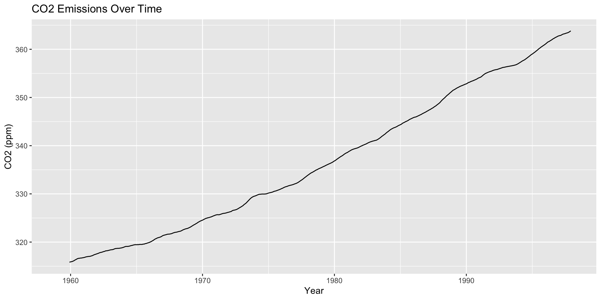
Helpful: Visualize autocorrelations after removing the global trend (compute moving average with rollapply())
Autocorrelation Plots and Seasonality
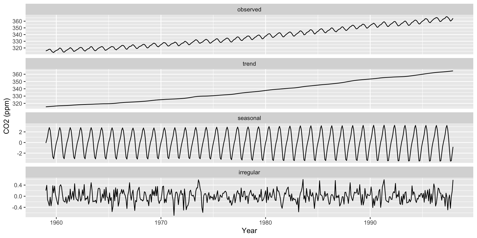
Seasonality Decomposition
Remember that there are three main components to a time series:
Average trends
Seasonality
Noise
. . .
Use ggsdc() (from ggseas
Plots the observed time series.
Plots a loess curve as the global trend.
Plots another loess curve on (observed - trend) as the seasonality.
Plots the noise (observed - trend - seasonality).
Seasonality Decomposition
|> ggsdc (aes (obs_date, co2_val), frequency = 12 , method = "stl" , s.window = 12 ) + geom_line () + labs (x = "Year" , y = "CO2 (ppm)" )
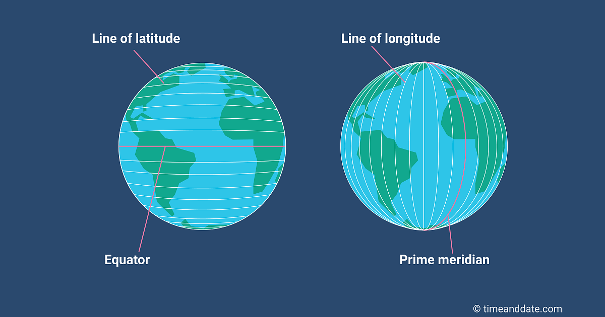
How should we think about spatial data?
Typically location is measured with latitude / longitude (2D)
Latitude and Longitude
Map Projections
Map projections : Transformation of the lat / long coordinates on a sphere (the earth) to a 2D plane
Mercator Projection (1500s)
Mercator Projection (Tissot indicatrix)
Robinson Projection (Standard from 1963-1998)
Robinson Projection (Tissot indicatrix)
Winkel Tripel Projection (proposed 1921, now the standard)
Winkel Tripel Projection (Tissot indicatrix)
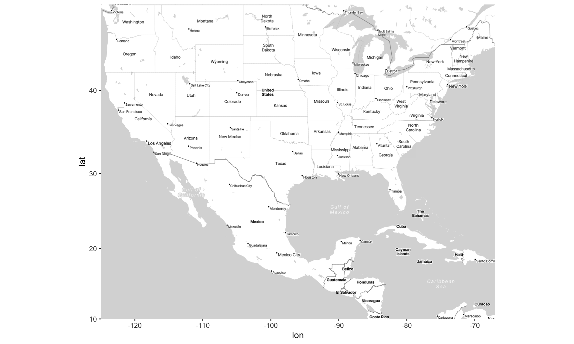
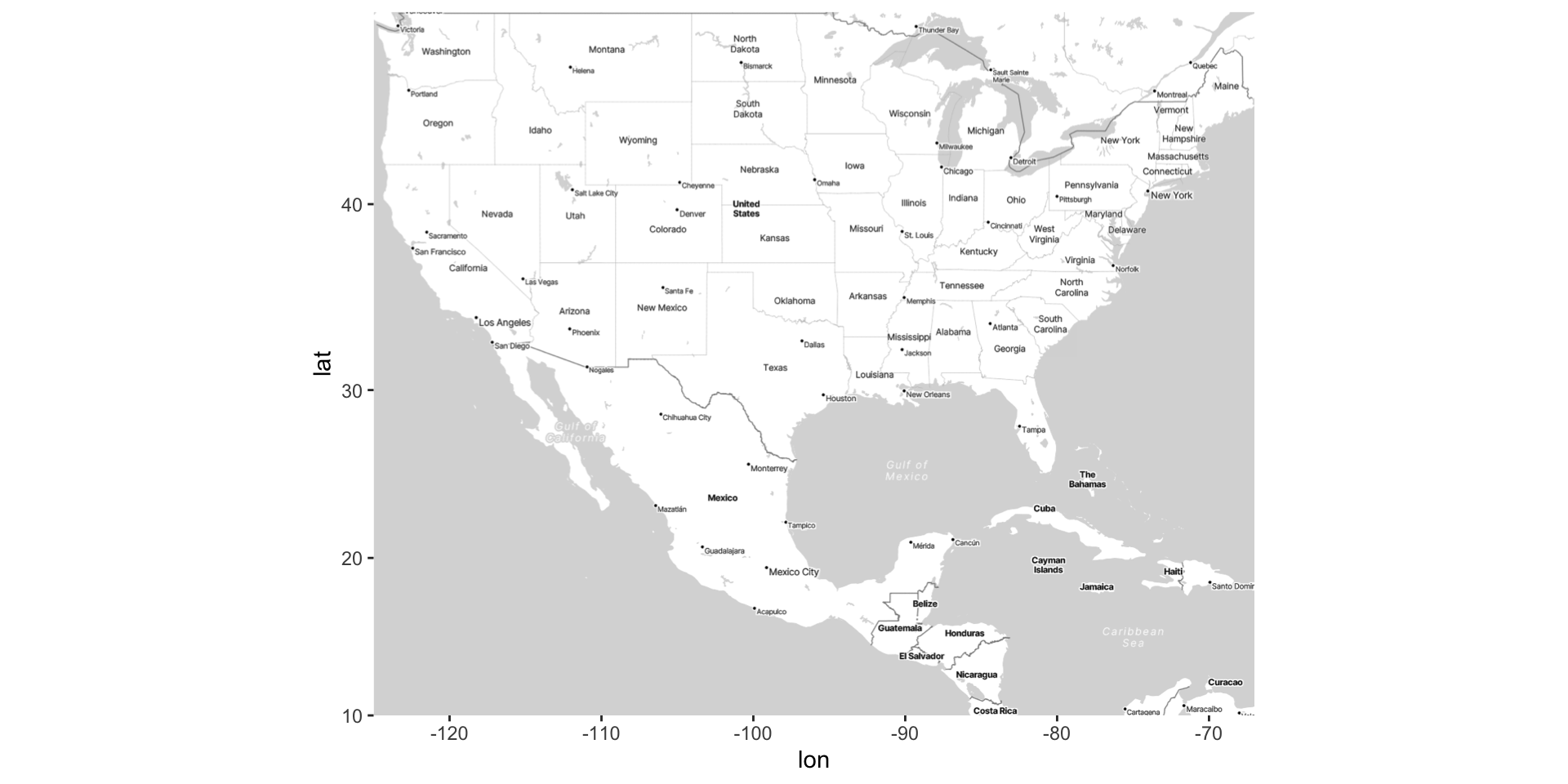
Visualizing spatial data on maps using ggmap
library (ggmap)# First, we'll draw a "box" around the US (in terms of latitude and longitude) <- c (left = - 125 , bottom = 10 , right = - 67 , top = 49 )<- get_stadiamap (US, zoom = 5 , maptype = "stamen_toner_lite" )# Visualize the basic map ggmap (map)
Draw map based on lat / lon coordinates
Put the box into get_stadiamap() to access Stamen Maps (you need an API key! )
Draw the map using ggmap() to serve as base
Visualizing spatial data on maps using ggmap
Three main types of spatial data
Point Pattern Data : lat-long coordinates where events have occurred
Point-Referenced data : Latitude-longitude (lat-long) coordinates as well as one or more variables specific to those coordinates.
Areal Data : Geographic regions with one or more variables associated with those regions.
We’re going to review each type of data. Then, we’re going to demonstrate how to plot these different data types
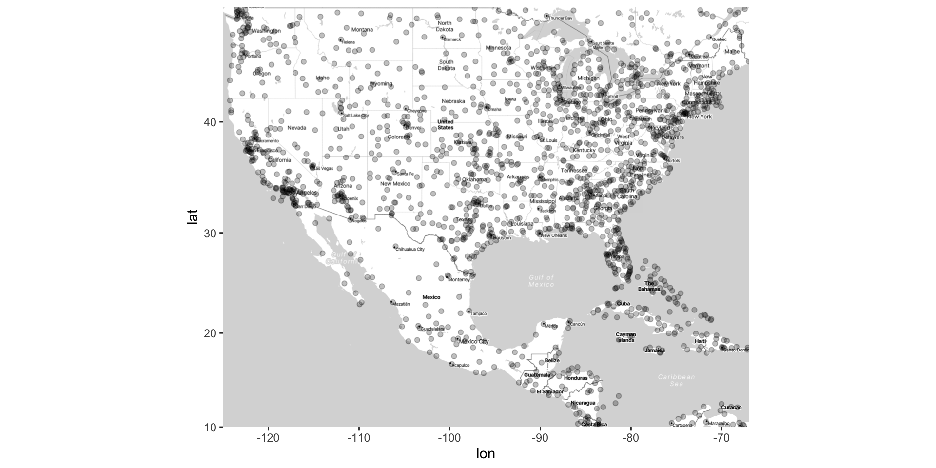
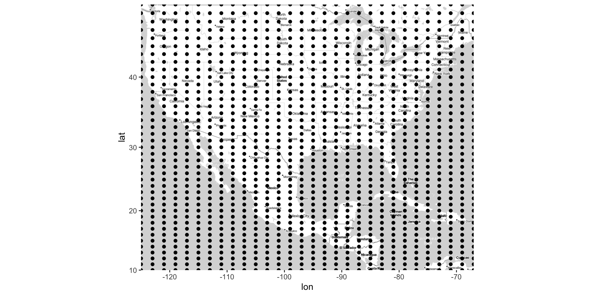
Point-Pattern data
Point Pattern Data : lat-long coordinates where events have occurred
Point pattern data simply records the lat-long of events ; thus, there are only two columns
Again, latitude and longitude are represented with dots, sometimes called a dot or bubble map.
The goal is to understand how the density of events varies across space
The density of the dots can also be visualized (e.g., with contours)
Use methods we’ve discussed before for visualizing 2D joint distribution
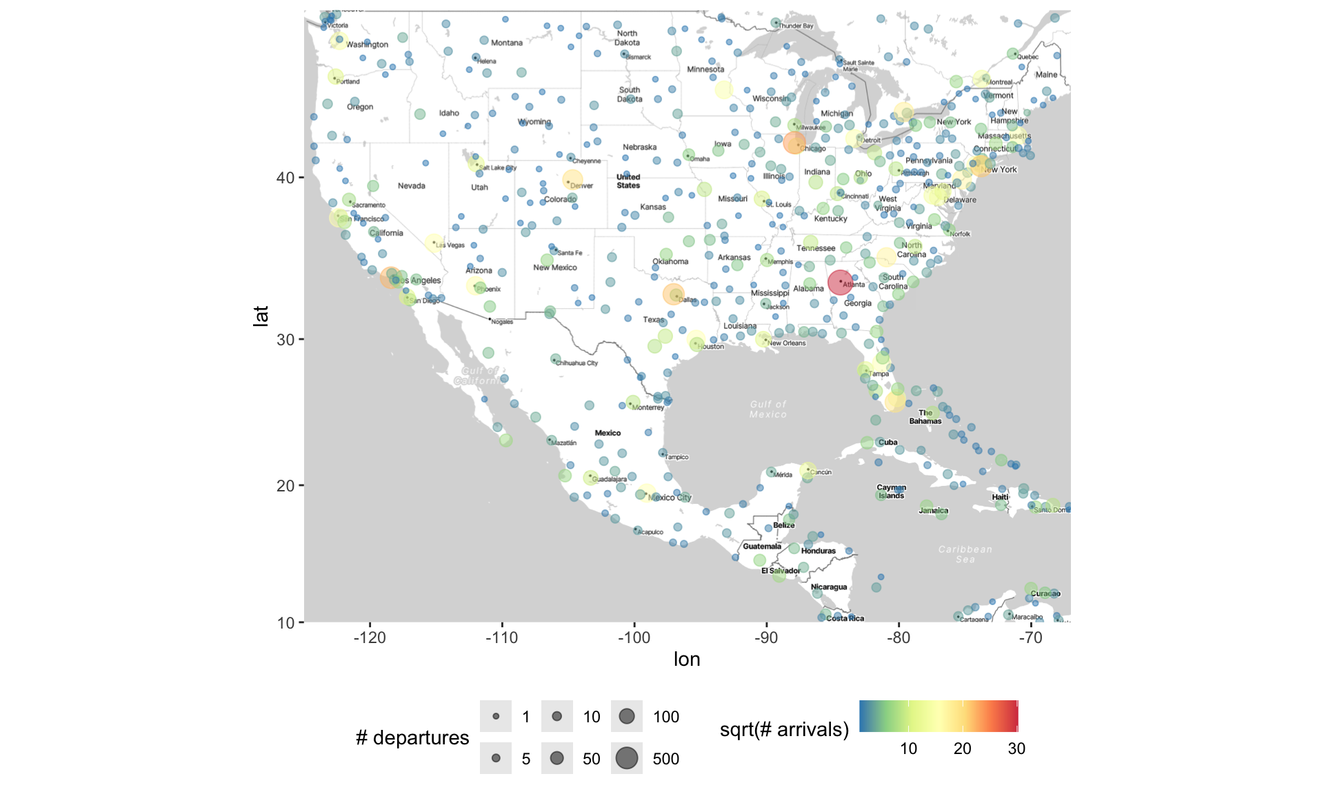
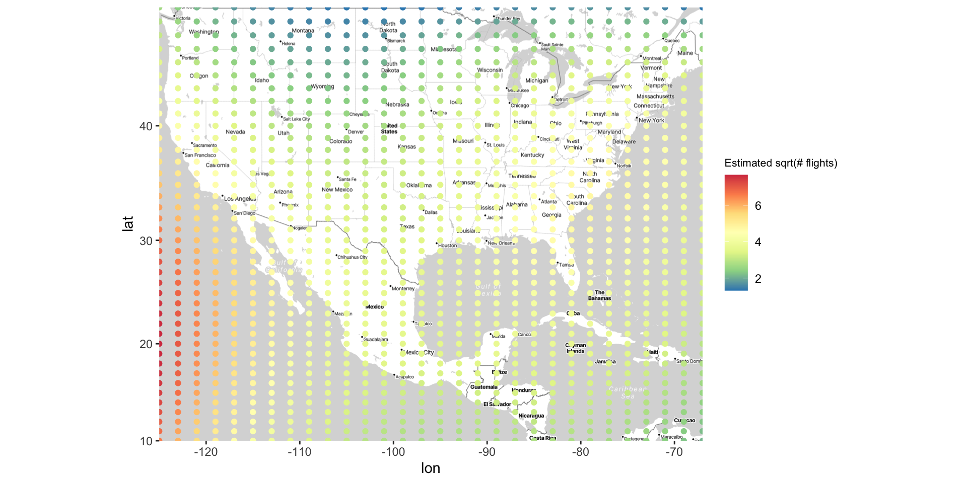
Point-Referenced data
|> dplyr:: select (lat, lon, altitude, n_depart, n_arrive, name) |> slice (1 : 3 )
# A tibble: 3 × 6
    lat   lon altitude n_depart n_arrive name
  <dbl> <dbl>    <dbl>    <int>    <int> <chr>
1 -6.08  145.     5282        5        5 Goroka Airport
2 -5.21  146.       20        8        8 Madang Airport
3 -5.83  144.     5388       10       12 Mount Hagen Kagamuga Airport
The goal is to understand how the variable(s) (e.g., altitude) vary across different spatial locations
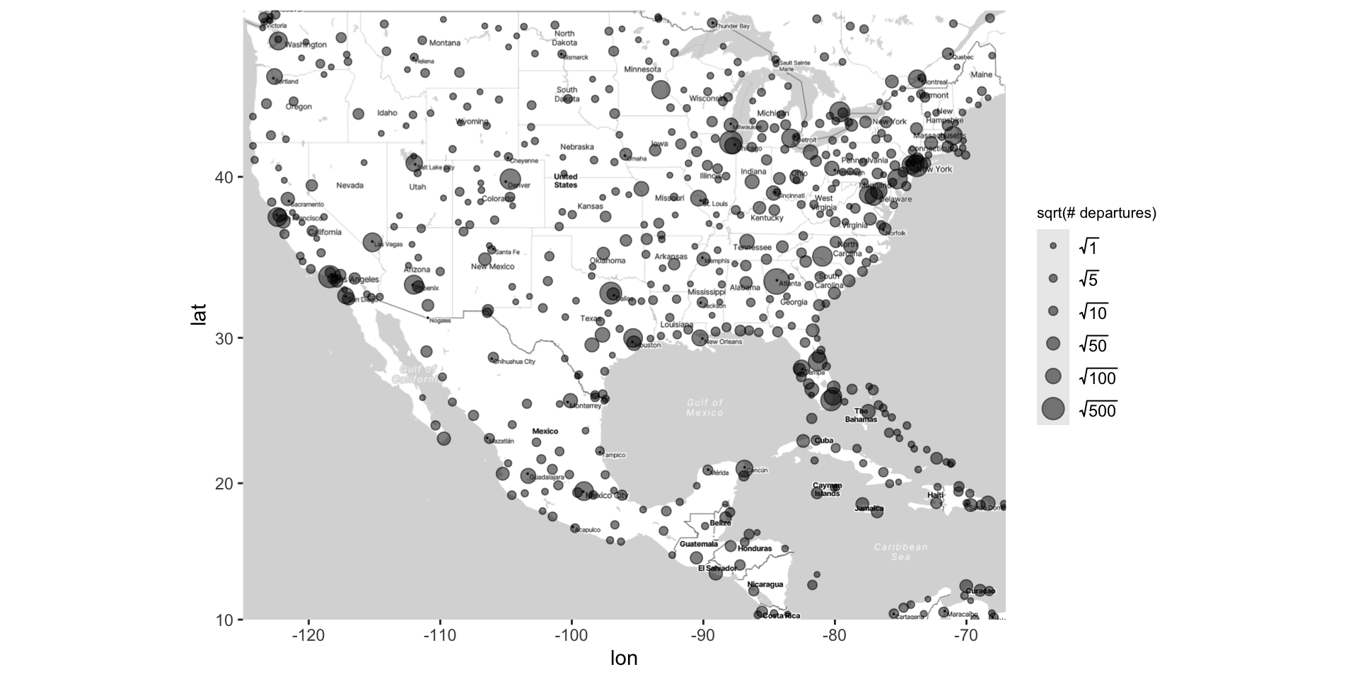
Typically, the latitude and longitude are represented with dots, and the variable(s) are represented with size and/or colors
Adding points to the map as usual
ggmap (map) + geom_point (data = airports, aes (x = lon, y = lat), alpha = 0.25 )
Altering points on the map (in the usual way)
ggmap (map) + geom_point (data = airports, aes (x = lon, y = lat, size = sqrt (n_depart), color = sqrt (n_arrive)),alpha = .5 ) + scale_size_area (breaks = sqrt (c (1 , 5 , 10 , 50 , 100 , 500 )), labels = c (1 , 5 , 10 , 50 , 100 , 500 ), name = "# departures" ) + scale_color_distiller (palette = "Spectral" ) + labs (color = "sqrt(# arrivals)" ) + theme (legend.position = "bottom" )
Altering points on the map (in the usual way)
Inference for Spatial Data
There are whole courses, textbooks, and careers dedicated to this. We’re not going to cover everything!
However, there are some straightforward analyses that can be done for spatial data.
Point-Referenced Data:
Divide geography into groups (e.g., north/south/east/west) and use regression to test if there are significant differences.
Regression of \(\text{outcome} \sim \text{latitude} + \text{longitude}\) . Smoothing regression (e.g., loess) is particularly useful here.
Visualizing Inference for Point-Reference Data
For basic linear regression:
Plot \((x, y)\) as points
Fit the regression model \(y \sim x\) , to give us \(\hat{y} = \hat{\beta}_0 + \hat{\beta}_1 \cdot x\)
Plot \((x, \hat{y})\) as a line
For point reference data, we have the following variables:
Inputs are longitude \(x\) and latitude \(y\) , and outcome variable is \(z\)
Consider the following linear regression model: \(z \sim \text{lat} + \text{long}\)
Goal: Make a visual involving \((\text{long}, \text{lat}, \hat{z})\) , and possibly \(z\) .
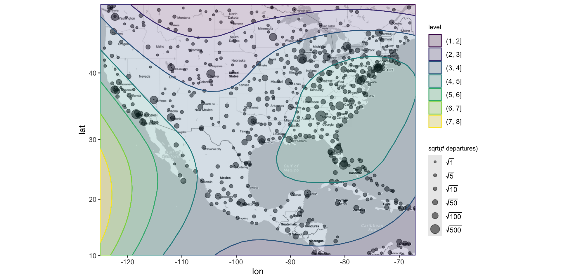
Kriging
Goal: Make a visual involving (long, lat, \(\hat{z}\) ) and possibly \(z\)
Want \(\hat{z}\) for many (long, lat) combos (not just the observed one!)
To do this, follow this procedure:
Fit the model \(z \sim \text{lat} + \text{long}\)
Create a grid of \((\text{long}, \text{lat})_{ij}\)
Generate \(\hat{z}_{ij}\) for each \((\text{long}, \text{lat})_{ij}\)
Plot a heat map or contour plot of (long, lat, \(\hat{z}\) )
You can also add the actual \(z\) values (e.g., via size) on the heat map
This is known as kriging , or spatial interpolation
Kriging: airline data example
Kriging: creating the map
Kriging: generating the grid
Kriging: generating predicted values
Kriging: plotting heat map of predicted values
Kriging overview
The steps used to create this map are…
Fit an interactive regression model using loess()
Make a grid of lat/long coordinates, using seq() and expand.grid()
Get estimated outcomes across the grid using predict()
Use geom_contour_filled() to color map by estimated outcomes
Recap and next steps
Walked through basics of time series data, such as moving averages, autocorrelation, seasonality
Visualized spatial data in a 2D plane (latitude/longitude), i.e., maps
Point pattern: Scatterplots with density contours
Point-referenced: Scatterplots with color/size, use regression/loess for inference