# A tibble: 3 × 9
  Population Income Illiteracy `Life Exp` Murder `HS Grad` Frost   Area state
       <dbl>  <dbl>      <dbl>      <dbl>  <dbl>     <dbl> <dbl>  <dbl> <chr>
1       3615   3624        2.1       69.0   15.1      41.3    20  50708 alabama
2        365   6315        1.5       69.3   11.3      66.7   152 566432 alaska
3 2212 4530 1.8 70.6 7.8 58.1 15 113417 arizonaAreal data and creating high-quality graphics
2024-09-30
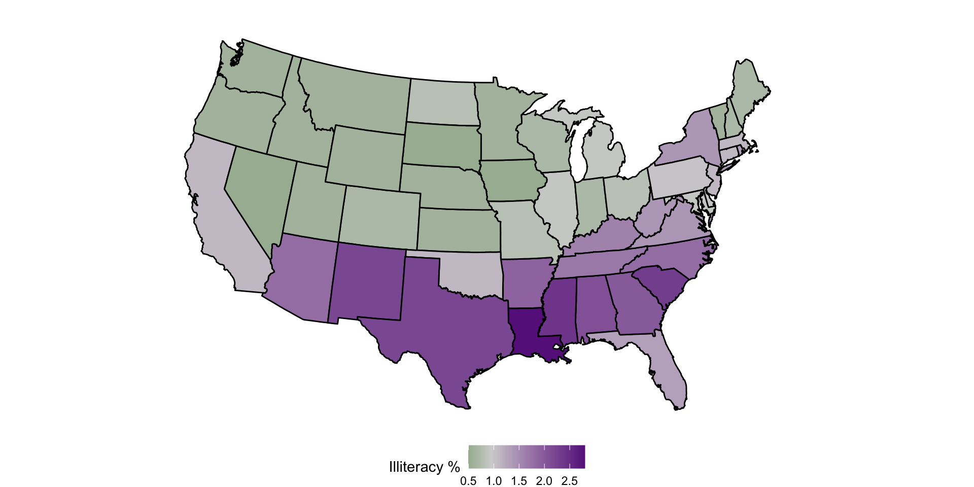
Create a choropleth map with geom_polygon()
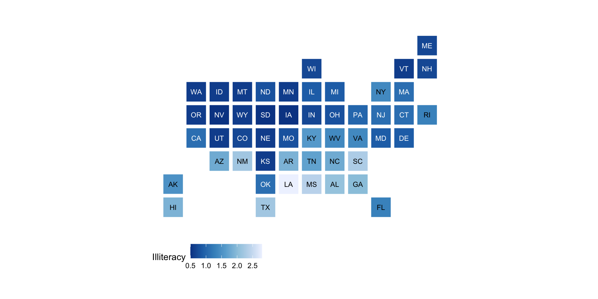
Uniform size with statebins
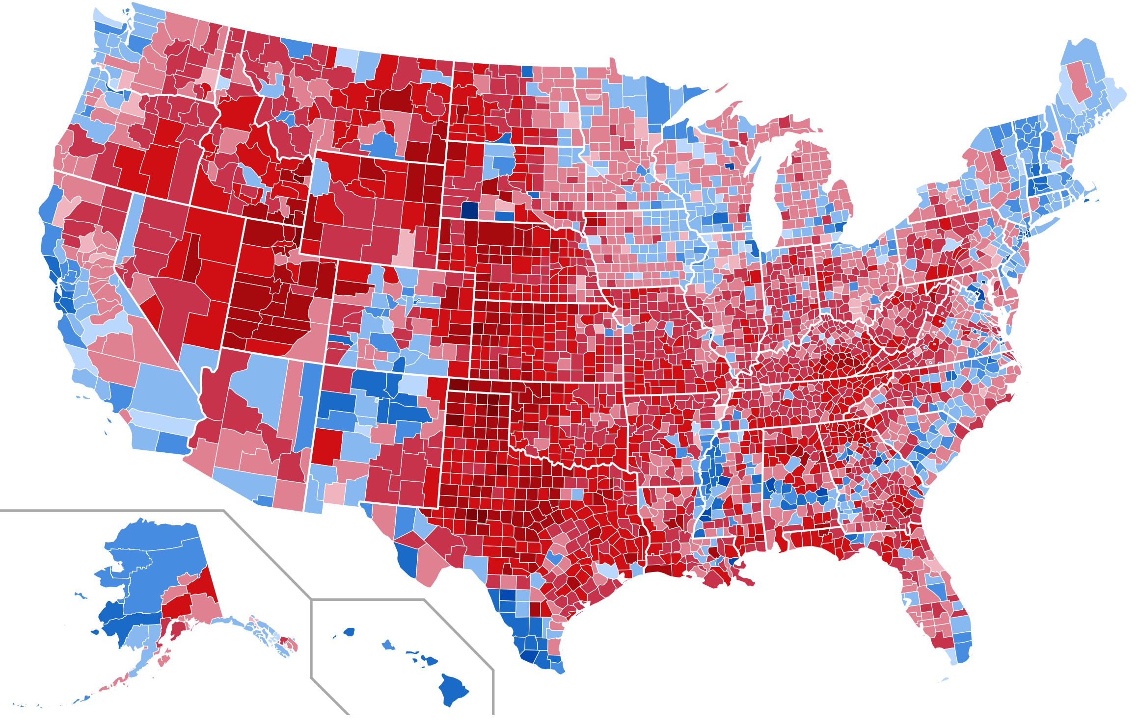
Many choices for displaying maps…
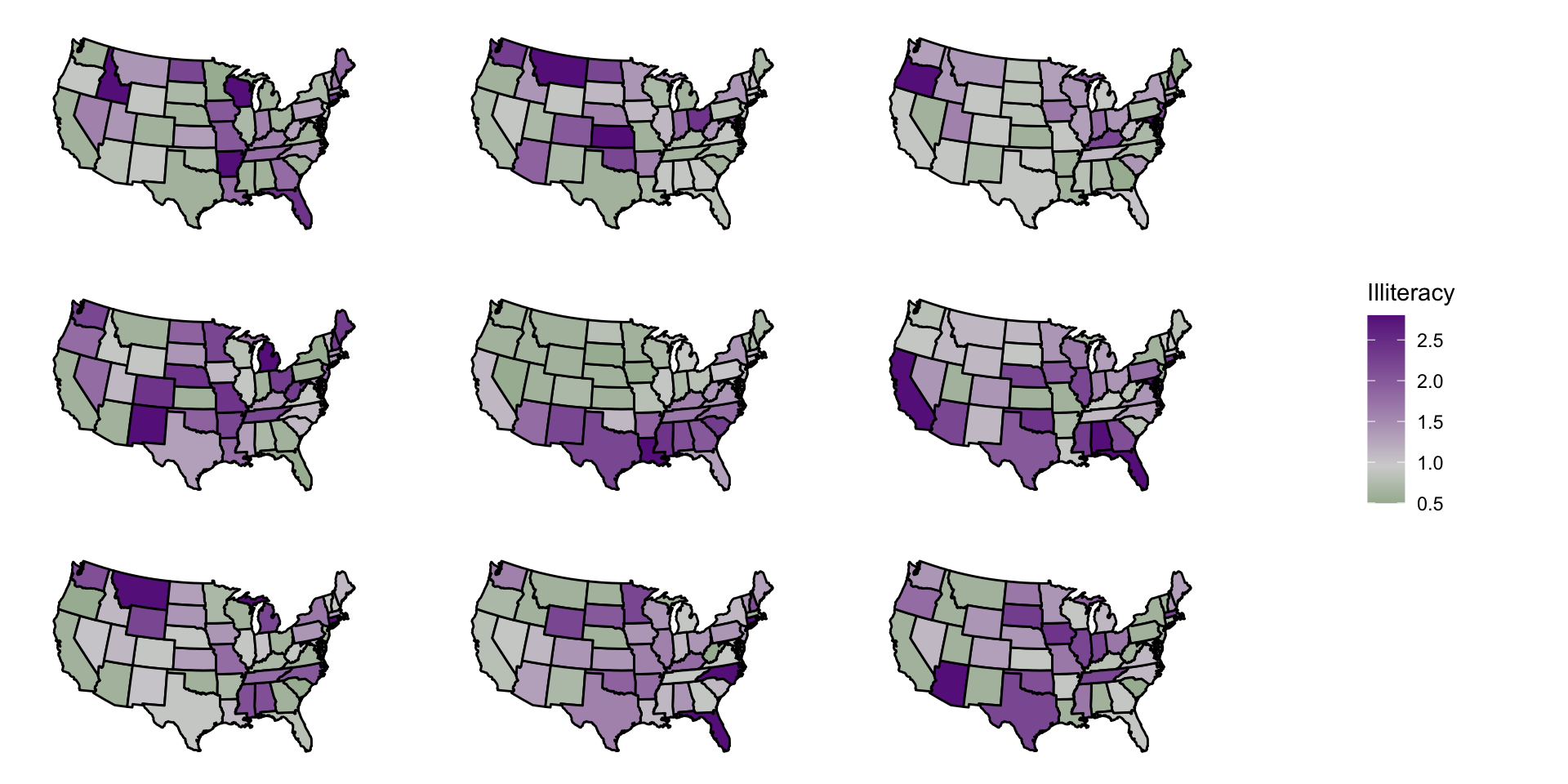
Visual randomization test
Visual randomization test
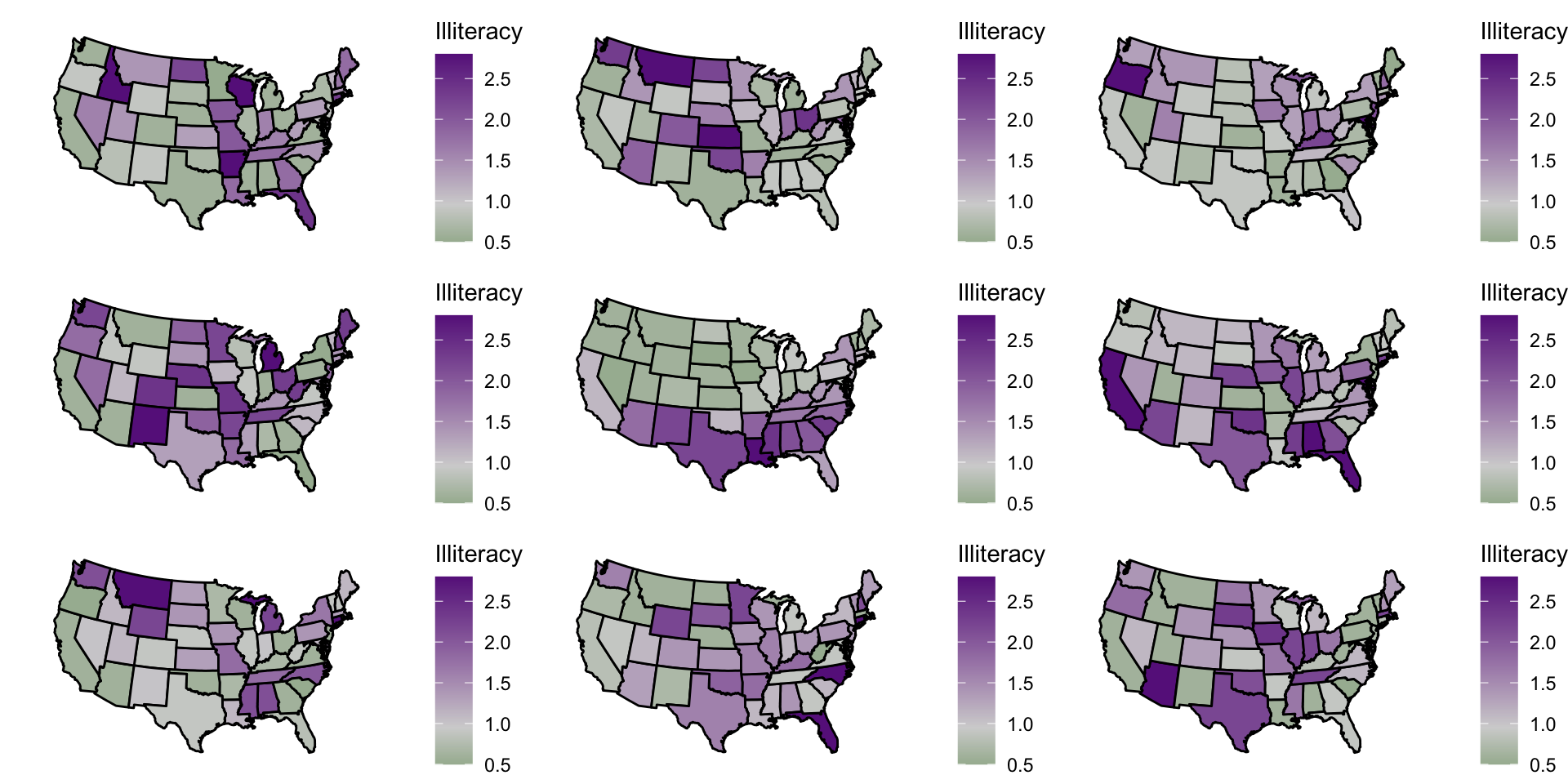
Creating the same type of plot many times
Creating the same type of plot many times
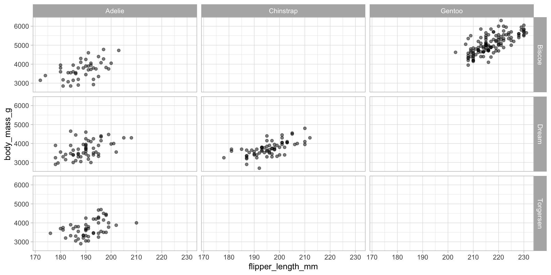
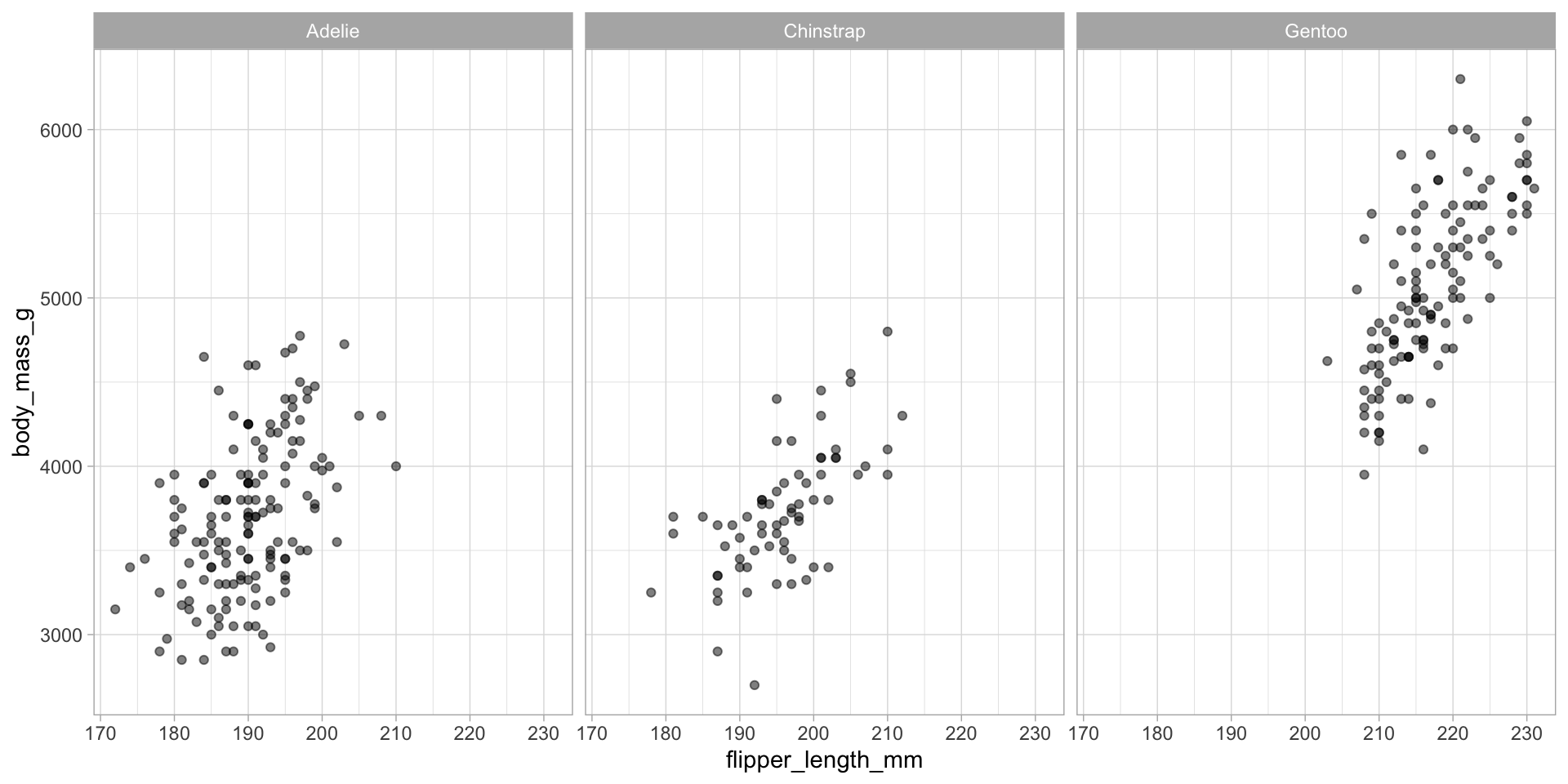
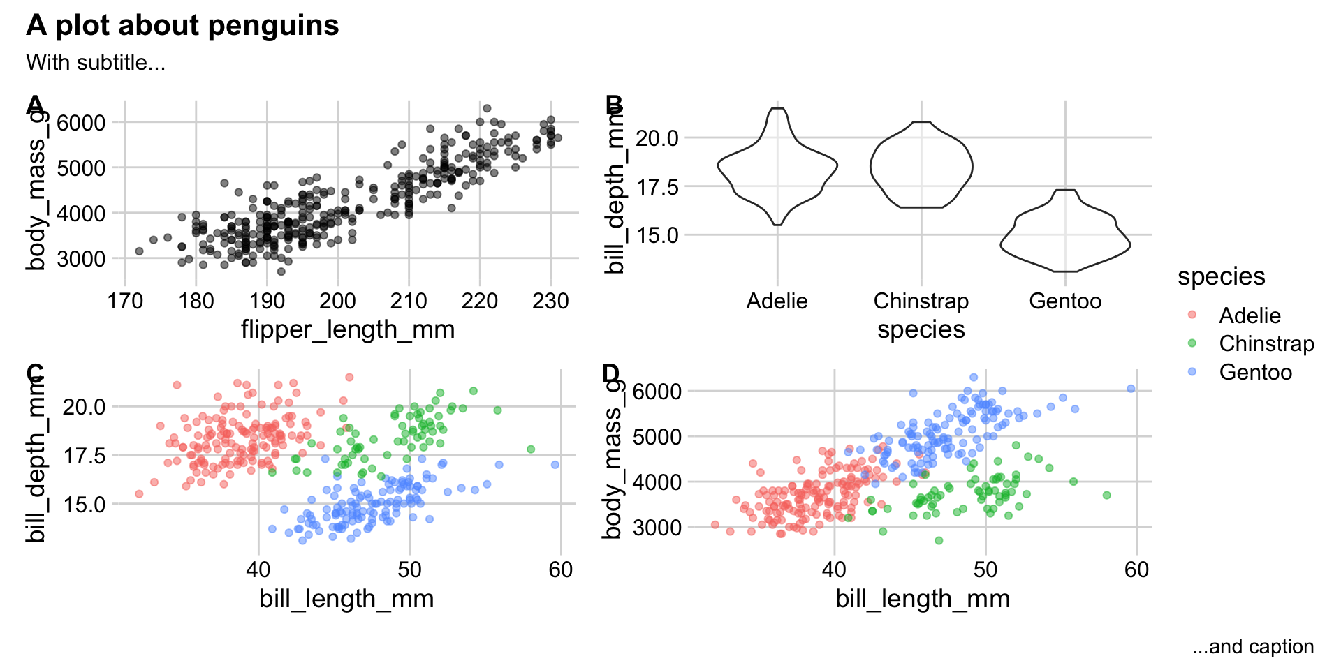
Creating a single cohesive display of multiple plots
Creating a single cohesive display of multiple plots
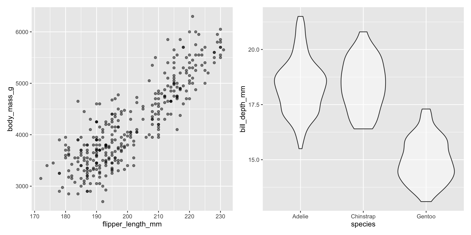
Using cowplot to arrange plots together
Using cowplot to arrange plots together
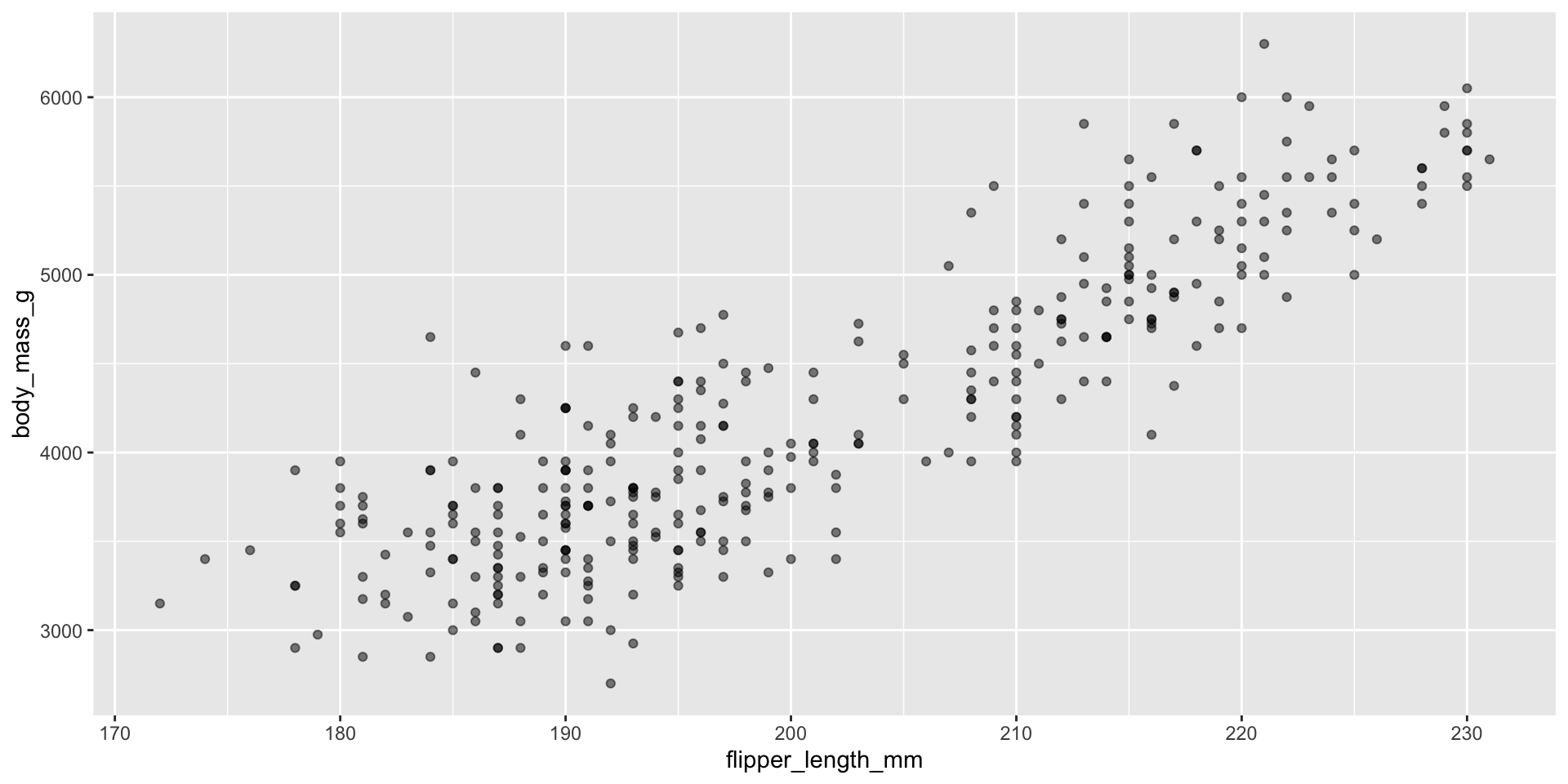
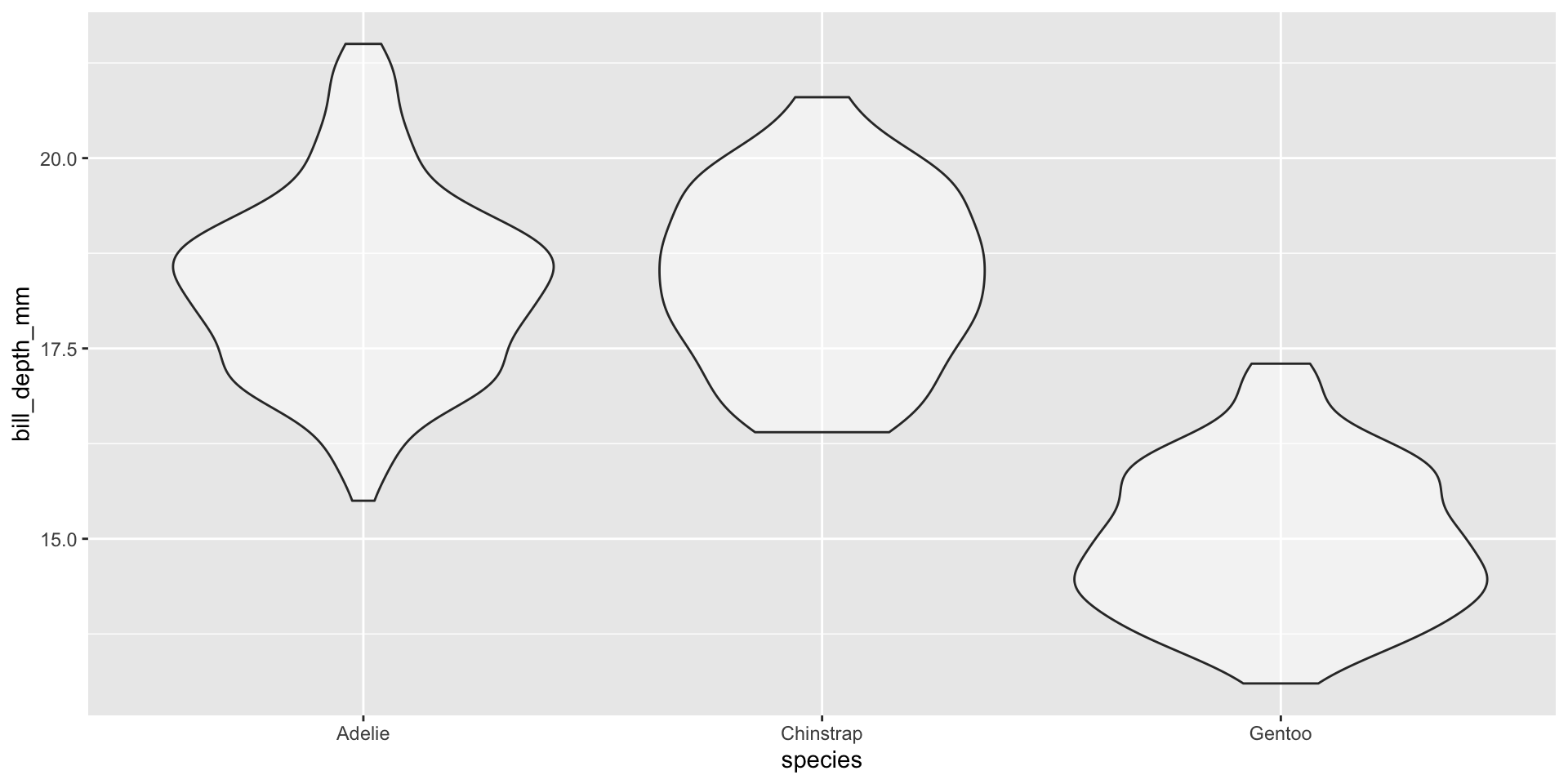
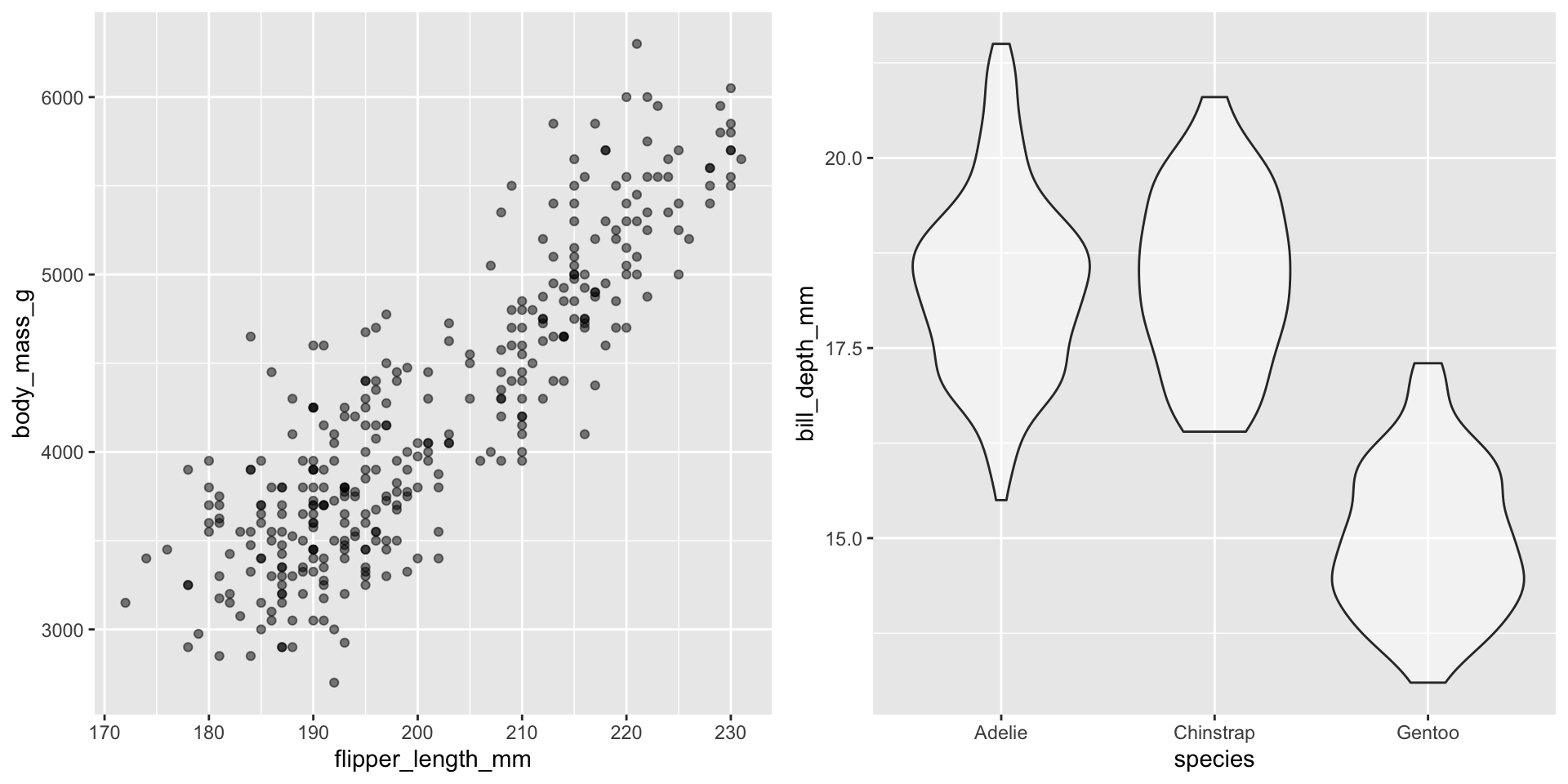
Using patchwork to arrange plots together
Using patchwork to arrange plots together
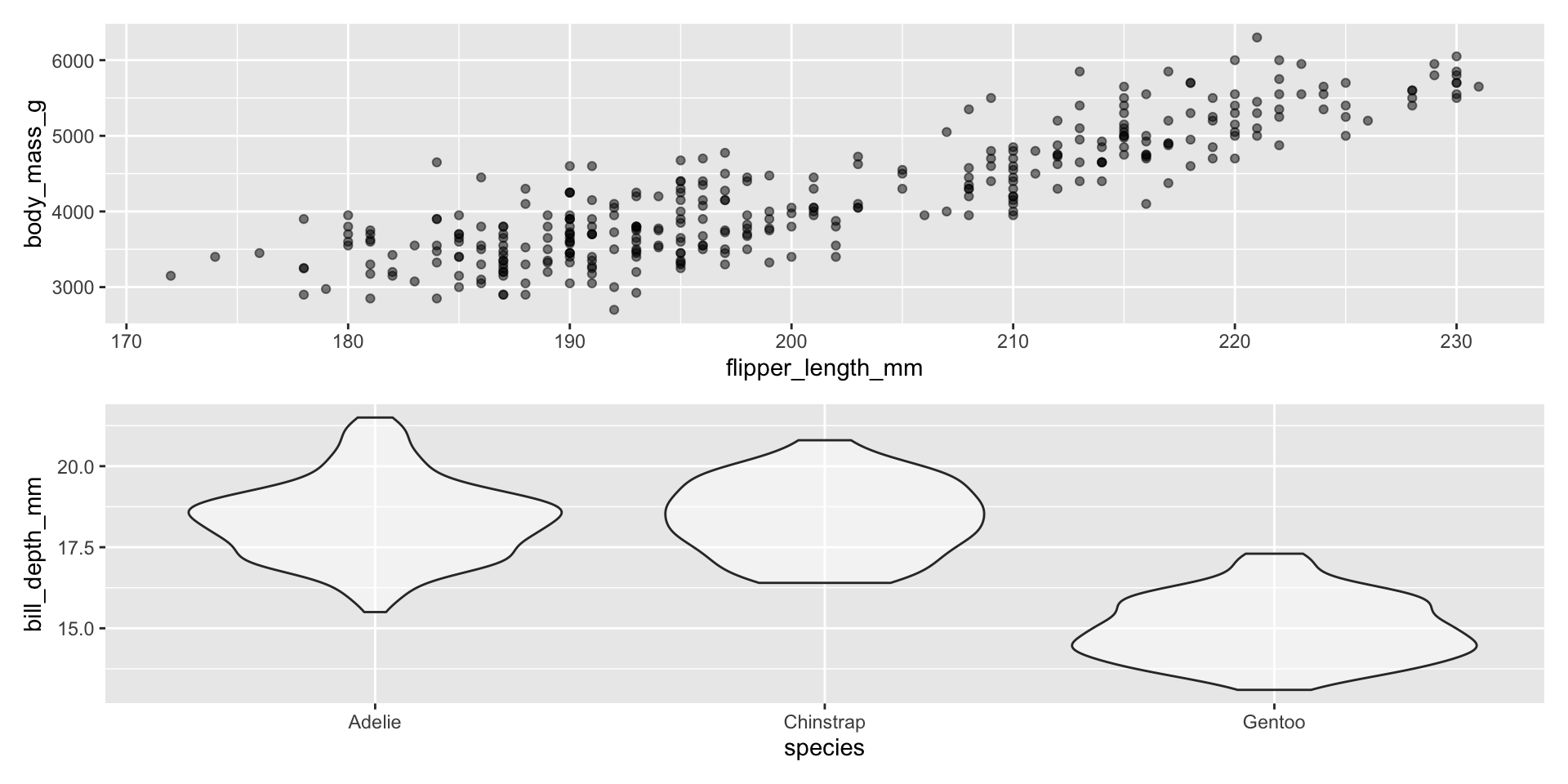
Using patchwork to arrange plots together
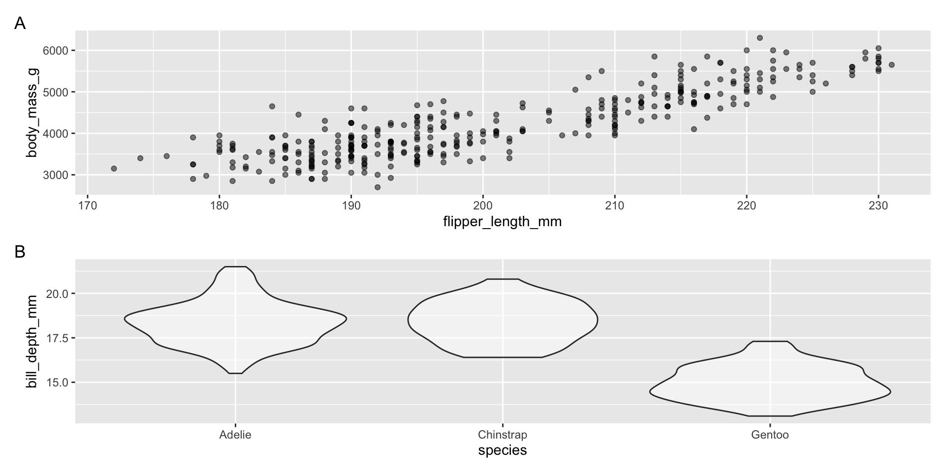
Using patchwork to arrange plots together
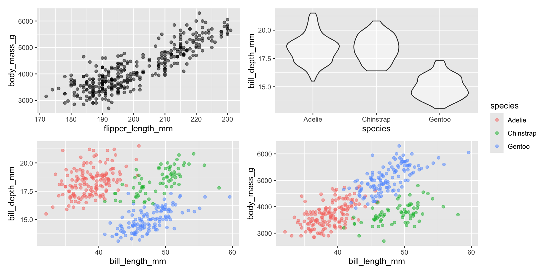
Using patchwork to arrange plots together
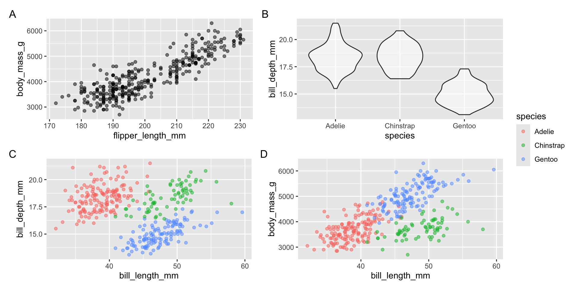
Using patchwork to arrange plots together
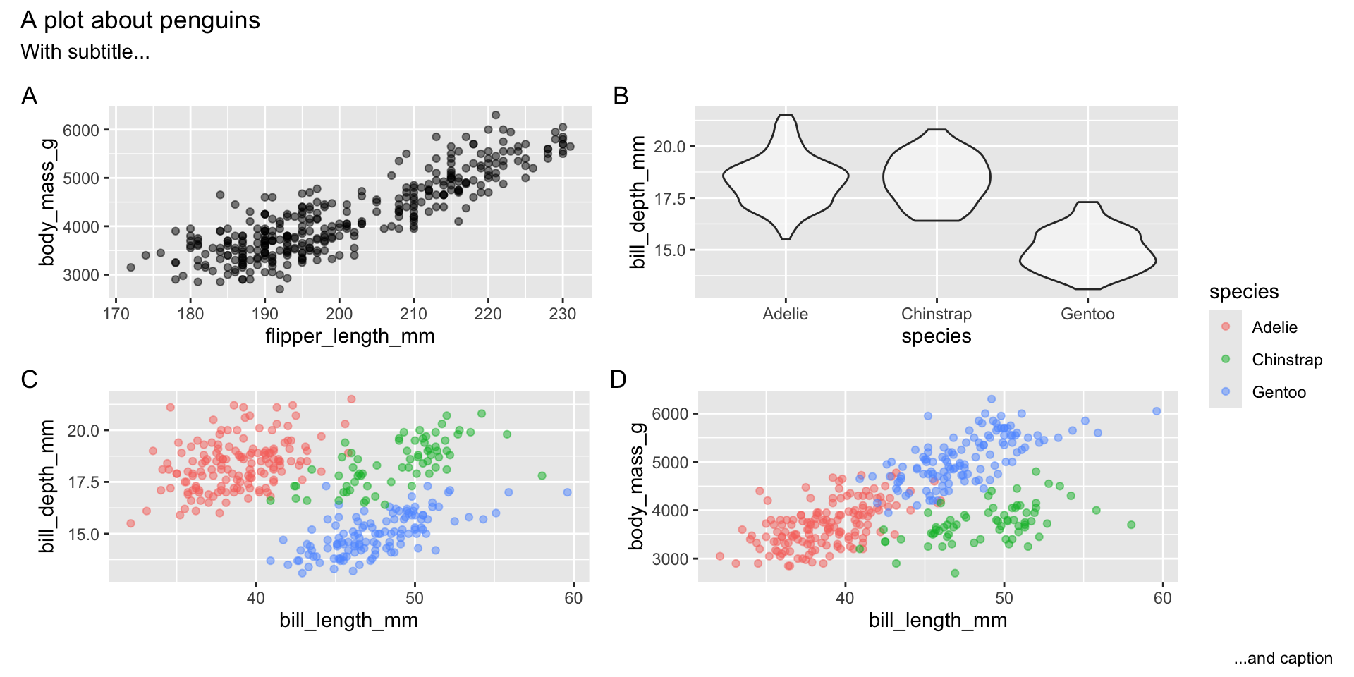
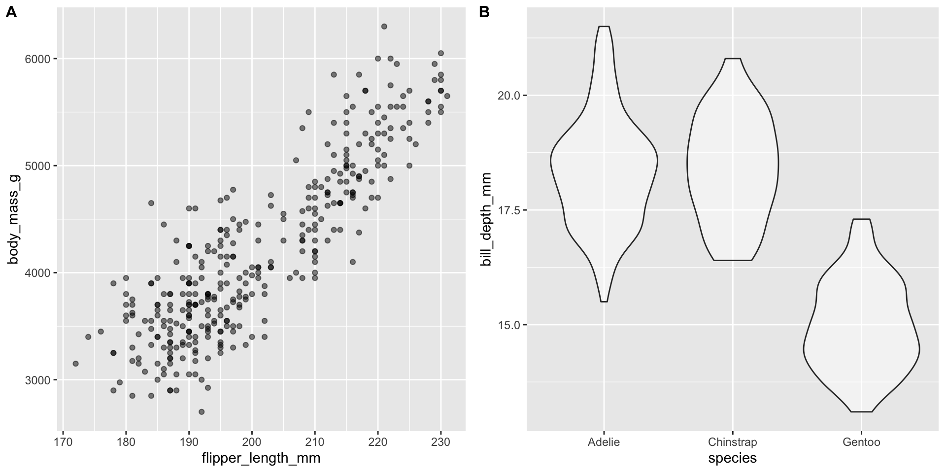
Infographics vs figures in papers/reports
- Infographics should standalone, thus they must have a title along with a relevant subtitle and caption (located within the plot)
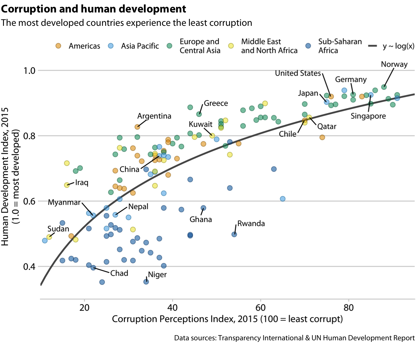
Infographics vs figures in papers/reports
- Figures in papers/reports will have captions containing the information from the standalone title/subtitle/caption, see example:
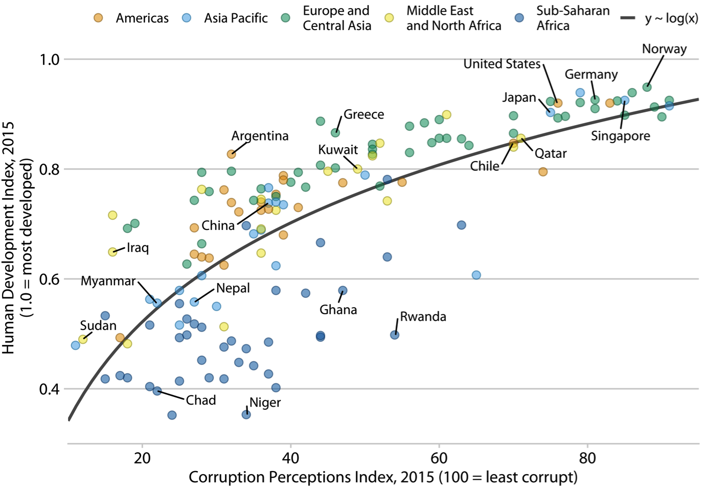
Figure 1. Corruption and human development. The most developed countries experience the least corruption. Data sources: Transparency International & UN Human Development Report.
Using patchwork to arrange plots together
Annotation
Using text can be a great way to highlight and explain aspects of a visualization when you’re not there to explain it
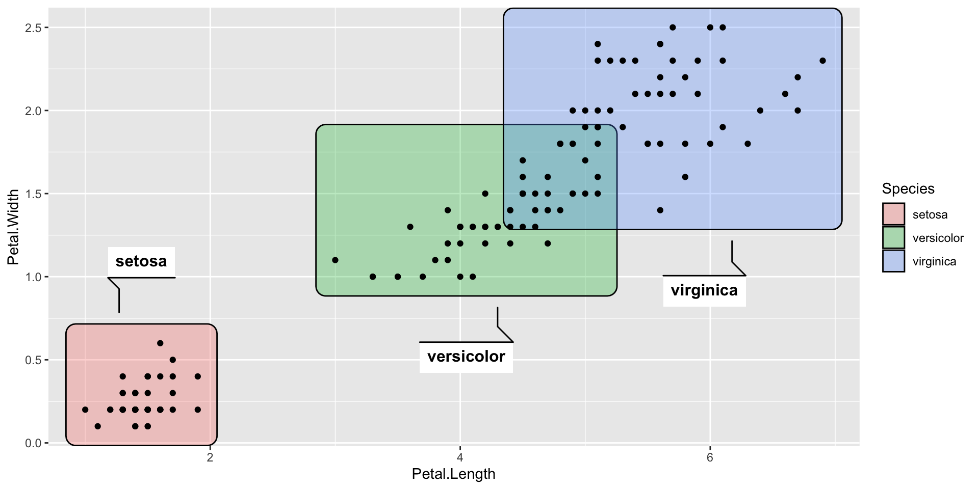
annotate()is an easy way to add text to ggplot objects or add rectangle layers for highlighting displays
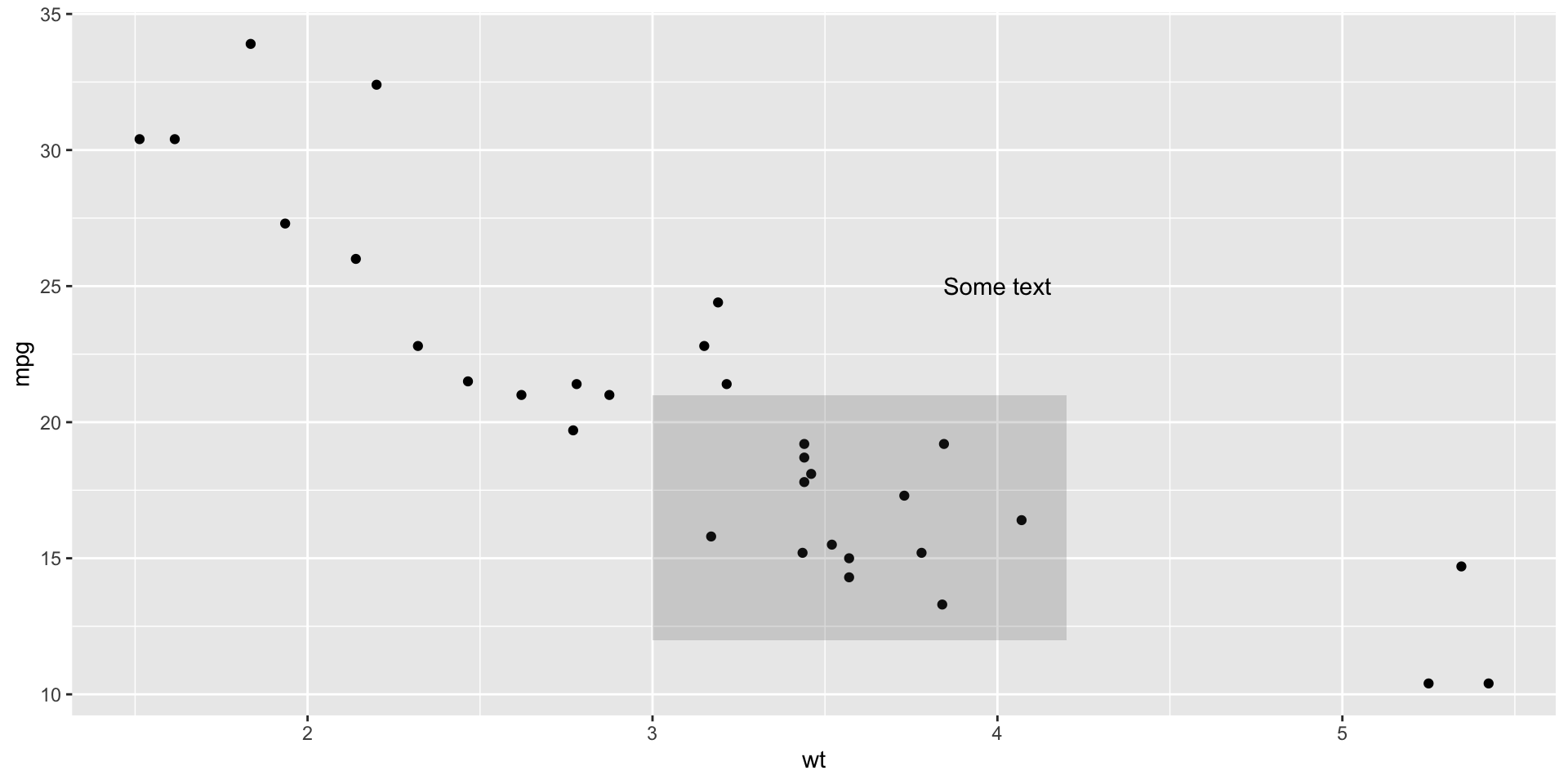
Annotation tools
- We’ve discussed
gghighlightandggrepel, butdirectlabelsandggforceare also useful